_18.38.50.png?table=block&id=c651e204-8edb-4bd8-96cb-760d7955b0bd&cache=v2)
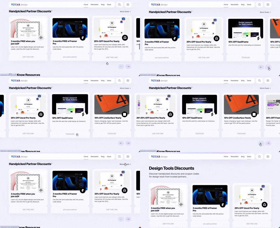
411. Ticket Carrousel (TOOOLS.design)
Users can browse a curated selection of offers by clicking pagination arrows, enabling efficient discovery and decision-making.
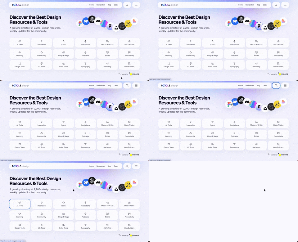
410. Hero Interactive Background (TOOOLS.design)
This pattern uses an animated, interactive background to engage users and visually highlight featured content, enhancing initial appreciation and pathfinding.

409. Customize Toolbar (2-pane interaction)
Users can personalize their toolbar by toggling specific buttons on or off, enhancing workflow efficiency and tailoring the interface to their needs.
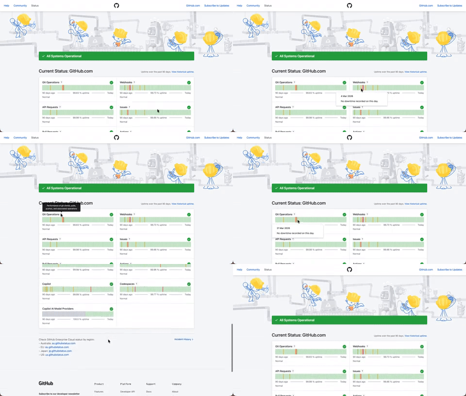
408. Status Page per Hour Indicators
Users can quickly assess system health over time via color-coded hourly indicators, revealing operational status and outage events at a glance.

406. Fixed Bottom-Right Chat Bubble

405. Ferrari Luce Website (by LoveFrom)

404. Sidebar Backdrop Menu

403. File Upload and Background Loader

402. Transition: Zoom-to-Dock for Minimize
This transition visually guides the user as a window minimizes, smoothly shrinking and moving to its new location in the dock, enhancing spatial awareness and system feedback.

401. In-App News Notification

400. 3D Button Shadow
This pattern uses a subtle 3D shadow animation on hover to provide clear visual feedback, enhancing user awareness and guiding interaction.

399. Snooze newsletter (Joshwcomeau.com)
This pattern confirms a successful subscription update, offering a clear path to re-enable emails if the user changes their mind.

397. Modal w/ Card Options
This modal presents users with clear, card-based options to initiate a task, guiding them efficiently through initial decision-making.

394. Page Outline Scroller (touch)

393. Colored Checkboxes

392. SaaS for Construction Workers

390. Icon Software Landing Page

389. Text Edit Inline Input

388. Drag & Drop and Checkbox to Select Multiple Item
Users can efficiently organize multiple items by dragging and dropping them into a target category, enhancing content management and task completion.

386. Skeleton Loader
This pattern uses skeleton screens to progressively load content, providing immediate visual feedback and reducing perceived wait times for users.

383. Video Animation on Touch
This pattern uses a dynamic video animation that plays upon user touch, providing engaging visual feedback and enhancing interaction.
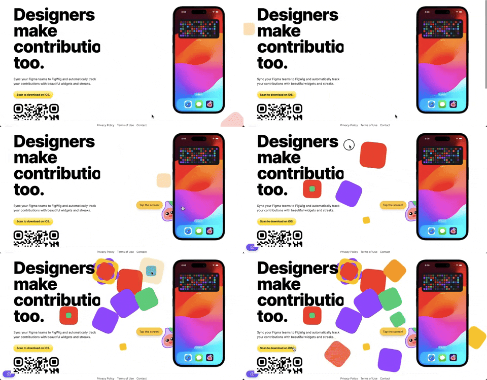
382. Interactive Background Animation
This pattern uses subtle, interactive background animations to engage users and provide dynamic visual feedback as they scroll or interact with the page.

379. Dropdown Filters

378. Modal Blackout w/ Animation
This pattern uses an animated blackout modal to focus user attention on critical information or actions, ensuring clear decision-making.
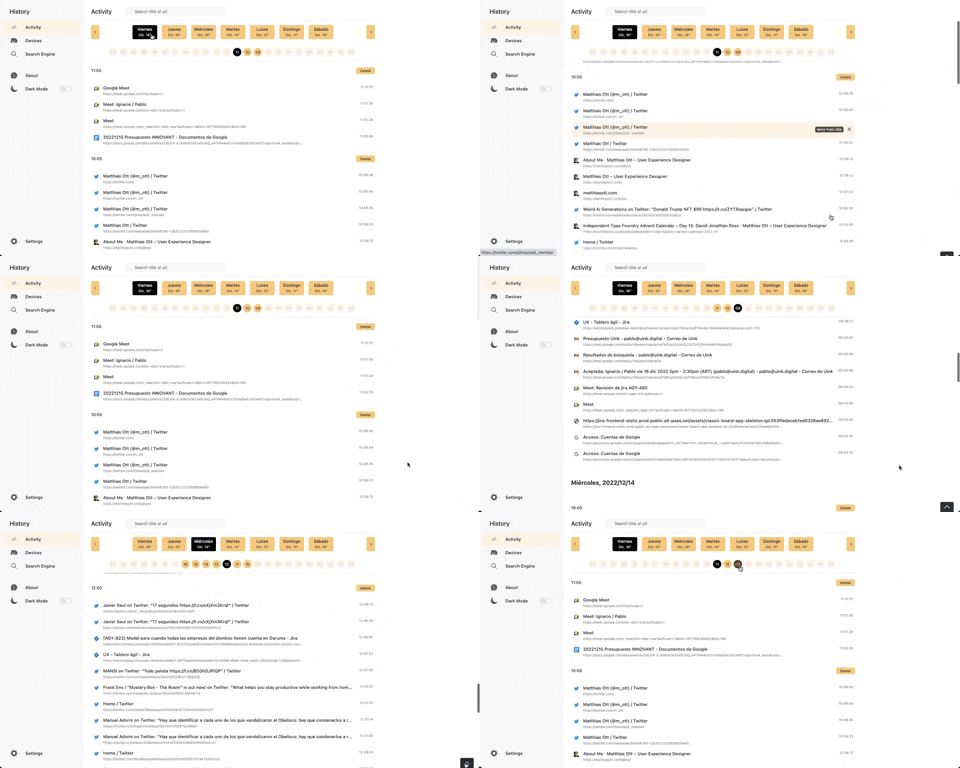
363. Better History - Back to Top on scroll
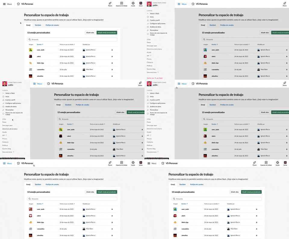
375. Toggle/Show Sidebar Menu
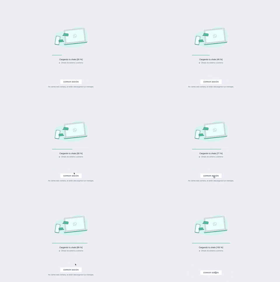
361. WhatsApp - Progress Bar Loading
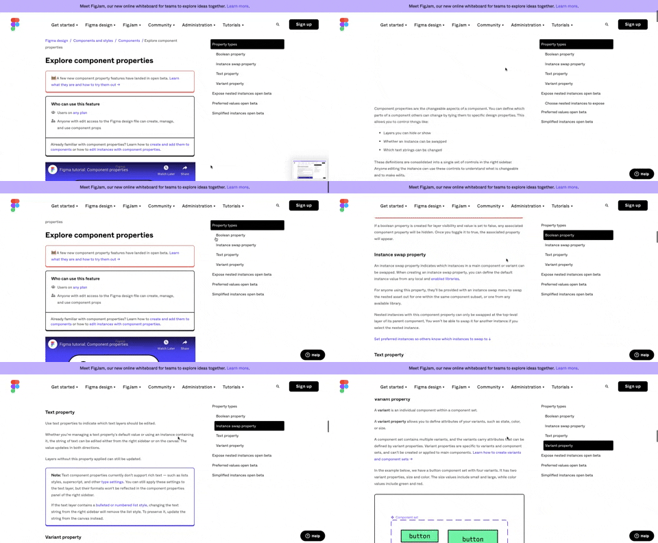
360. Page Outline Menu
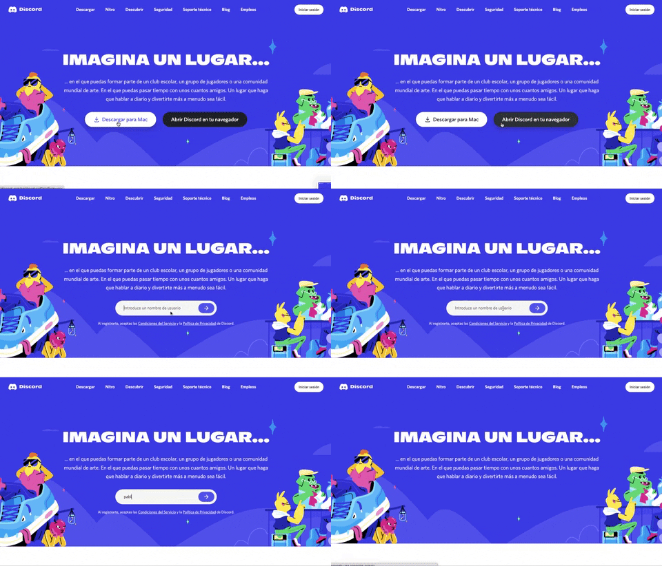
359. Discord - Button to Input Transition
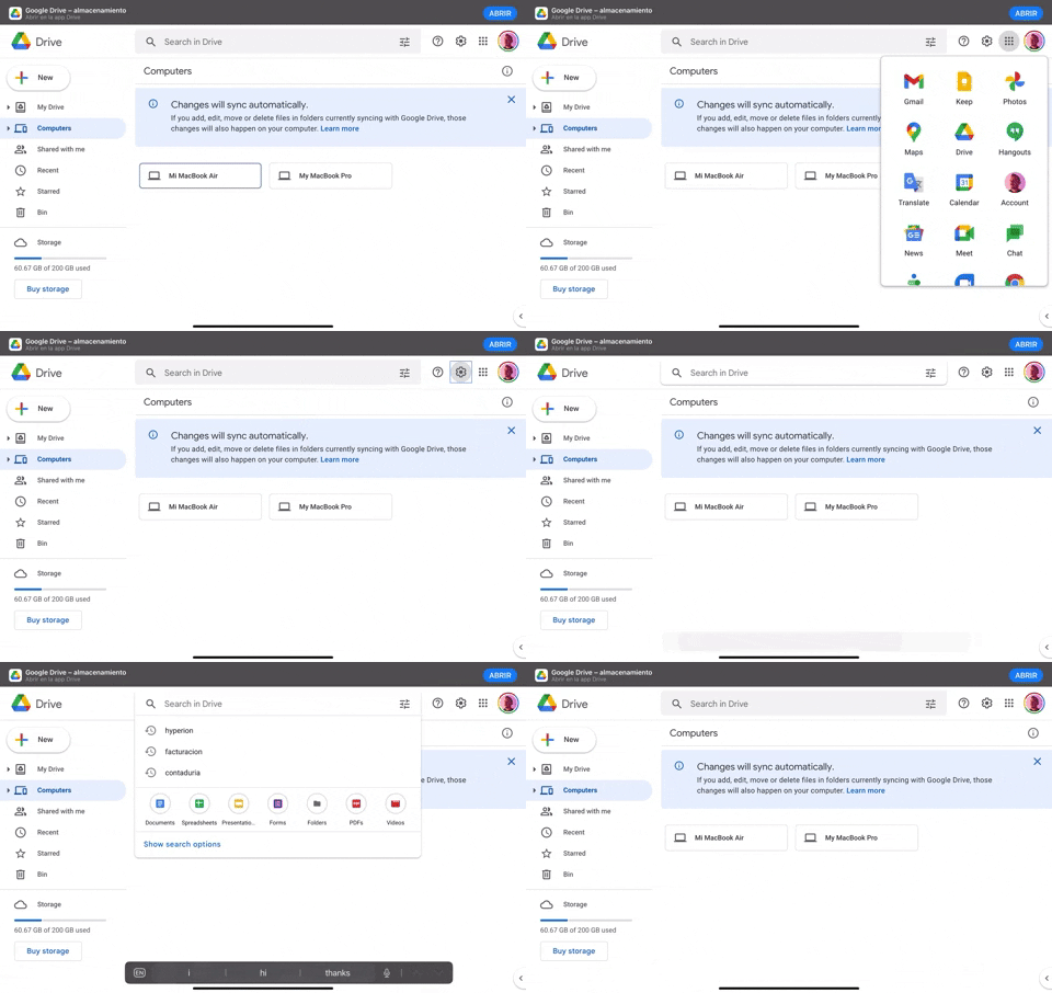
370. Floating Navbar Menus
369. Fixed Form with Steps
This pattern describes a multi-step form that maintains a fixed position on the screen, typically presented within a side panel. It is designed to guide users through a sequence of inputs, often involving text fields, for processes such as collecting feedback, raising awareness, or expressing appreciation. This pattern is suitable for web and tablet interfaces, ensuring a consistent user experience during data entry. Notable behavior: Form Submission; Step Navigation; Active Step.
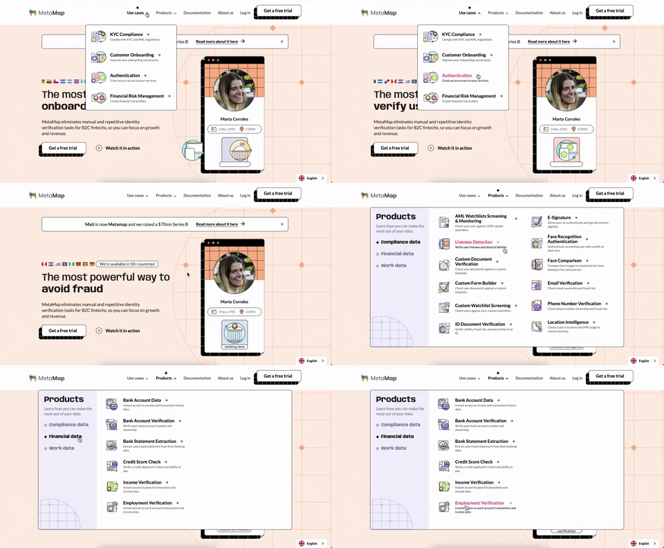
356. MetaMap - Multi-Layout Topbar Menu
355. Jira - Feature Presentation Tooltip
A feature presentation tooltip, as seen in Jira, guides users through new functionalities or important updates. It often appears during onboarding or to raise awareness, utilizing tooltips with hypertext links and pagination for multi-step tours on both desktop and web interfaces.
354. Figma - Floating Form with Steps
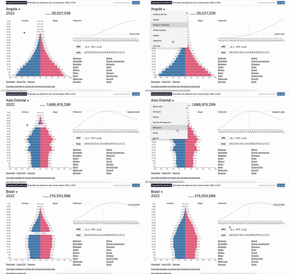
353. Population Pyramid - Visualizations with live filters
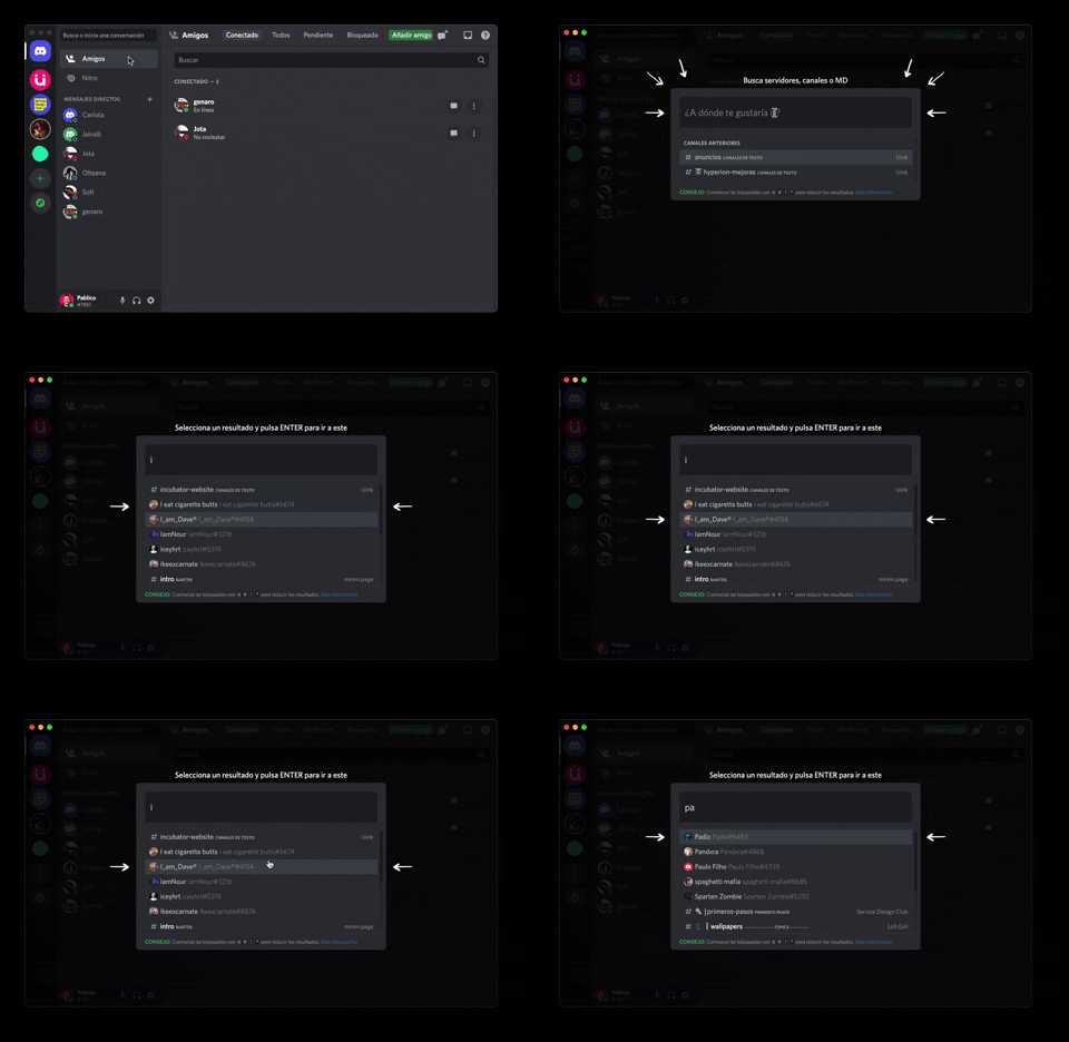
362. Modal Blackout w/ Form & Animations
A modal with a blackout overlay and animated transitions provides a focused input form, ensuring users can quickly add friends without distraction.
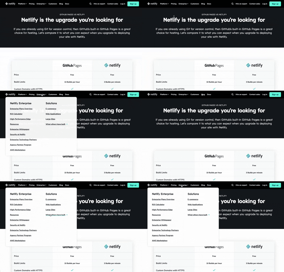
350. Netifly - Multi-layout Topbar Menu
This topbar menu dynamically adjusts its layout and content, offering users clear navigation and relevant options as they explore different sections of the site.
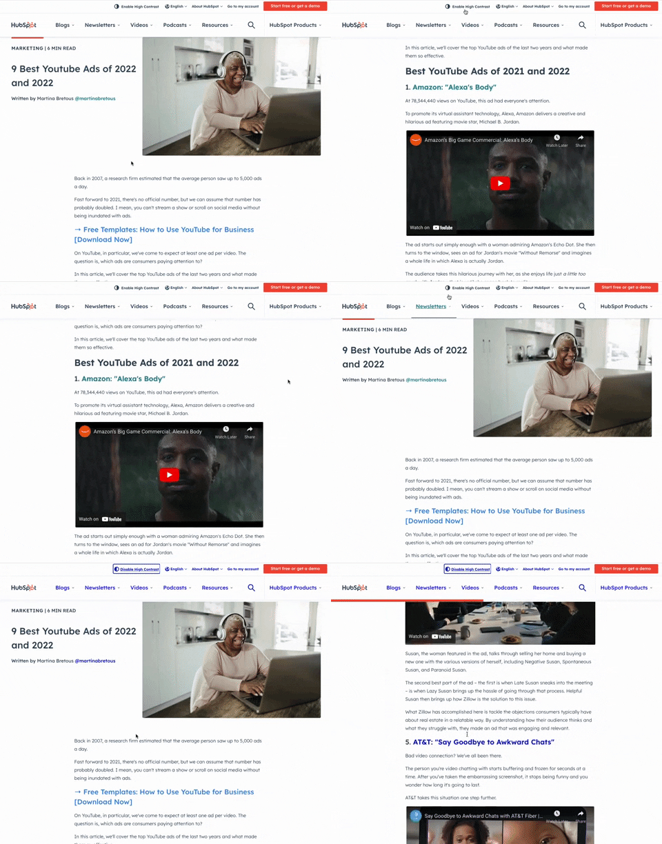
349. HubSpot - Toggle High Contrast

359. Toggle List/Grid View
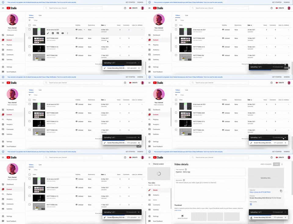
347. YouTube - Floating Progress Bar
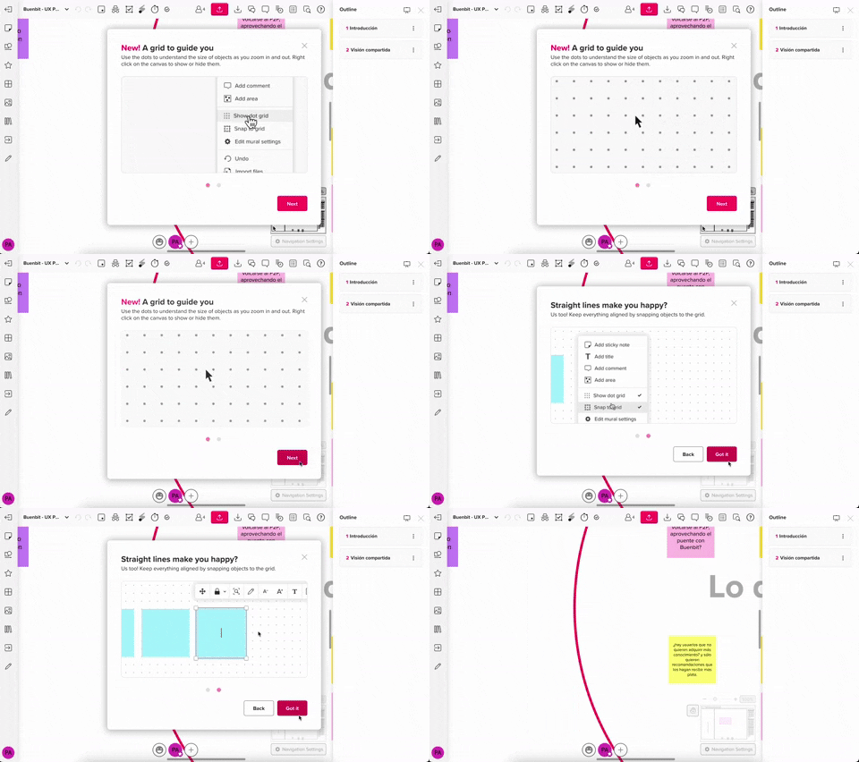
357. Modal w/ Steps & Animation (No blackout)

355. Navigation Tabs with Slider (Swipe)
Users can effortlessly navigate distinct content categories by tapping tabs or swiping horizontally, ensuring quick access to desired information.
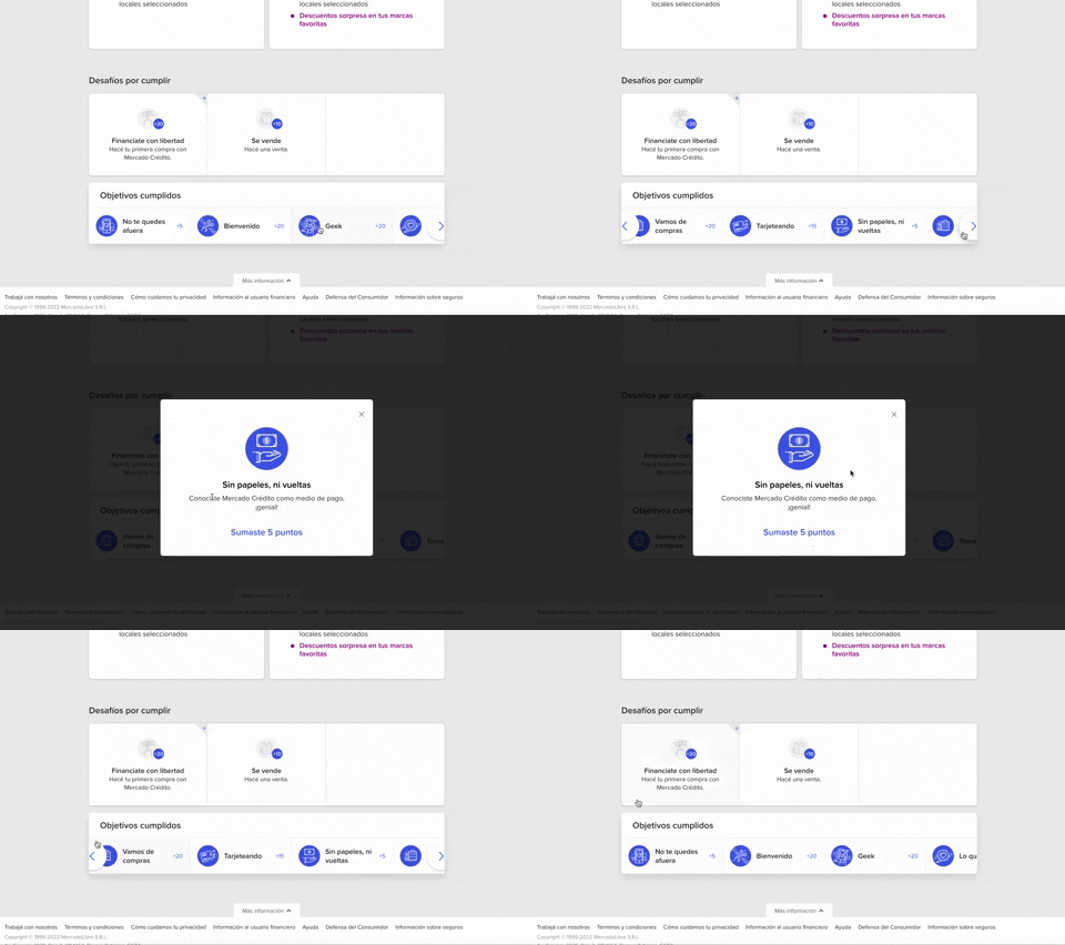
344. MercadoLibre - Horizontal Item Slider
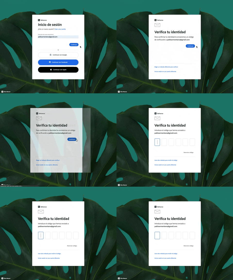
343. Behance - Login with Code Validation
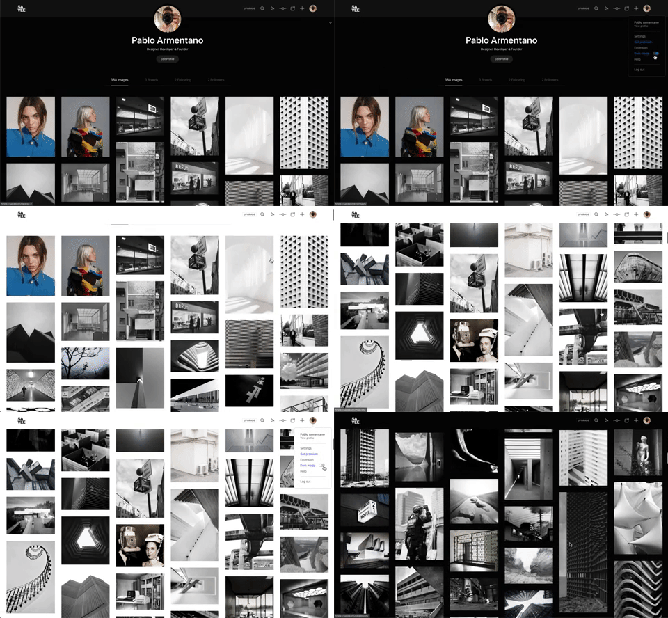
342. Savee - Light/Dark Mode Switcher
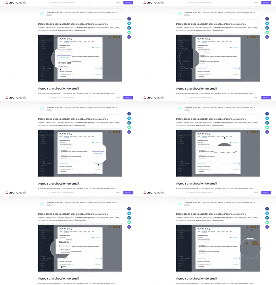
340. Asana - Zoom/Magnifier Over Image
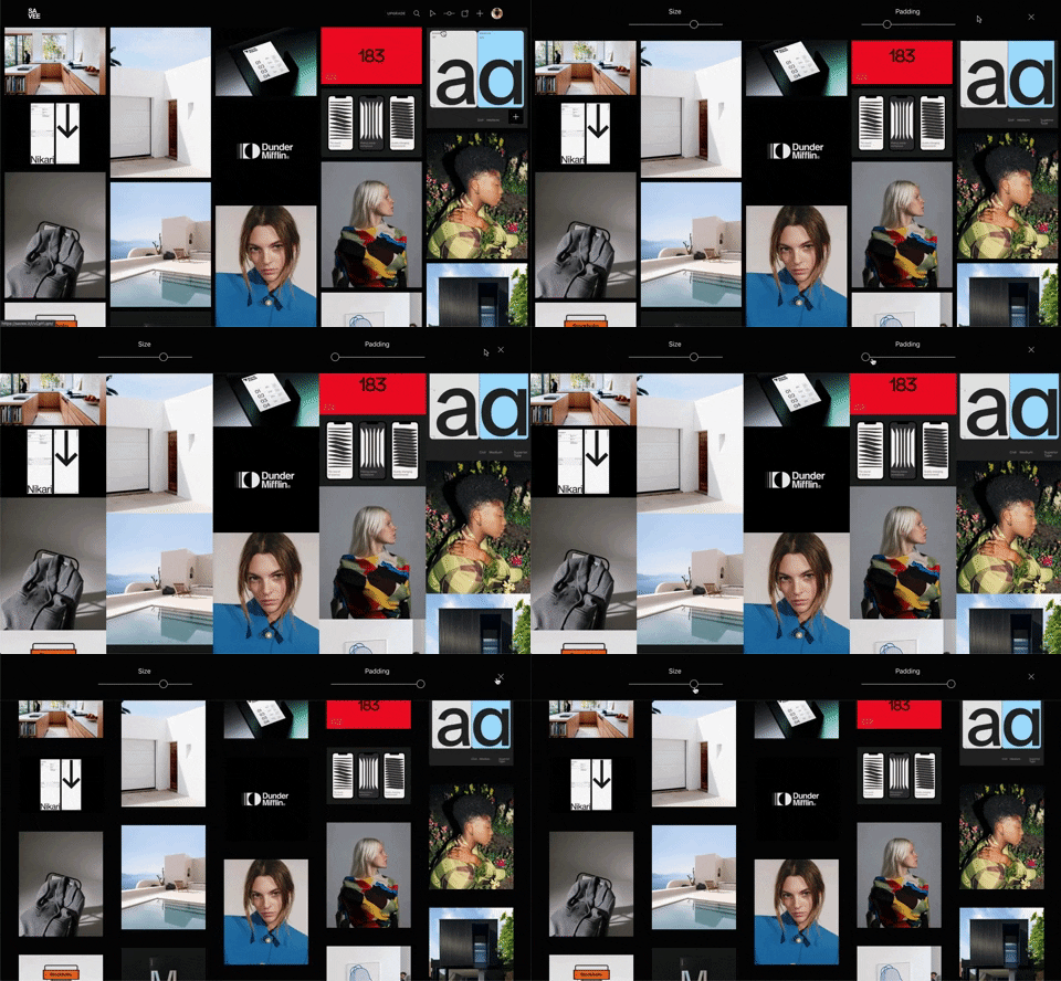
341. Image Grid Customization Sliders
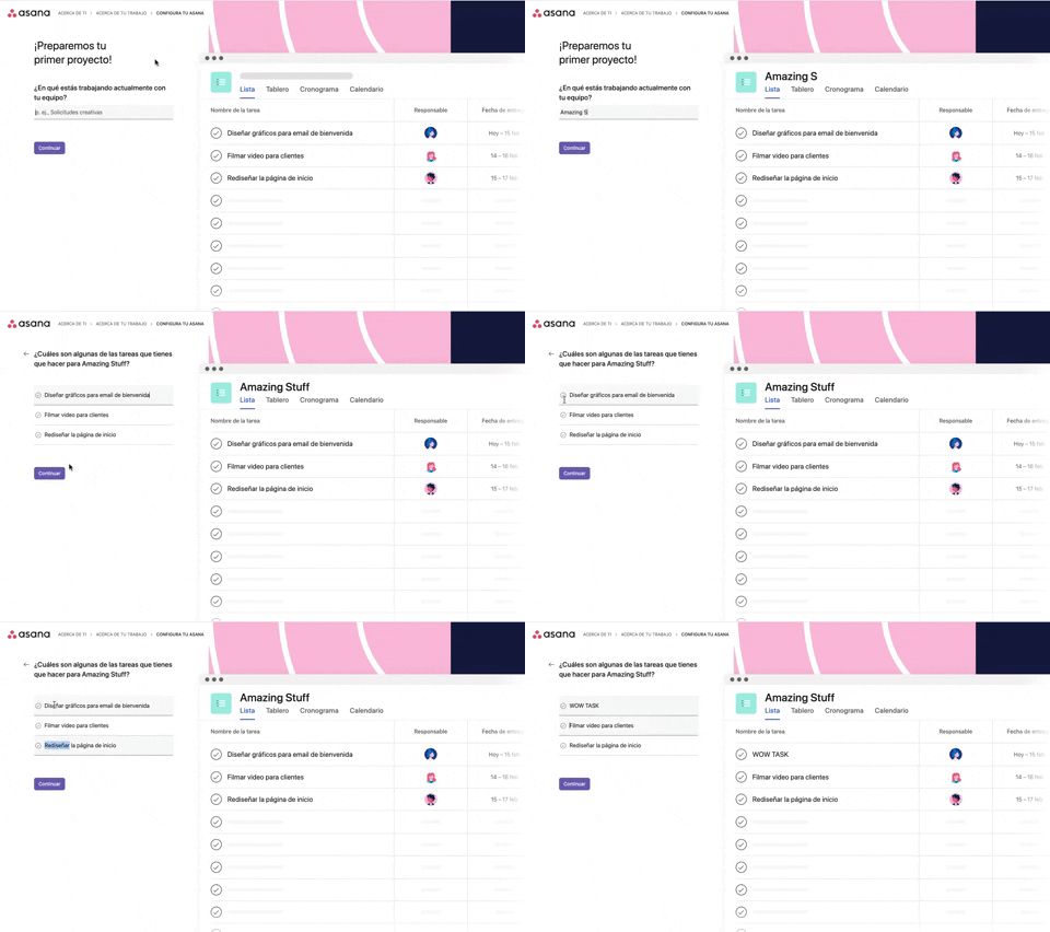
339. Asana - Platform Onboarding Simulator

346. Sidebar Menu With Collapsable Items (Show More)

345. Vertical Accordion for FAQs
336. Floating Popover on Click
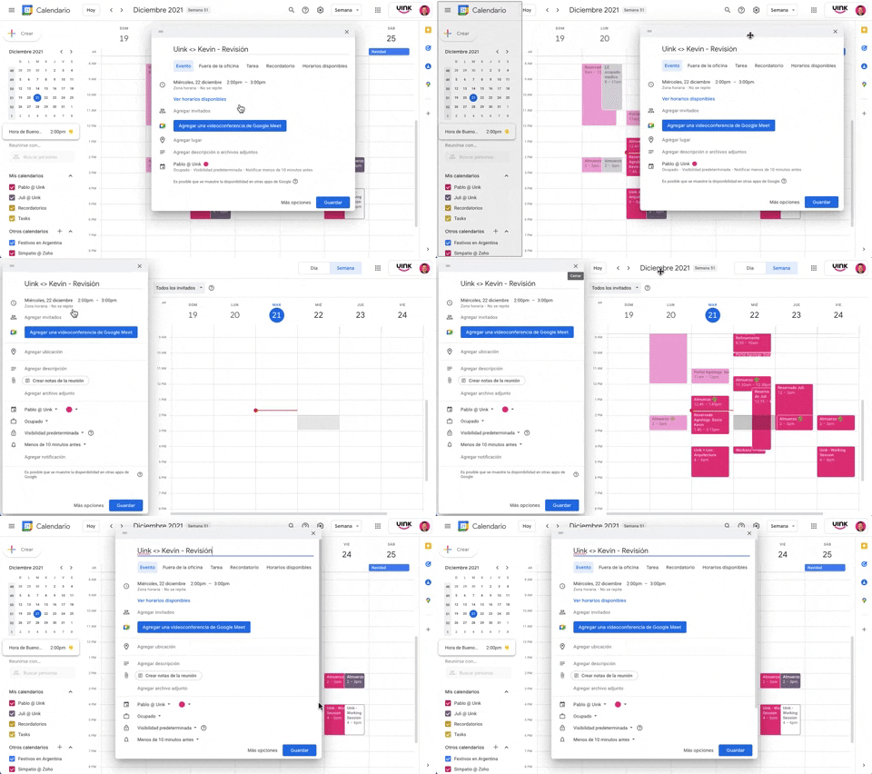
343. Modal/Dialog Drag & Drop to Fixed Position
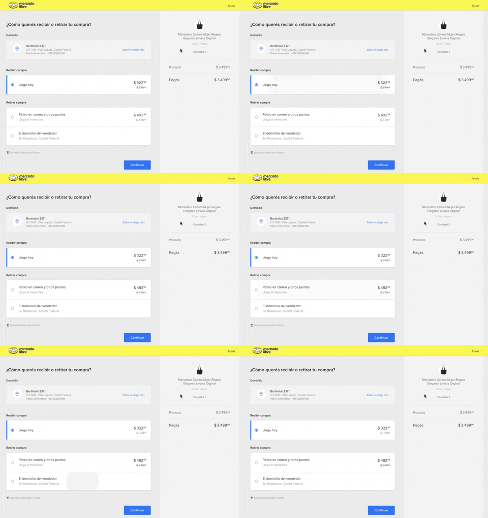
334. MercadoLibre - Call to Action Trigger Effect
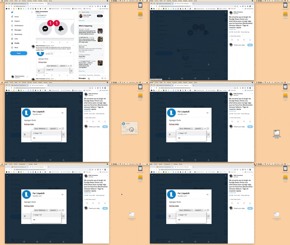
332. Drag & Drop to Create File from Web Image
Users can effortlessly create a new file on their desktop by dragging and dropping an image directly from a web browser.
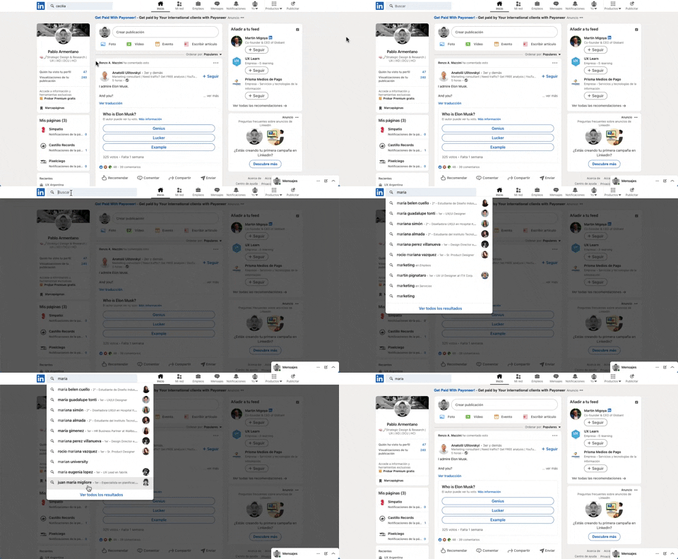
331. Linkedin - Search Bar Blackout
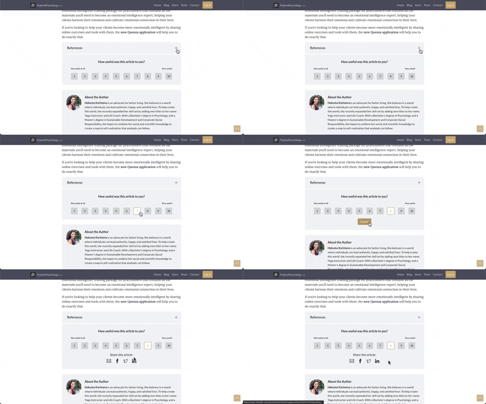
330. PositivePsychology - Article User Feedback

322. Search on Menu Items
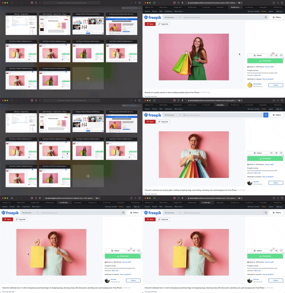
336. Transition: Zoom-In/Out for Browser Windows
This transition allows users to fluidly zoom between a grid of browser tab thumbnails and a full-screen view, enhancing navigation and context switching.
333. Static Tooltip with Steps
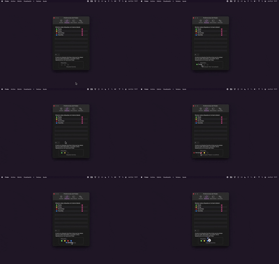
325. Drag & Drop Tag Colors to Slots
Users can intuitively assign color-coded tags to designated slots via drag-and-drop, enhancing organization and quick visual identification of items.
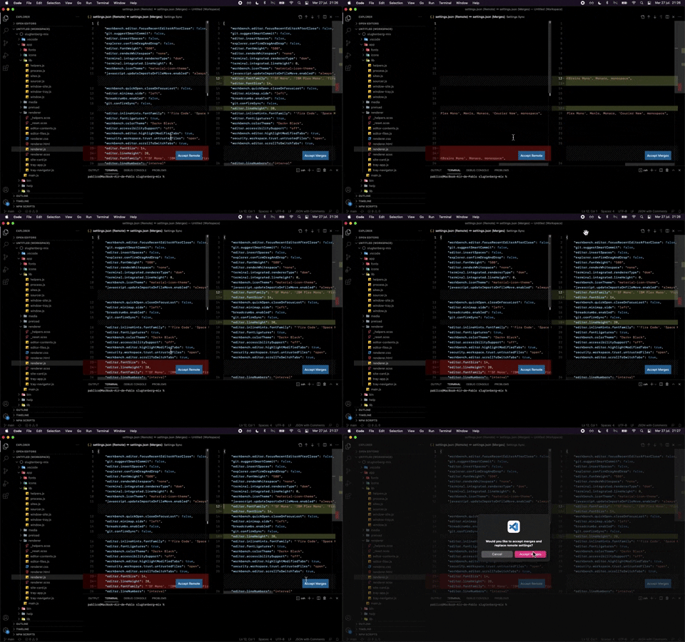
324. Visual Studio Code - Dual View Scroll Sync
329. Postman - Onboarding Tooltips

321. Caloriemama - App Hero Swiper
This hero swiper provides a quick overview of daily calorie metrics, allowing users to easily track their budget, consumption, exercise, and remaining calories.
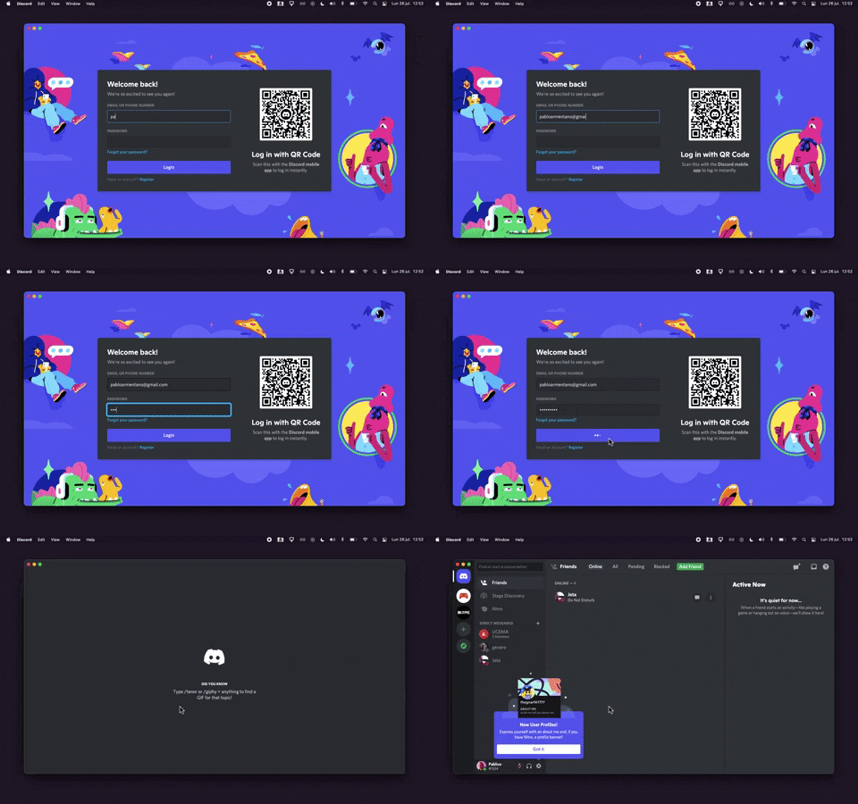
320. Discord - Sign In with Loading Tips
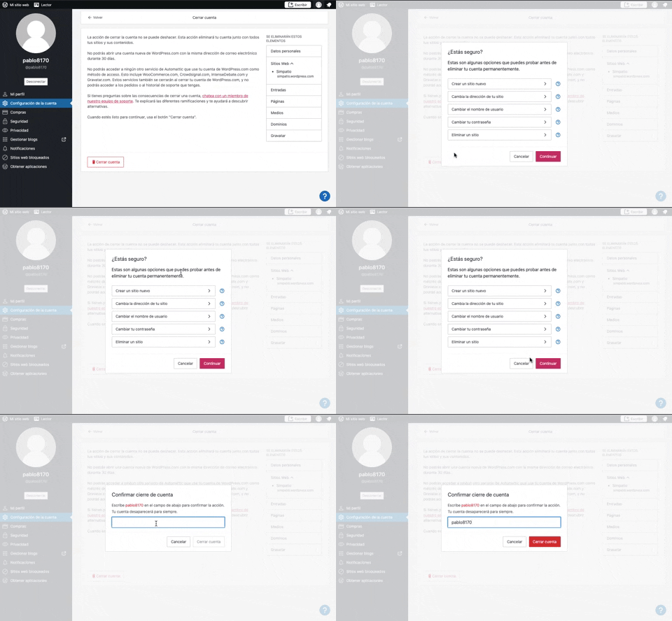
319. Modal Blackout w/ Multiple Choice
This pattern uses a modal blackout to confirm a user's intent to close an account, ensuring they understand the irreversible consequences before proceeding.
318. Binance - Tooltip on Features

317. Zoom In—Out Transition on Click
Users can tap a thumbnail to smoothly zoom into a full-screen view of the image, providing an immersive and focused viewing experience.
316. Apple - Tooltip on icon
315. Signal - PIN Reminder
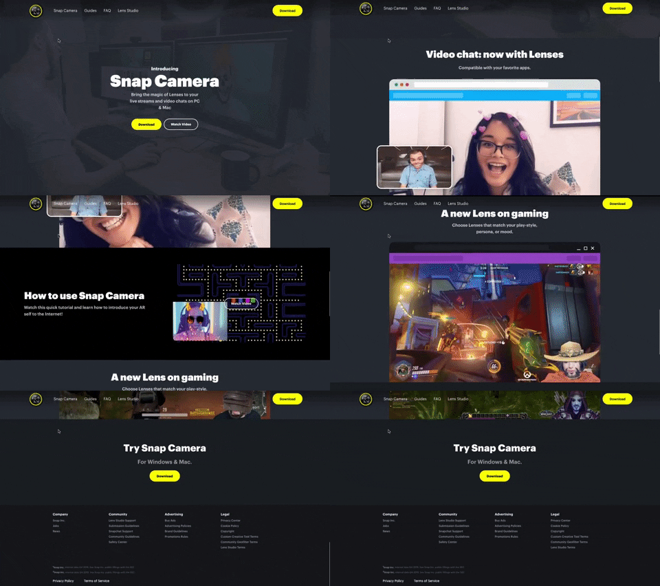
314. Snapchat - Snap Camera
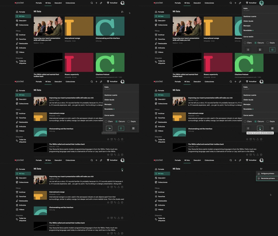
312. Pocket - View Switcher
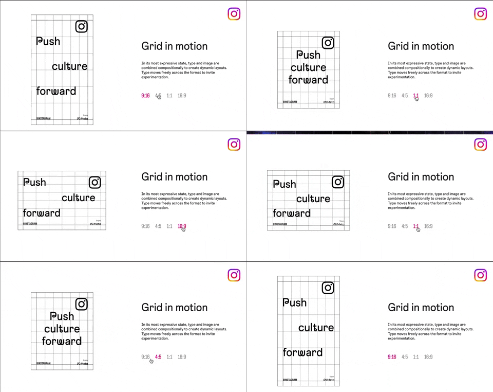
318. Instagram - Animated Illustration with Menu
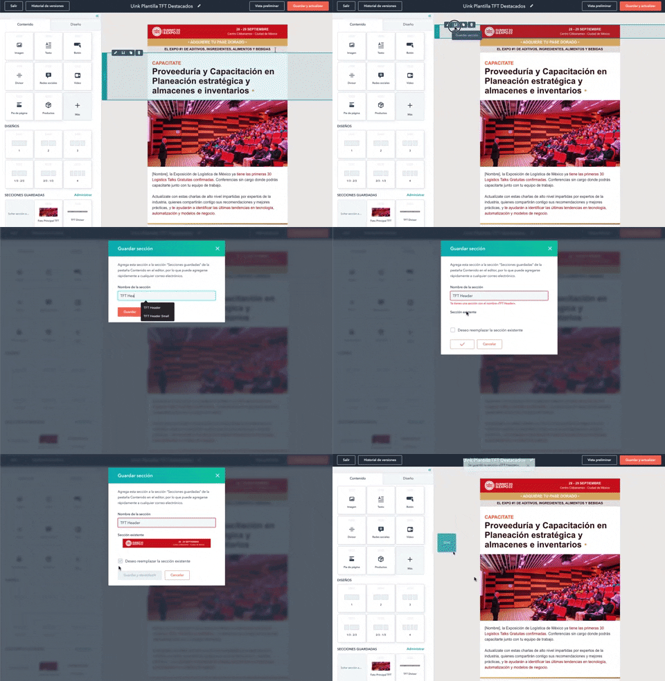
316. Modal Blackout for Delete Confirmation
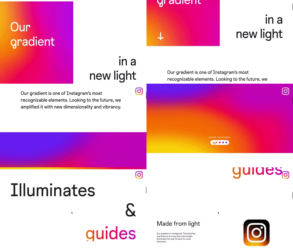
309. Instagram - Brand Gradient
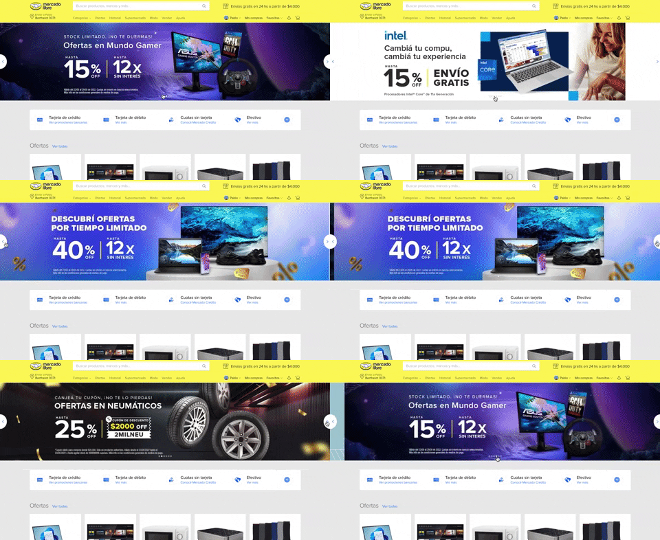
308. MercadoLibre - Hero Slider
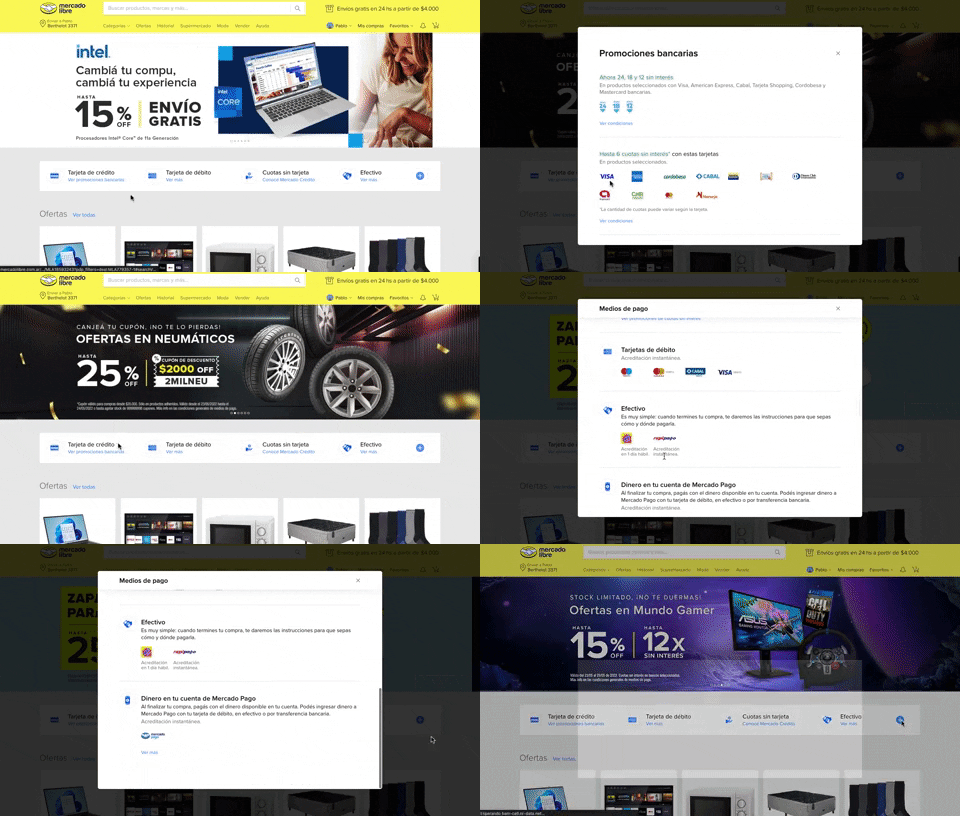
313. Modal Blackout w/ Scroll
This pattern displays a scrollable modal over a darkened background, allowing users to focus on its content while retaining context of the underlying page.
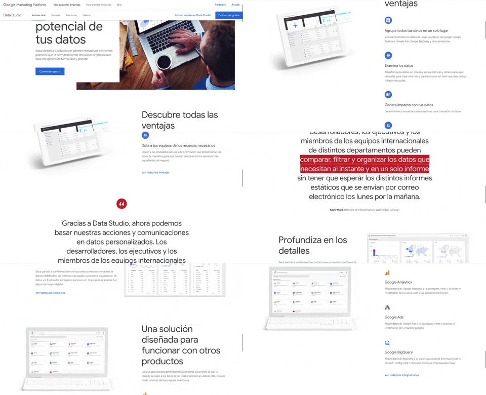
312. Google Data Studio
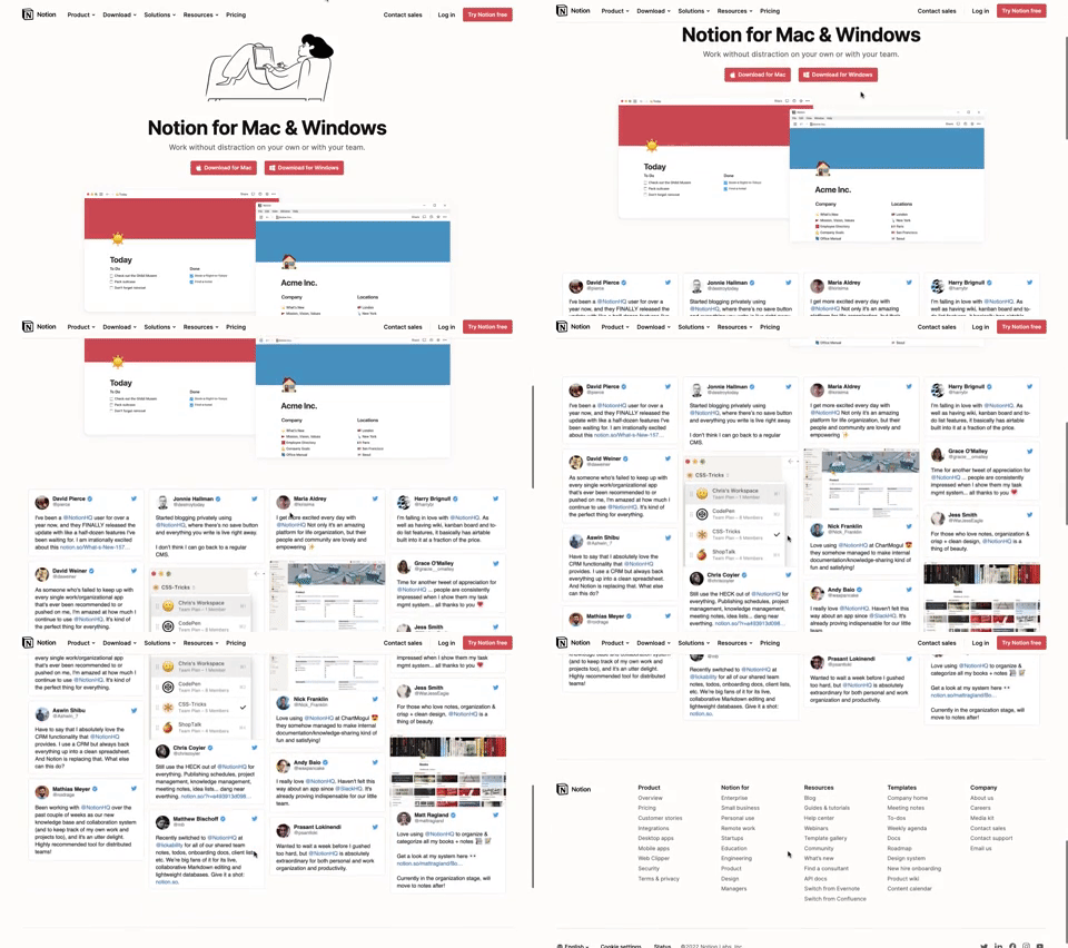
311. Landing Page for App Download
This landing page guides users to download the application for their specific operating system, simplifying the installation process.
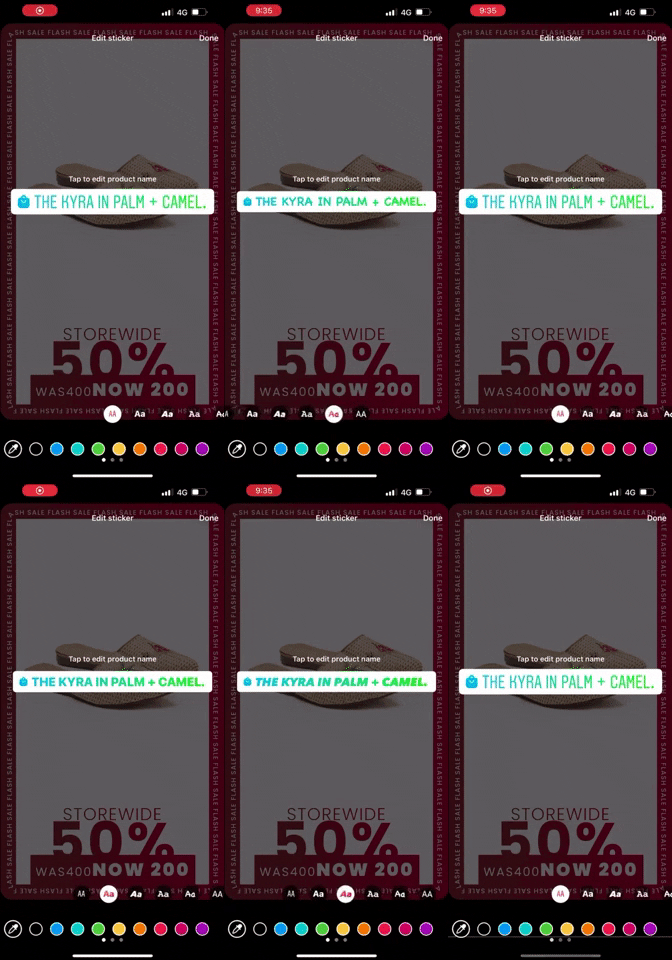
309. Horizontal Slider for Styles

308. Spinners for Module Loading

307. Tooltip on Hover
Hovering over a truncated title reveals its full text in a tooltip, providing complete context without cluttering the interface.
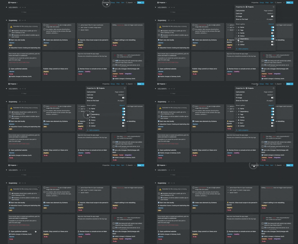
306. Drag & Drop for Reordering List Items (Mouse)
Users can intuitively reorder list items by dragging and dropping them, providing a direct and efficient way to customize their view.
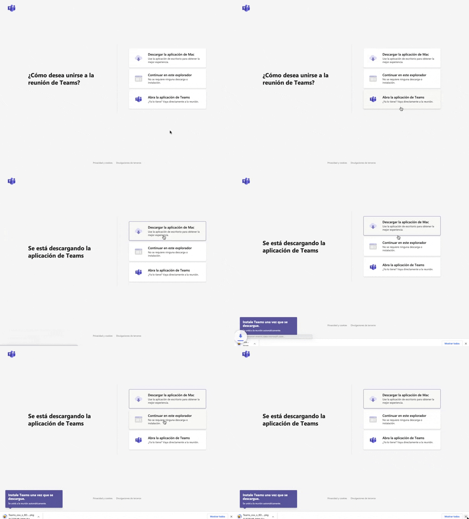
305. Button Combo for App Download
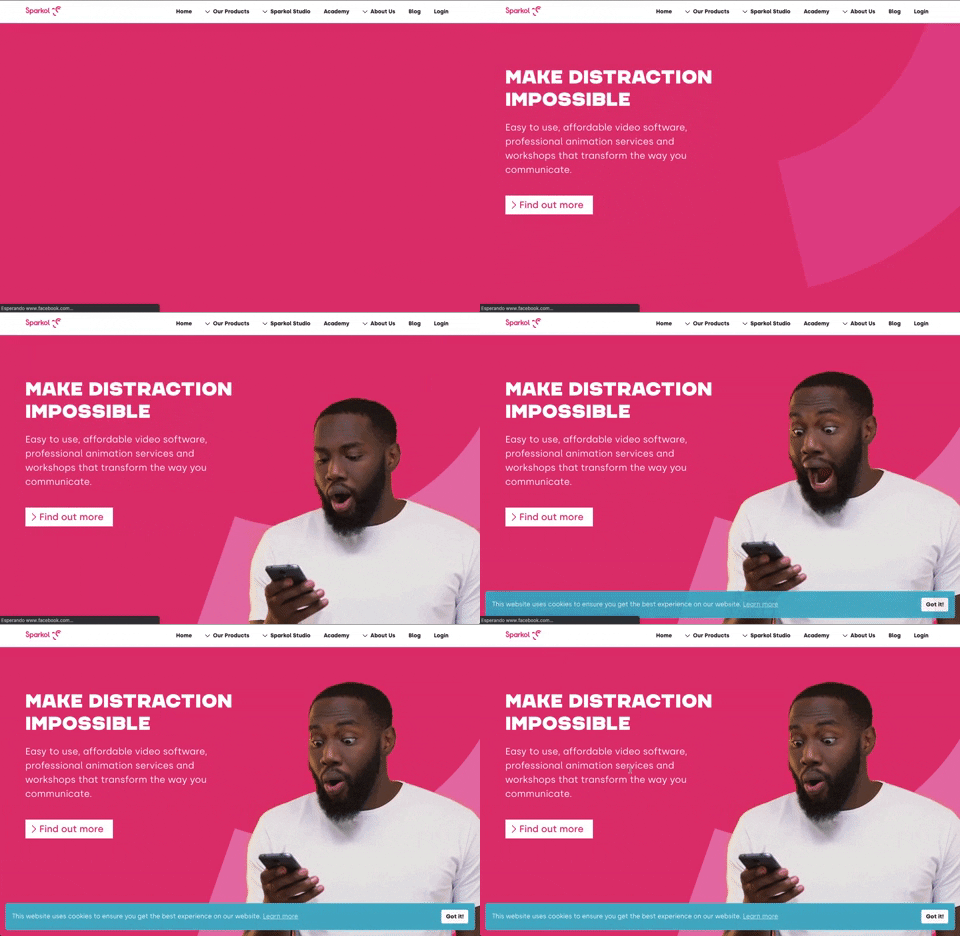
303. Background Animation (on Load)
A dynamic background animation on page load engages users immediately, providing visual interest and a sense of activity while content renders.
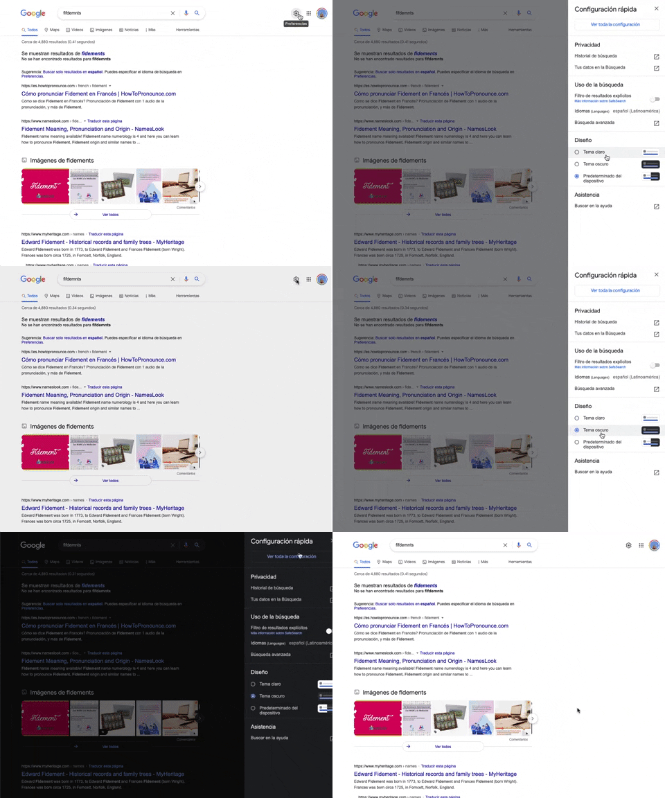
302. Theme Switcher in Side-drawer
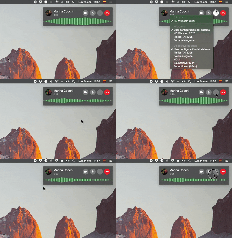
300. Sound Bars Graph
299. Fixed Corner Popup with Steps
298. Avatar Sync with NFT
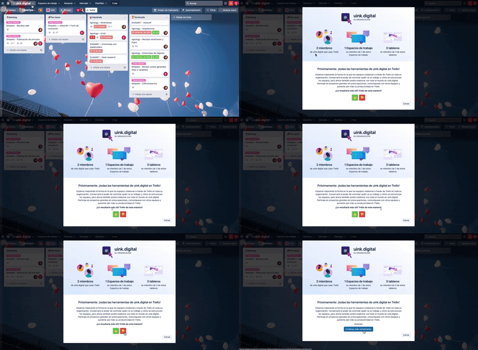
297. Thumbs Up/Down
_00.42.51.png?table=block&id=0252c6ff-06c8-496f-88d6-e8f876a3af4d&cache=v2&width=760&quality=80)
295. “NEW” Badge on Menu Items

294. Full-Screen Steps Animated Transition
Users navigate a multi-step onboarding flow with smooth, full-screen animated transitions, enhancing engagement and clearly indicating progress through each stage.
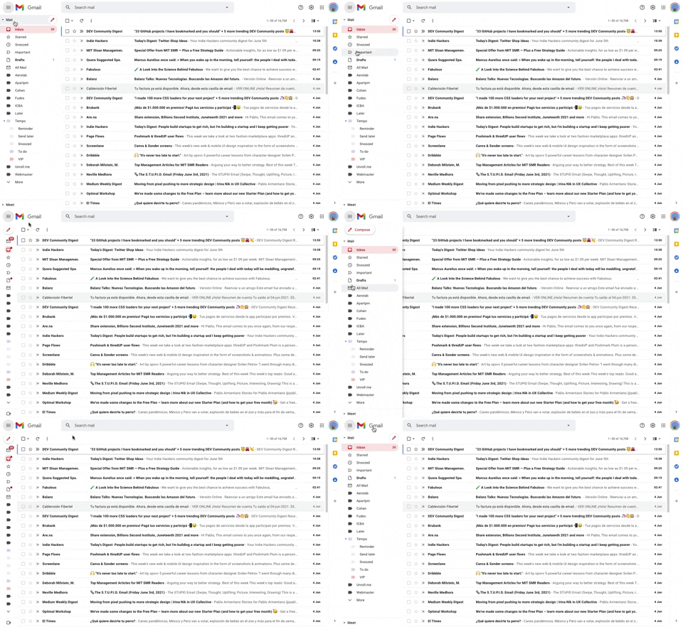
293. Collapsable Sidebar Menu
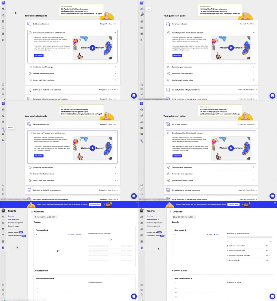
292. Vertical Icon Menu
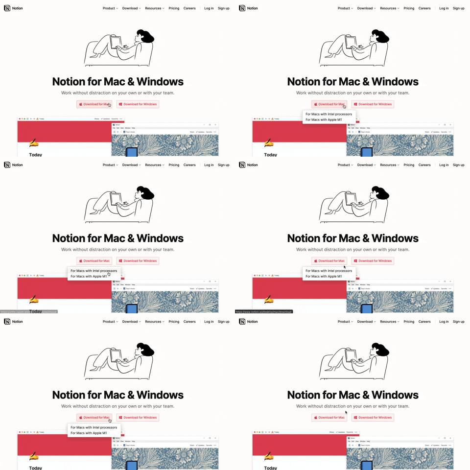
291. Action Menu from Button
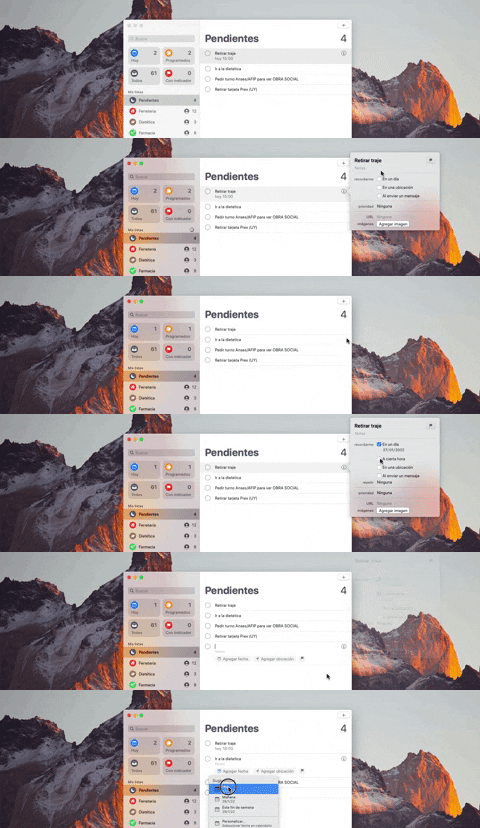
290. Floating Popover on Click
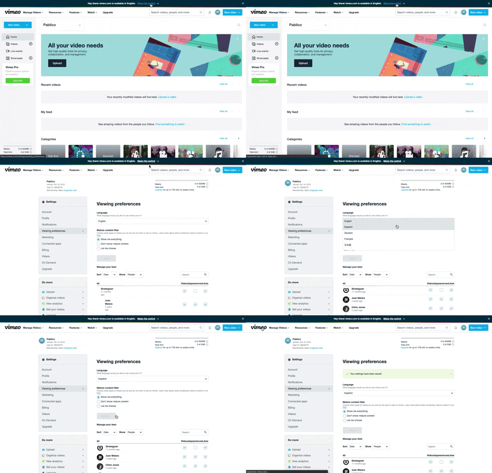
288. Vimeo - Topbar Language Switching

286. Background Animation on Scroll
This pattern uses a fixed background image that animates and shifts as the user scrolls, creating a dynamic and engaging visual experience.
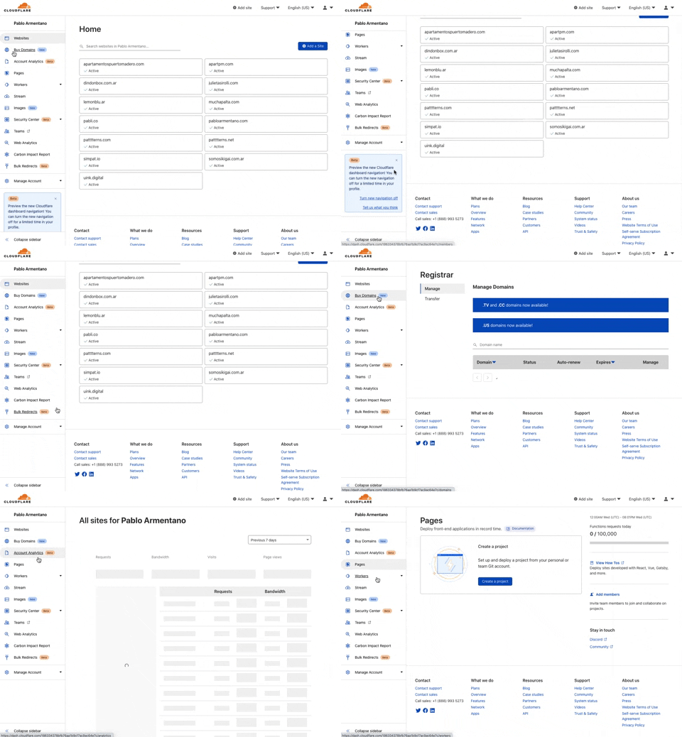
285. Cloudflare - Sidebar with Scroll
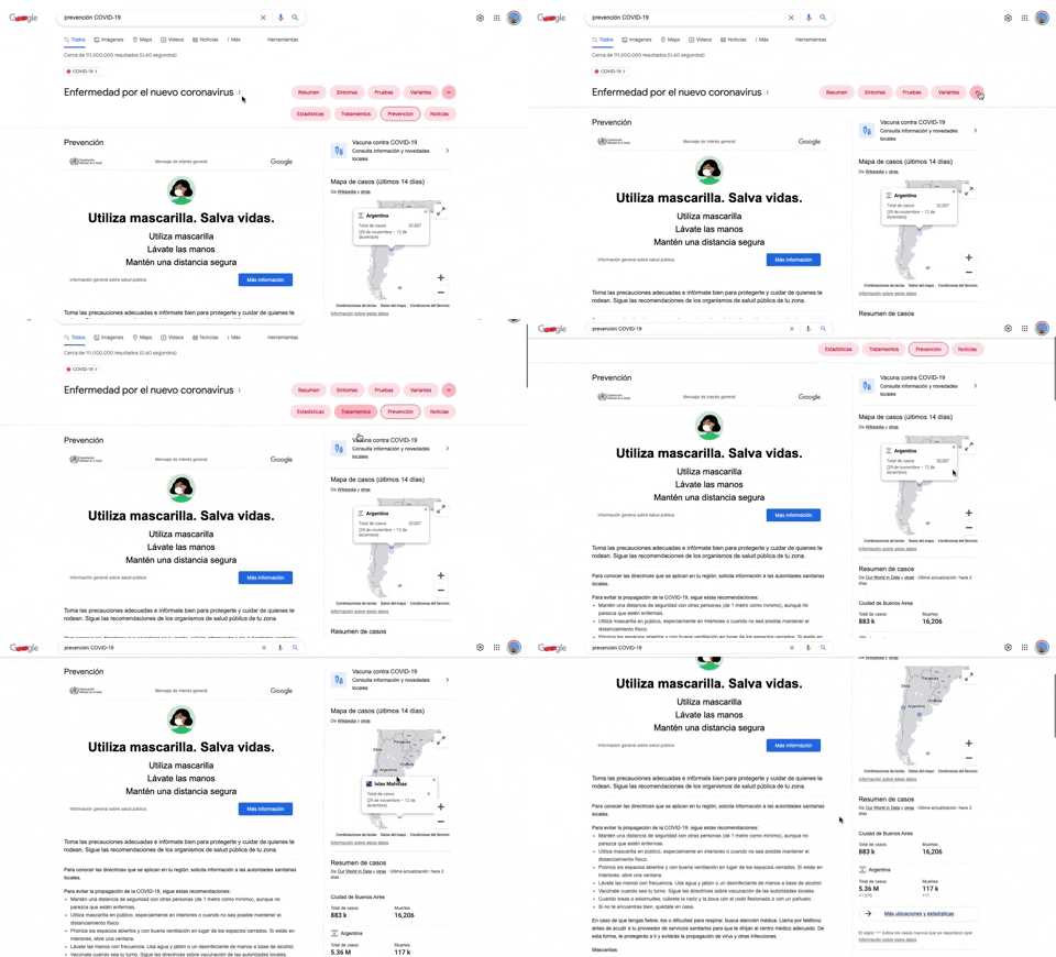
284. Emergency Information Map
284. Top Tooltip on Link Hover
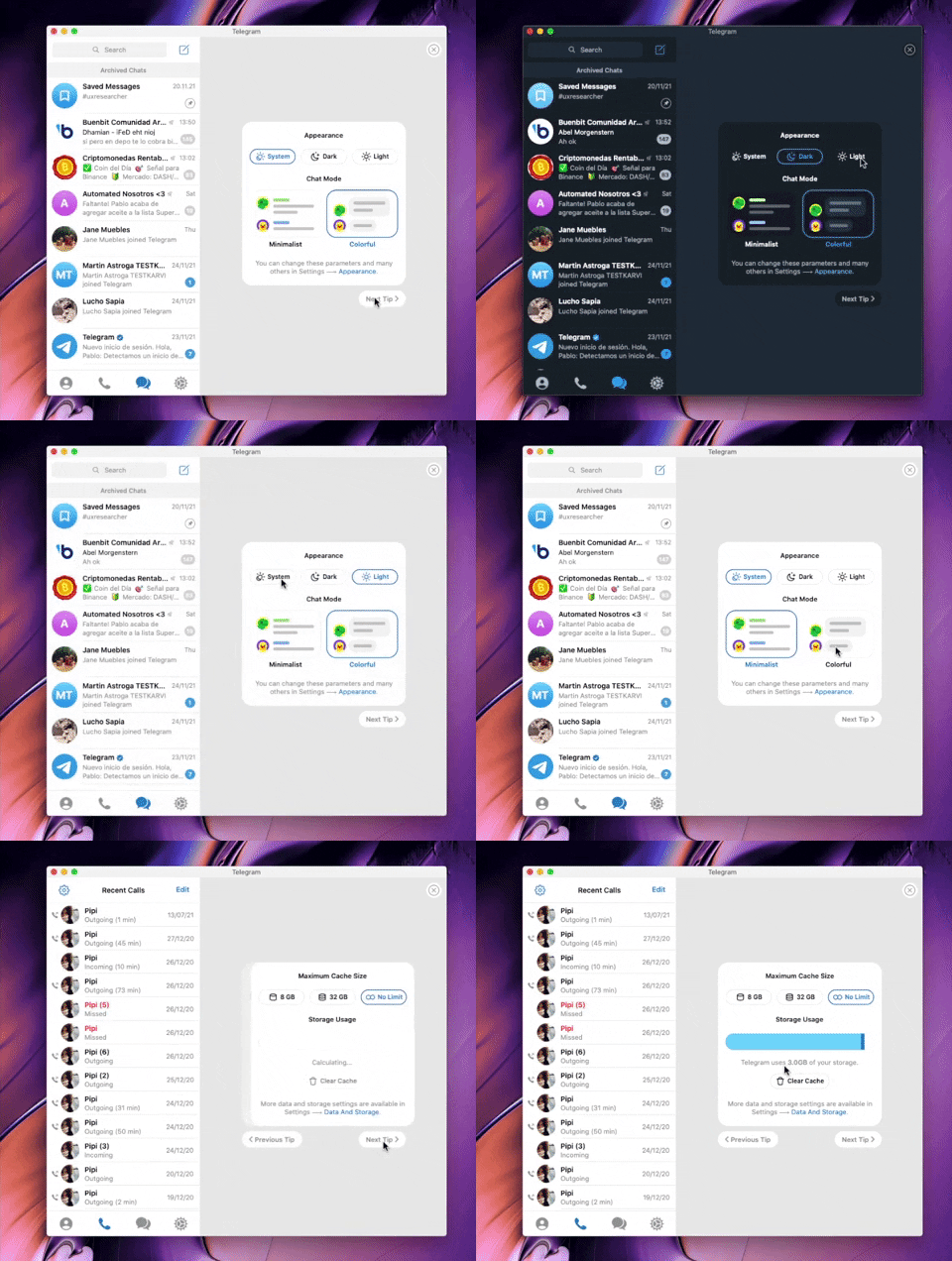
282. Telegram - Chat Setup Wizard
This wizard guides users through initial setup choices like appearance and chat mode, ensuring a personalized experience from the start.
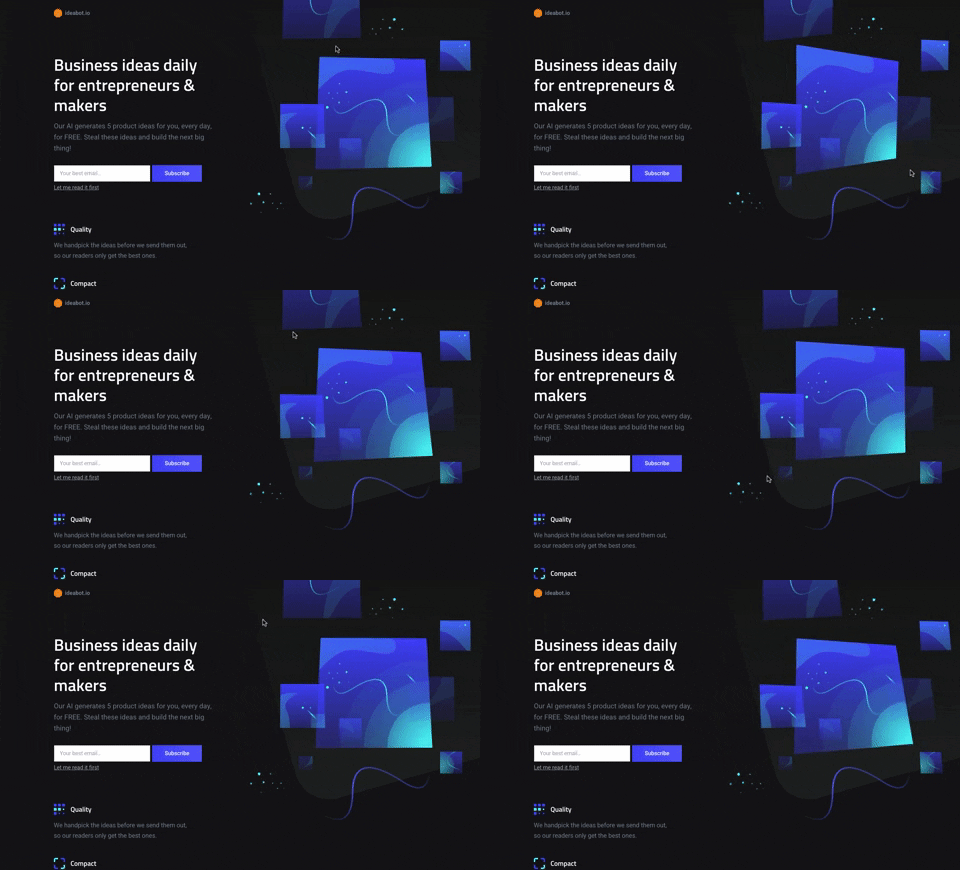
281. Background Animation (on Mouse Move)
This pattern uses subtle background animations that react to mouse movement, creating an engaging and dynamic visual experience for users.

280. Slack - Workspace Creation Wizard

279. Collapsable Layout Sidebars
Users can collapse and expand layout sidebars to optimize screen space, enhancing focus on primary content while maintaining quick access to navigation.

278. Search Menu Dropdown from Input Text
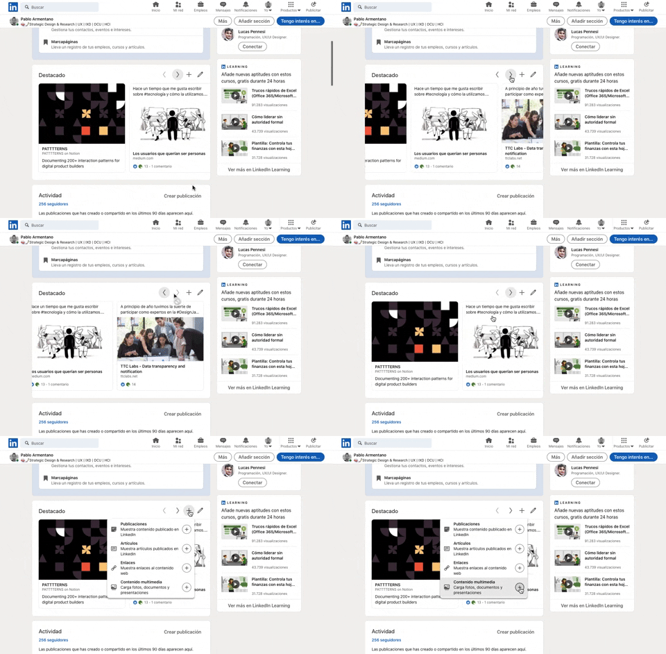
277. Horizontal Card Slider with Actions

268. Drag & Drop to Upload File
Users can effortlessly upload files by dragging them from their desktop directly into a designated drop zone within the application.
_07.10.33_p._m..png?table=block&id=1b4e4bae-3d76-8055-baf9-d28c23cd351f&cache=v2&width=760&quality=80)
275. Popover on Hover

274. Interactive Background Animation
This pattern uses an interactive background animation to engage users and provide visual feedback as they navigate or interact with elements on the page.
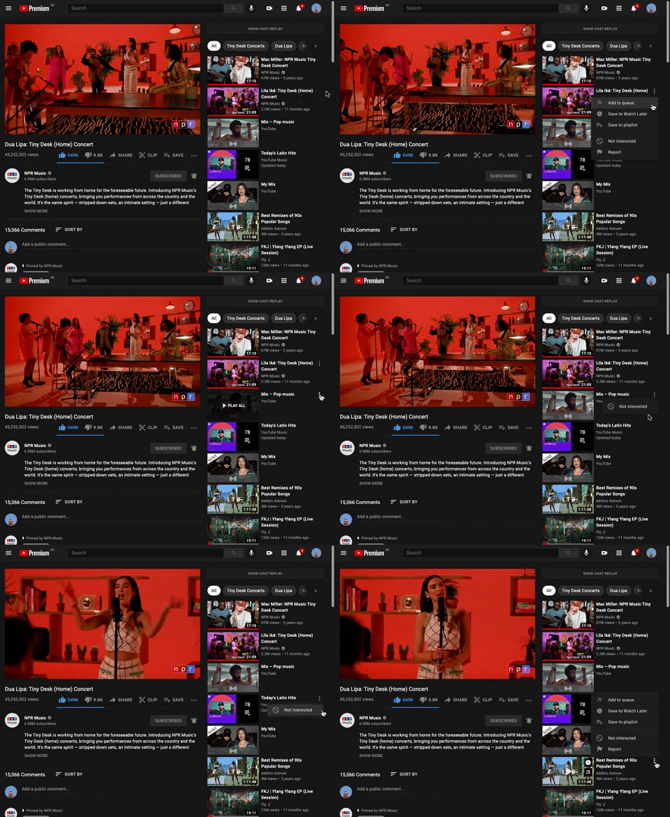
265. Youtube - Hidden Options Menu (Dots)
264. Interactive Background Animation
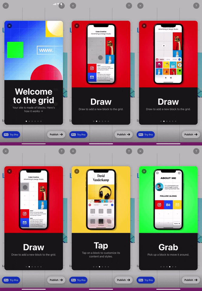
268. Modal Blackout w/ Swiper
This pattern guides users through an onboarding flow with a fullscreen modal and swipable content, ensuring focused attention on key information.
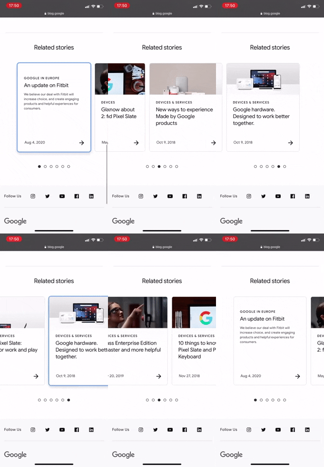
267. Google - Horizontal Card Slider
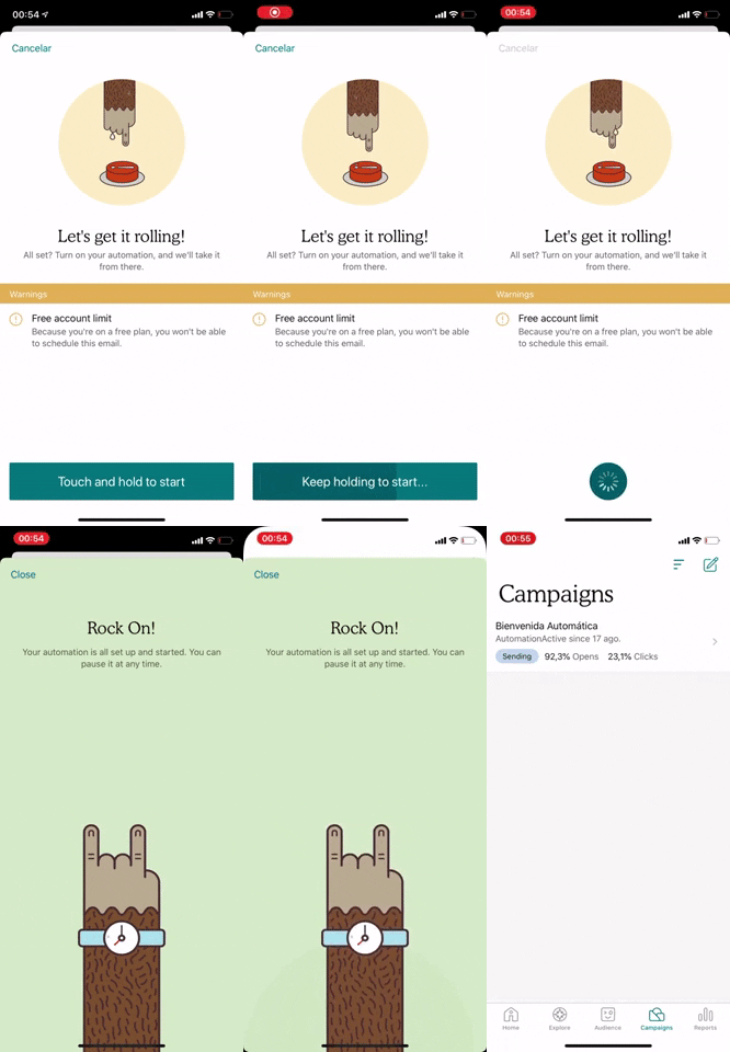
266. Mailchimp - Hold Button for Confirmation
Users confirm a critical action by holding a button, preventing accidental taps and ensuring deliberate engagement with the system.
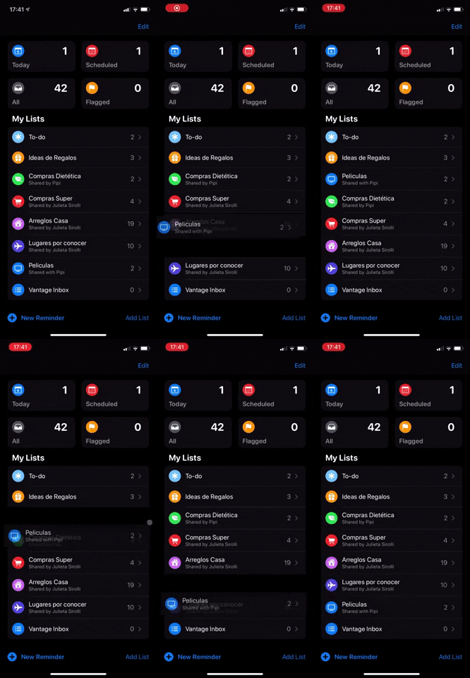
263. Drag & Drop to Reorder List Items (Touch)
Users can intuitively reorder list items on touch devices by dragging and dropping them, providing flexible organization and personalized views.
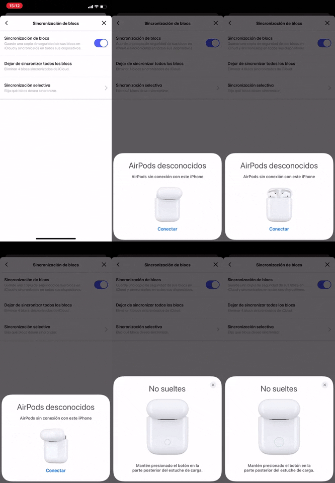
262. Bottom Fixed Modal Blackout
This pattern presents critical information or actions in a bottom-fixed modal, ensuring user focus by dimming the background content.
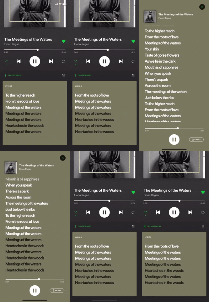
257. Transition: Zoom-In to Full Screen (on Click)
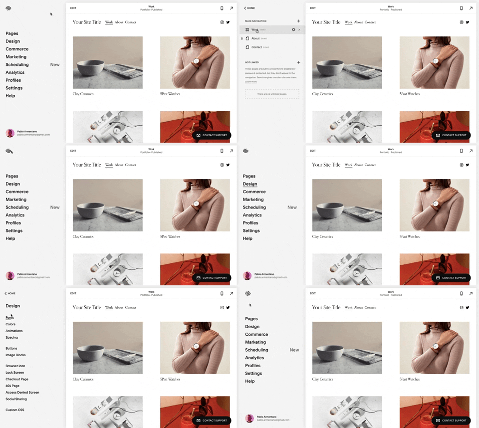
259. Multi-depth Sidebar Navigation
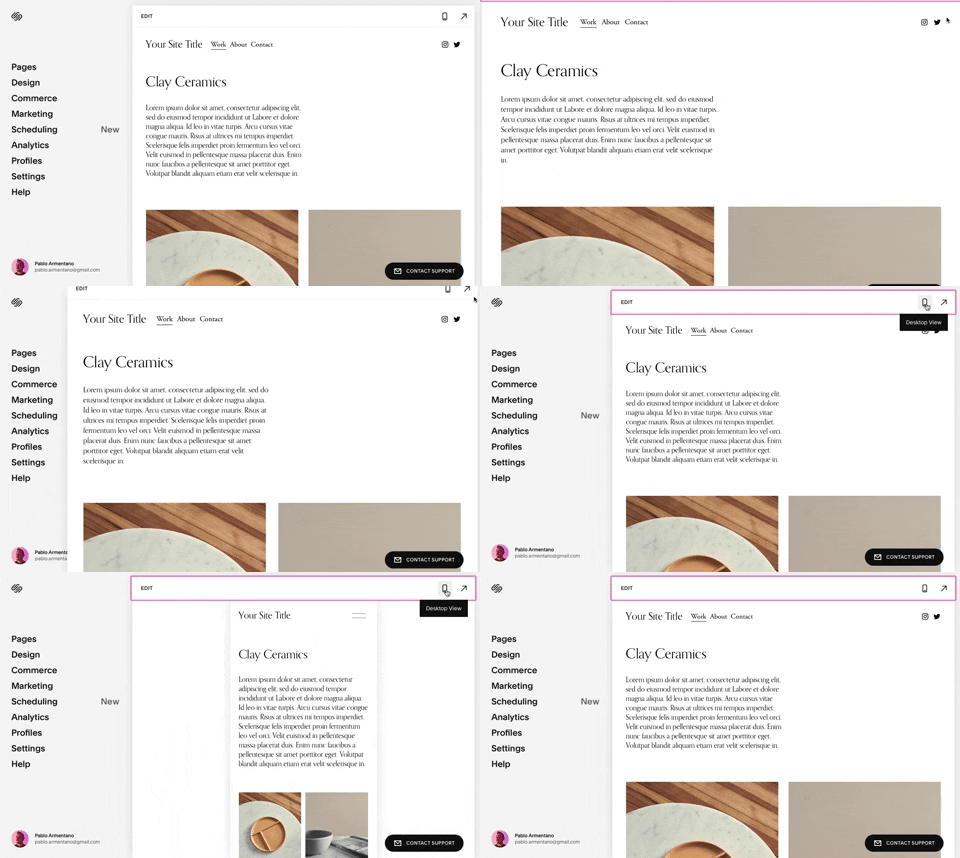
258. Squarespace - Adaptable Viewport Size
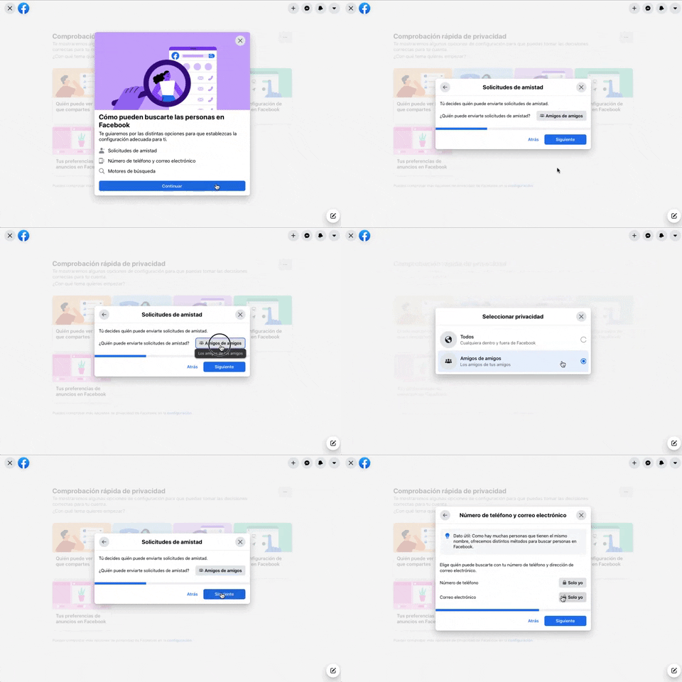
256. Modal Blackout w/ Forms & Steps
This modal blackout pattern guides users through multi-step forms, ensuring focused input and clear progression for critical decisions.
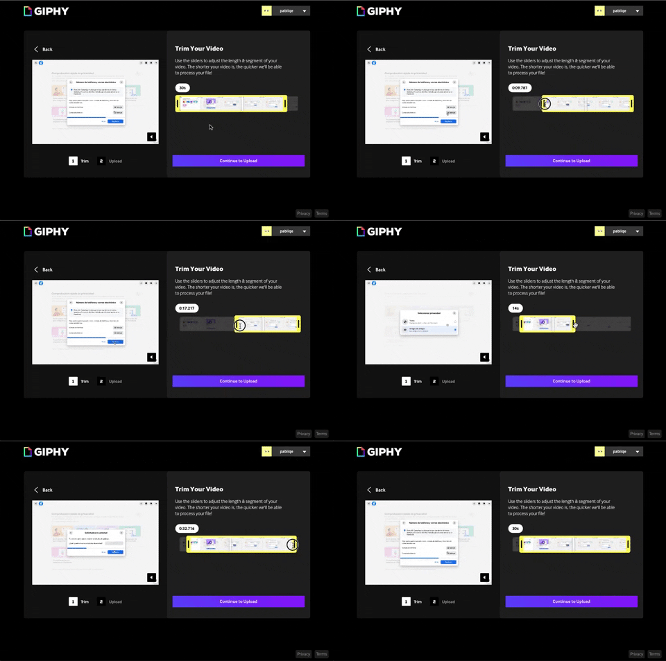
243. Trim Video Slicer

254. Toggle/Hide Sidebar Menu (Mouse)
Users can toggle the sidebar menu to hide or reveal navigation, optimizing screen space for content focus or quick pathfinding.
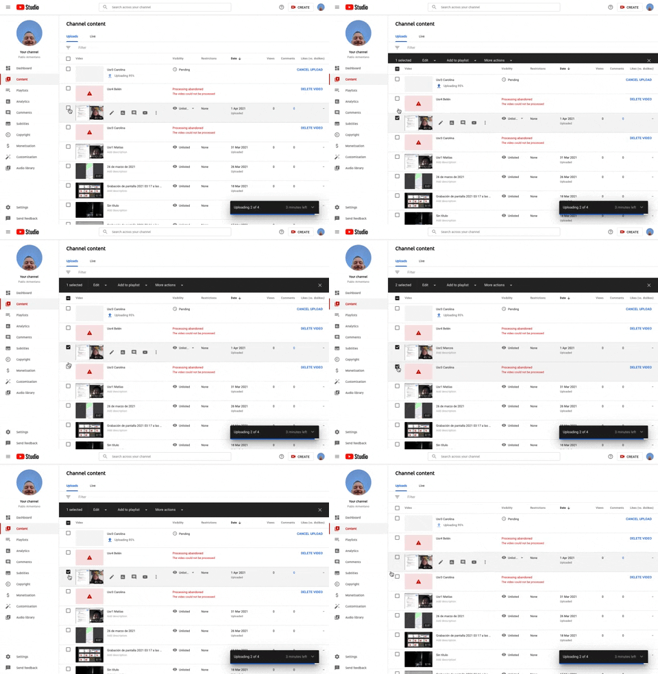
253. Youtube - Table Row Selector
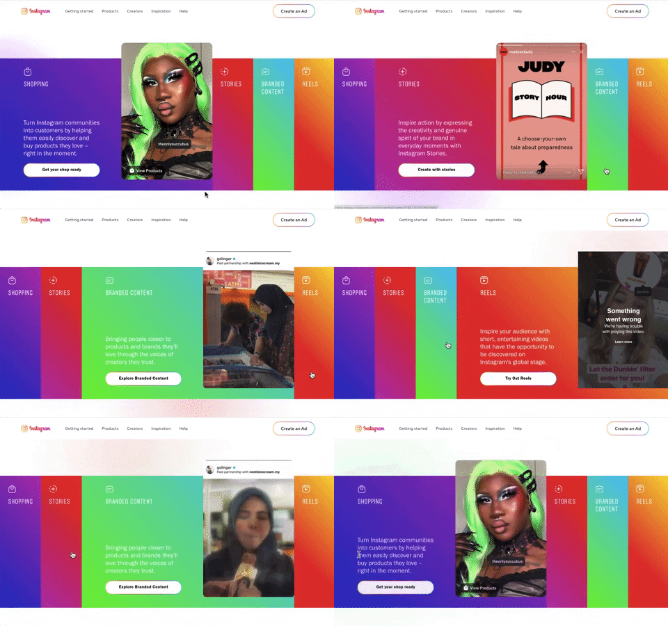
240. Instagram - Horizontal Accordion
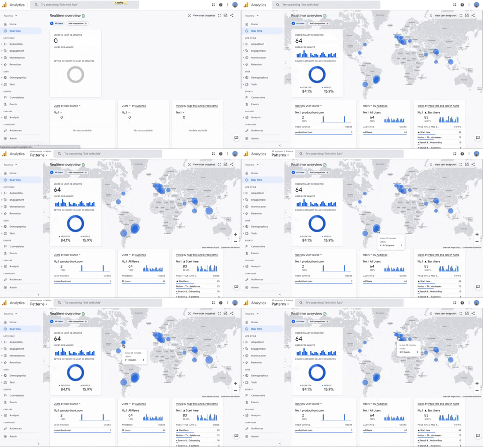
251. Progressive Layout Loader
This pattern provides immediate visual feedback during page loads, progressively revealing content to reassure users that the system is actively processing their request.
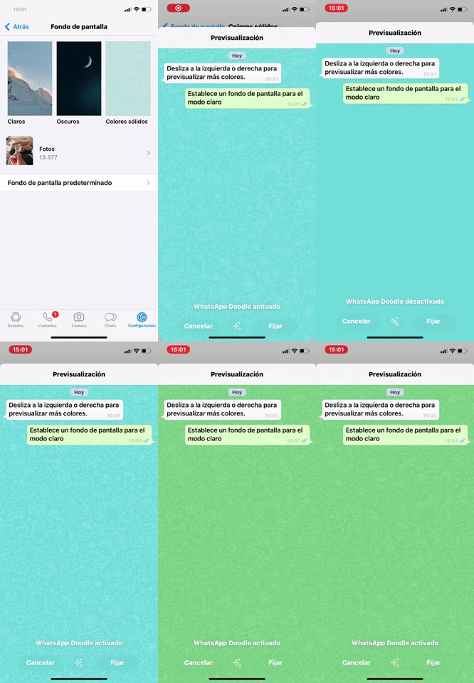
238. WhatsApp - Color Switcher Preview
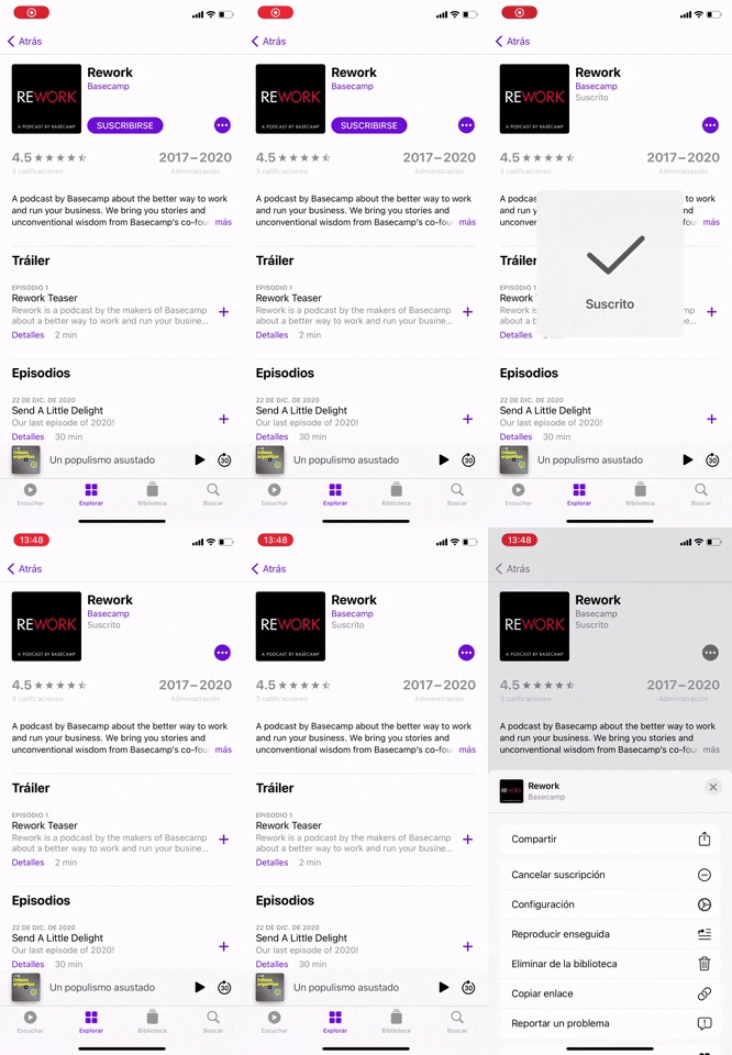
237. Apple - Snackbar Popup Animation
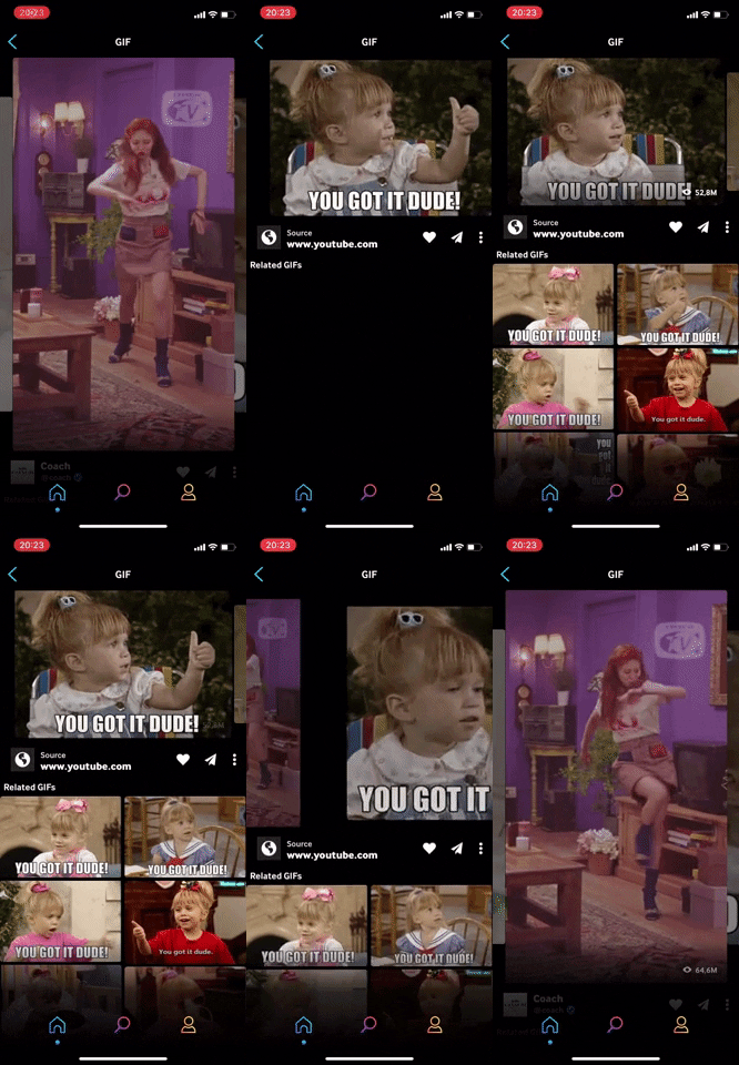
236. Horizontal Swiper Navigation
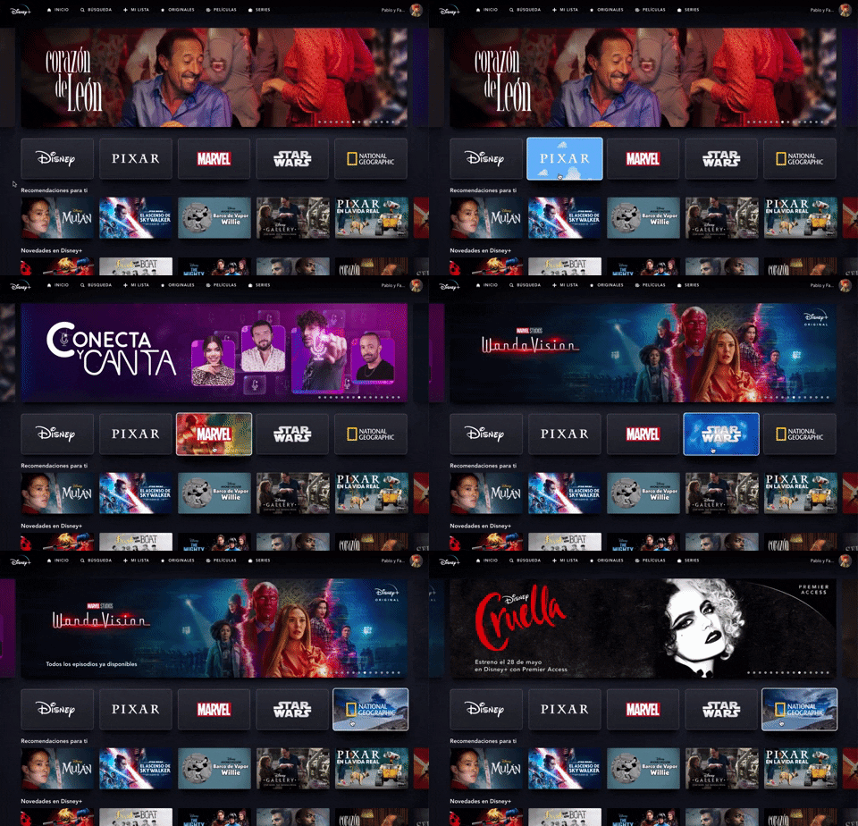
235. Background Animation (on Mouse Hover)
This pattern uses a subtle background animation on hover to provide visual feedback, guiding users to interactive elements and enhancing discoverability.
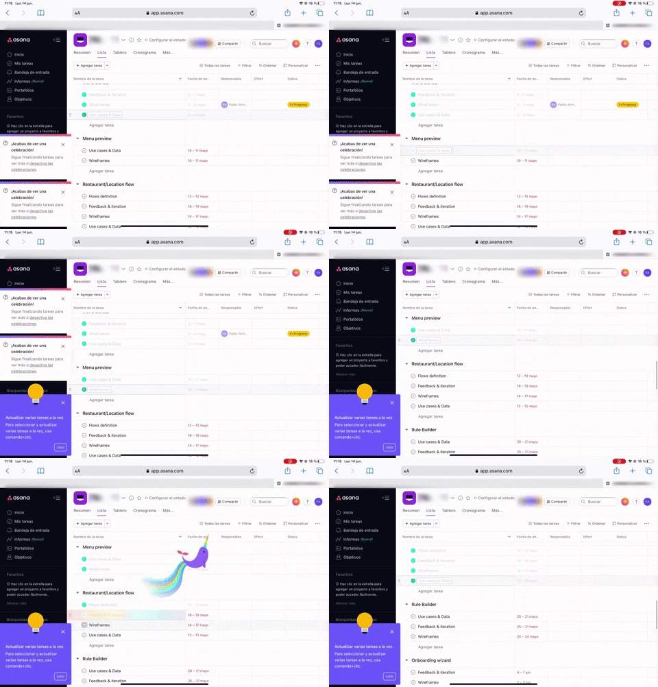
233. Floating Animation
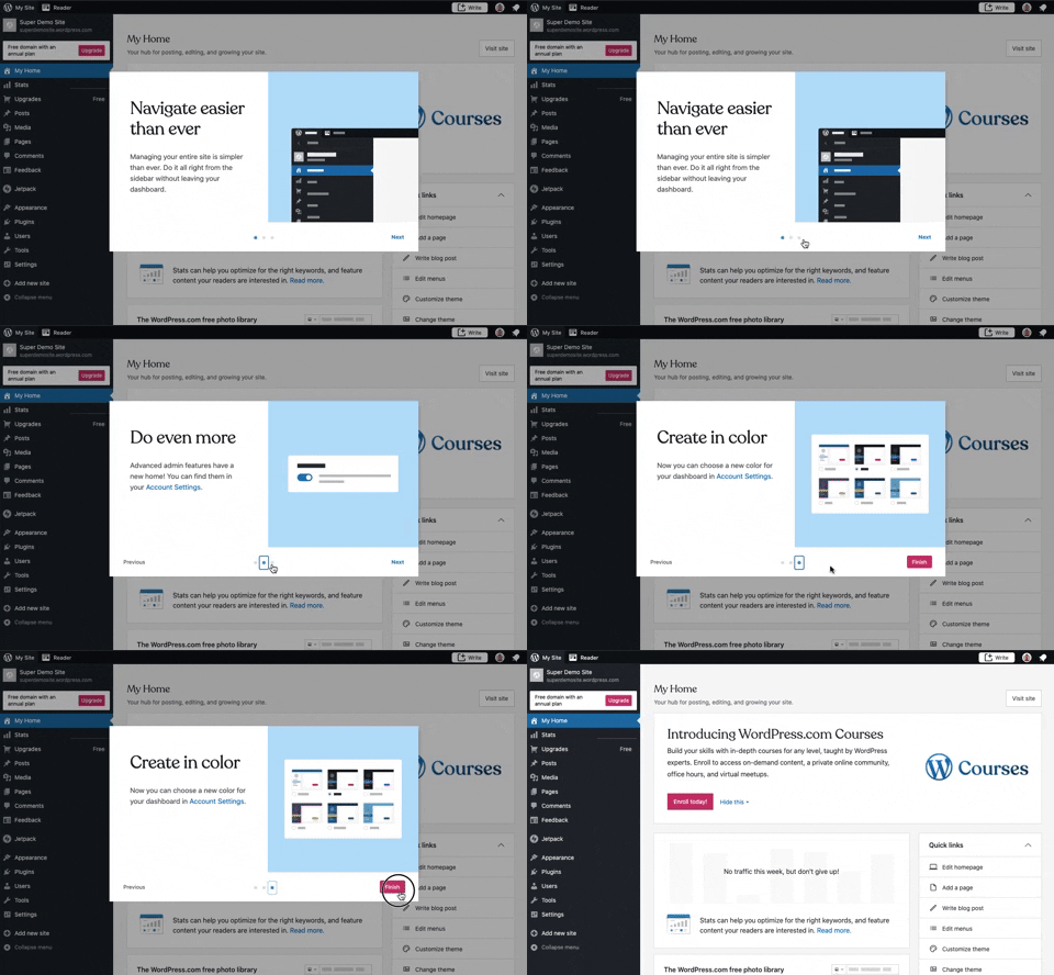
241. Modal Blackout w/ Steps
This multi-step modal guides users through key features with clear explanations and visual cues, ensuring a smooth onboarding experience.
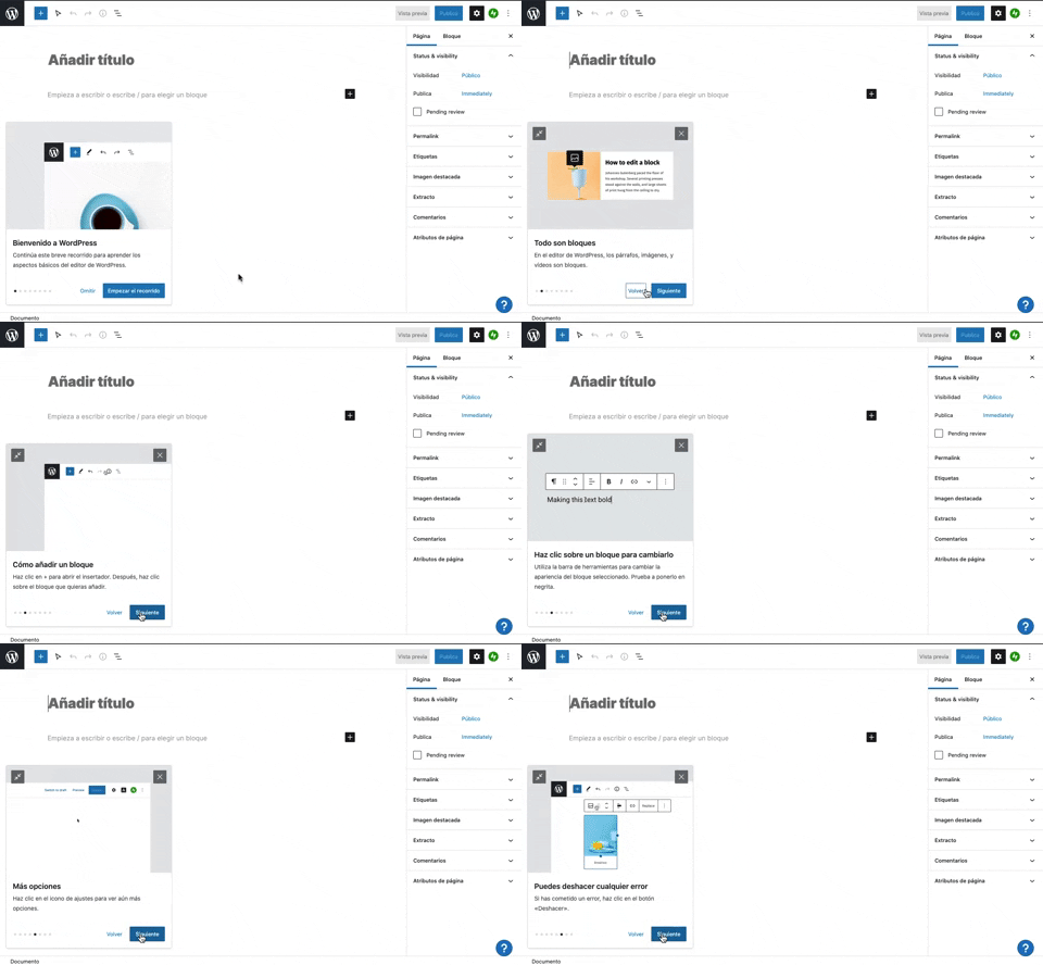
231. Floating Dialog Popover w/ Steps
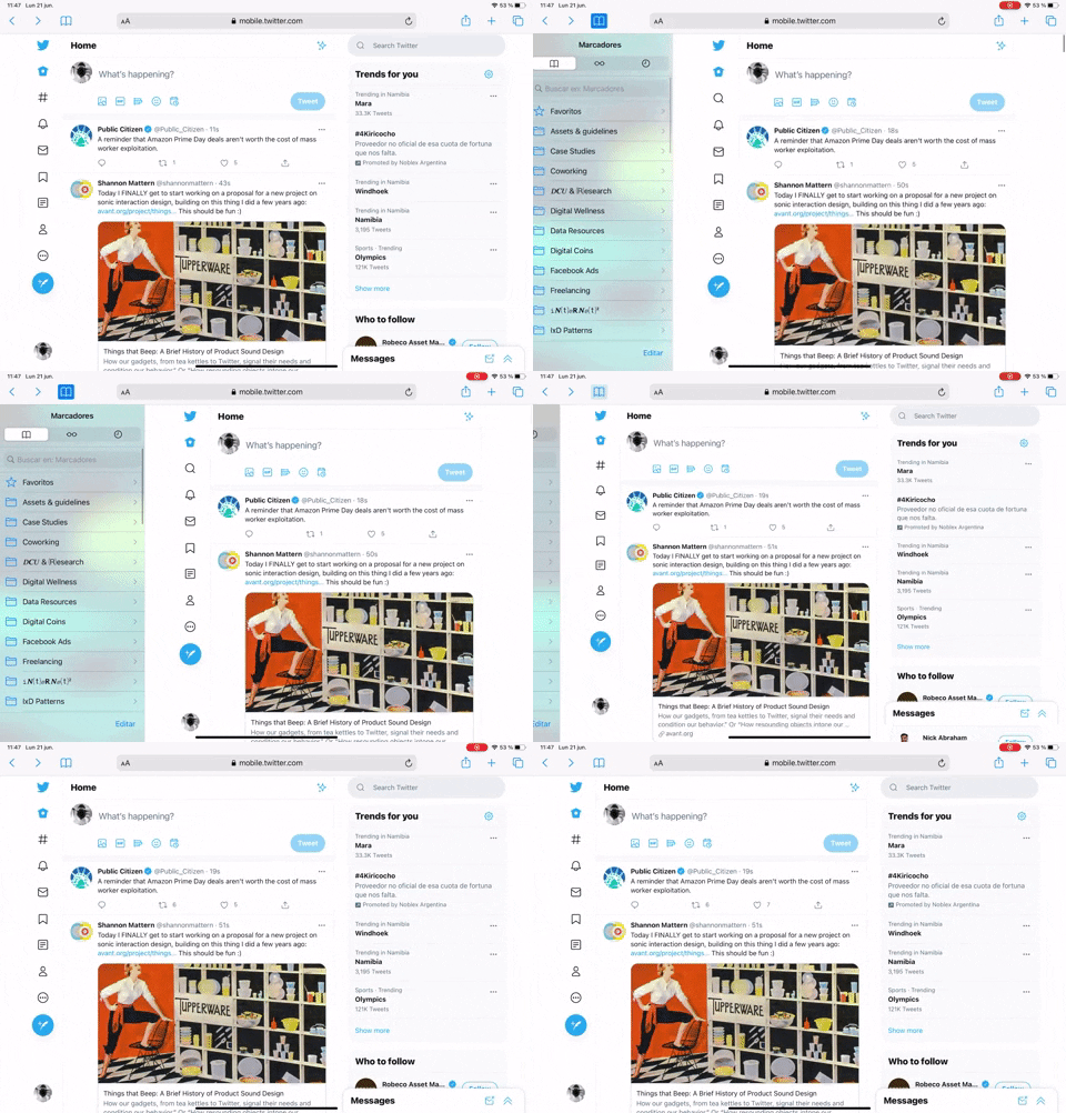
239. Secondary Sidebar Toggle (Touch)
Users can tap a persistent icon to reveal or hide a secondary sidebar, optimizing screen real estate while maintaining quick access to additional content.
229. Top Banner for Design Changes
228. Notification Bell Status
236. Horizontal Graph with Time Ranges
226. Youtube Studio - Image Multi-zone Crop
225. Cloudflare - Multiple Graphs by Time Ranges
232. Drag & Drop to Browser
223. Stop Operation Progress
222. Cloudflare - Toggle Light/Dark Theme
221. Apple - Image Grid Spacing
228. Open in New Window (Doble Click)
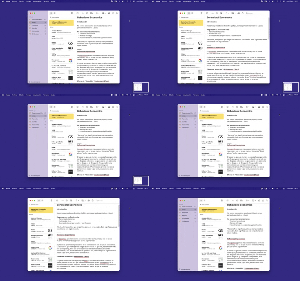
227. Secondary Sidebar Toggle (Mouse)
Users can toggle a secondary sidebar to reveal or hide contextual information, optimizing screen real estate and focus on primary content.
218. Apple Keynote - Template Format Selection
217. Apple - Cropping multiple screens
222. Floating Banner on User Input
221. Stacked Action Button
214. Netflix - Information Toggle
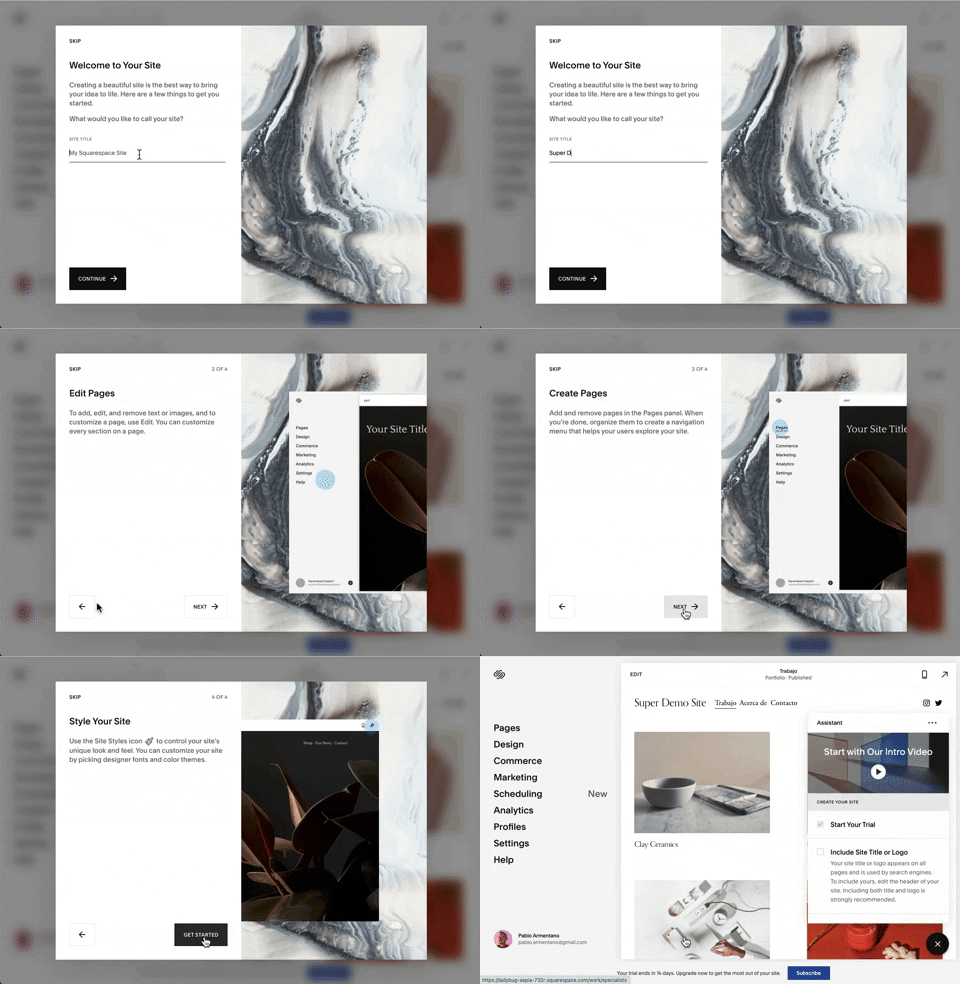
218. Modal Blackout w/ Steps, Forms and Animations
This multi-step modal guides users through an onboarding process with clear form inputs and animated transitions, ensuring focused completion of initial setup tasks.
217. Vertical Icon Menu (duplicated)
212. Automatic Background Animation (on Load)
45. Webapp Video Loader
203. Two-step Download Flow
59. Ecommerce App Homepage (5)
205. Full Screen Widget Customization
162. Login Value Compare
207. Downloading Desktop App
169. Youtube Studio - Delete Content Forever
121. 2-pane Audio Navigation
172. PedidosYa - Search Results Recommendation
52. Uber EATS - Making a Food Order
31. Page Blocker Edition Warning
5. Website Promotional Top Banners
53. Apple Safari - Editing Bookmarks
189. Feature Preview on Menu
190. Delete Confirmation w/ Name (moved)
175. Tab Preview on Hover State
161. Apple - Two-Factor Validation (2FA)
91. Settings for Account Privacy
138. Read Modes
_18.38.50.png?table=block&id=c651e204-8edb-4bd8-96cb-760d7955b0bd&spaceId=56bb3260-a2ab-4c9f-b532-f274a860c9bc&expirationTimestamp=1780308000000&signature=9L4w9lIi4hBJA4dt5Nx-spOIBNPb9sMraqHPt9H9K3I)
148. Search Bar Fade-out
This pattern allows users to quickly search their content with a prominent search bar that reveals recent searches and relevant suggestions upon interaction.
134. Save for Reading Later

43. File Upload Status
This pattern provides real-time feedback on file upload progress and status, allowing users to monitor, manage, and resolve potential issues efficiently.

199. Sidebar Emptystate
This sidebar empty state introduces new features with a clear illustration and call to action, guiding users to discover and adopt new functionalities.
54. Apple Safari - Browser Reader Mode

201. Modal Blackout w/ Actions
This modal blackout pattern informs users about enhanced ad privacy, offering clear choices to manage settings or accept changes with distinct action buttons.
189. Illustration (Meme) on Empty State
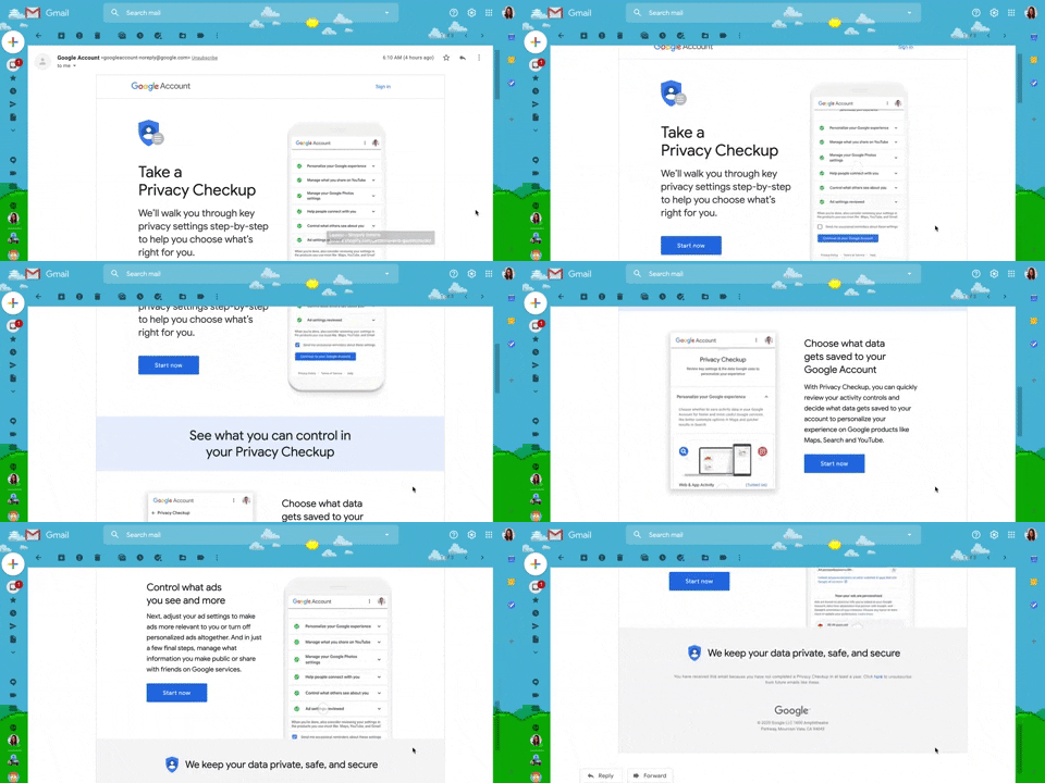
130. Animated Email Page
This pattern uses subtle animations within an email to guide users through a privacy checkup, enhancing engagement and clarity for important account actions.

114. News Swiper
This pattern allows users to effortlessly browse a carousel of news or definition cards, providing quick access to multiple content pieces with clear navigation.
151. Menu Drop-down
144. Meeting Guest Warning

93. Top Secondary Banner
This banner provides timely, relevant information and a clear call to action, ensuring users are aware of important updates or opportunities.
137. Product Color Selector
132. Amazon - Store Tooltip Reminders
181. Plan Upgrade Flow
106. In-App Promotional Banner
111. Magazine Subscription
7. sitepoint - Accessibility Adjustments
163. Open App from Web
164. Static Tooltip on Menu
A static tooltip on a menu provides immediate, contextual information for menu items. It typically appears on hover or focus, enhancing user understanding of an item's function or details without requiring an explicit click.
191. Viedo Rewind & Forward
42. Browser Status Banner for Pages
157. Webflow - Magnifying Glass on Images
65. PedidosYa - Location Confirmation
169. Download & Confirmation Buttons
198. Take action on Music Claims
89. Bottom Page Fake-News Warning
61. Section Dropdown
150. Split OS Screens

90. In-product Top Primary Banner
This banner provides critical, timely information to users at the top of the page, ensuring high visibility for important updates or alerts.
70. Trip Starting Point
62. Google Maps - Weekly Schedule
127. Google Maps - Notifications Disabled Warning
179. Stylized Feature Highlighting
203. Password Expiration on Login
56. Floating Tooltip with Steps and Blackout
158. Bar Reading Status
115. Buffer - Hover Instructions
81. MercadoLibre - Saving Favourites as Guest
51. Download App Reminder
138. Widget Customization Sidebar (2-pane)
139. Synced Hover Animations
193. Apple iOS - Contextual Feature Presentation

73. App Swiper
Users can quickly navigate between open applications by swiping horizontally, revealing a stack of app previews for efficient task switching.

152. File Icon Selector
149. Security Top-banner
145. Communication Preferences on Sign Up Flow
146. Floating Banner for Pricing/Subscription (3-tier)
147. Linked Settings for User Permissions
148. Half-page Illustration Slider
29. About.me - Wizard Generation Profile
36. Contact Segmentation
87. Warning on Product Homepage
10. Background Ads
83. Banner on News Page

100. Floating Tooltip/Dialog
A floating tooltip or dialog provides contextual information or prompts user action without disrupting the main workflow, enhancing discoverability and engagement.
174. User Input for Image ALT Text
182. Static Tooltip for Text Formatting
124. Critical Changes Warning
107. Updating Phone Number Flow
192. Modal w/ Actions
128. Navigation Preferences
125. Product Highlights
103. Subscription Reminder

133. Card Slider with Call-to-Action
This pattern presents a horizontal carousel of content cards, each with a clear call-to-action, enabling users to explore related information and engage with offerings efficiently.
131. Free Audiobook Trial
8. Adobe - In-App NPS Survey

49. Notification for Order Review
This notification prompts users to review their recent food order, encouraging feedback that helps others make informed dining choices.
116. 2-pane Automatic Slider
28. Slack - Find your Workspace
15. Notifications on Map Geolocation
63. GitHub - Contextual Back Navigation Bar
14. App Bottom Popup
122. Automatic Popover with Steps
32. Mailchimp - Makes me feel

40. App Image Loader Skeleton
This skeleton loader provides visual feedback during content retrieval, reducing perceived wait times and improving user experience by showing layout structure.
96. Encouraging Allowing Ads
171. Slack - Multi-browser Sign In
115. Browser Background Customization
116. User Feedback on Web Content

117. Side Status Notification
This pattern provides a persistent, non-intrusive notification in a sidebar, informing users of available updates and offering a direct call to action.

173. Share Invitation to Live Movie
Users can invite up to six friends to a synchronized viewing experience, fostering shared enjoyment and social interaction around media content.
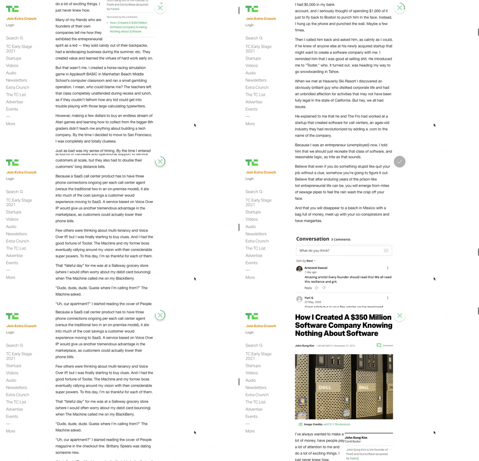
91. Bubble Status Reading
This pattern provides a fixed, animated bubble that indicates reading progress, helping users understand their position within long articles and enhancing content appreciation.

94. Top Primary Banner
A top primary banner provides crucial, timely information and calls to action, ensuring users are immediately aware of important updates or opportunities.
93. Welcome Screen with Background
129. PDF Show & Download
190. Ask Email for Playing Video
168. Anfibia - Natural Article Rating
79. Out of downloads
176. Wordpress.com - Natural Inputs with Suggestions
133. Website-Browser Notification Reminder
208. Checkbox for User Confirmation
98. Features on Signing-up
57. IDF - Encouraging Newsletter Sign-up
173. Toggl - Onboarding Action Tooltip
9. App Integration Banner
76. List Widget Customization
77. Sign Up Flow with Pricing Step

3. Apple Safari - Search Options on Focus
Upon focusing the search bar, users are presented with a curated list of favorites, frequently visited sites, and Siri suggestions, streamlining navigation and discovery.

99. Letterboxd - Topbar Dropdown Menu
Users can quickly access account-specific options and site navigation through a persistent topbar dropdown menu, enhancing pathfinding and personalization.
109. Native Long-press Menu
55. Contextual Form Input Errors
170. Figma - Fixed Form with Steps
83. Rewards Notification on Topbar
185. Bottom Action Menu
78. Apple iOS - Dark & Light Color Themes
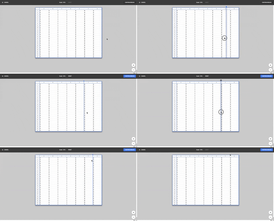
86. Table Column Slicer
Users can precisely define column breaks within a data table, enabling flexible data organization and improved readability for complex datasets.
25. Apple - Two-factor Auth
2. Youtube - Feed Filter Tabs

54. Modal for Language & Region Picker
This modal allows users to efficiently search for and select a preferred language from a comprehensive list, enhancing personalization and accessibility.
159. Wix - Natural Language Form
23. Suscription gimmicks
110. Vertical Perspective Grid
69. Uber EATS - Tab Menu Navigation

11. Intercom - Likert in chat
This pattern allows users to quickly rate a conversation using a Likert scale of emoji faces, providing immediate feedback within the chat interface.
196. Video Story on Website
119. PrestaShop - Site Cookie Management
66. Products Discounts

63. Window Maximize Options (on Right Click)
Users can right-click the maximize button to access a dropdown menu, enabling quick window arrangement options like full screen or tiling to the left or right.

39. Youtube - Dismissed Bottom Popup
This dismissible bottom-anchored popup informs users about critical information, offering options to dismiss or learn more without disrupting primary content viewing.
126. WeTransfer - In-front Site Terms
66. Actionable Empty State
38. Youtube - Video Statusbar

85. Bottom Popup Secondary
This bottom-anchored popup provides users with immediate access to secondary, contextually relevant information without disrupting their primary task.
60. MercadoLibre - Ecommerce App Searching (3)
104. Slack - Creating & Customization Workspace

80. Input Validation Status
This pattern provides immediate feedback on user input, guiding them to correct errors and successfully complete forms or tasks.
135. Stories From Network
58. Getting on Fitness
47. Notion - Workspace Types
41. Context Banner Card

42. Modal for Tags Editing
This pattern allows users to efficiently manage and organize their content by editing, adding, or removing tags through a dedicated modal interface.
21. Advanced Color Picking
75. Notification Recommendation

22. Mailchimp - First Mailing Campaign
This onboarding flow guides new users through initial profile setup, collecting essential personal details to personalize their experience and facilitate future interactions.
172. Contextual Popup for Service Upgrade
84. Pandemic Warning Message on Map
37. Branded Illustrations for Reinforcement
209. Apple Calendar - Zoom Transition Navigation
This pattern describes a navigation technique, commonly found in the Apple Calendar application, that uses a zoom transition to move between different hierarchical views (e.g., day, week, month, year). It enhances user awareness of their location within the application's structure.
35. Do Not Leave Popup
156. Figma - Keyboard Navigated Menu
88. Fake-News Warning

105. Floating Tooltip Blackout
This pattern presents a floating tooltip with a dim overlay, guiding users to initiate or schedule a meeting with clear options and keyboard shortcuts for efficiency.
29. General Form Errors Banner
72. Google Maps - Congratulation Displaying Results
154. Order Status Top Banner
136. Fitbit - Sleep Graph Visualization
46. Dribbble - Posting Graphics Online
158. Automatic Tooltip Blackout (2)
36. Scroll Required for User Confirmation
34. Premium gimmicks
12. Pricing Comparison (3-tier)
1. Steps Guidance
14. Delete Search History
143. Platform Sign-in/up
16. Incremental pricing
50. Food Order Receipt
71. Trip Tracking
166. Generated Effect: Confetti Explosion
77. Walking Directions
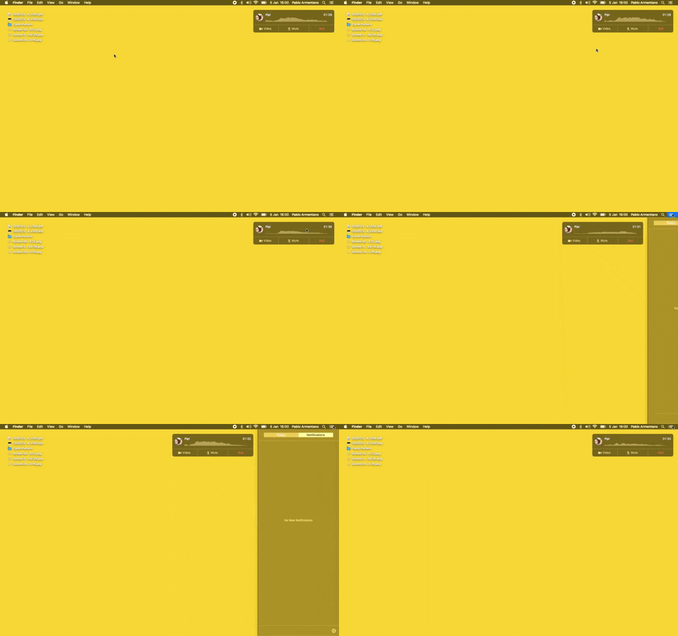
23. Floating Voice Widget with Actions
This floating voice widget provides persistent awareness of an active call, allowing users to quickly mute, unmute, or end the conversation without interrupting their workflow.
19. Twitter - Email Validation on Sign Up
112. Share on Social Networks
188. Trello - Color shapes for Colour-blind
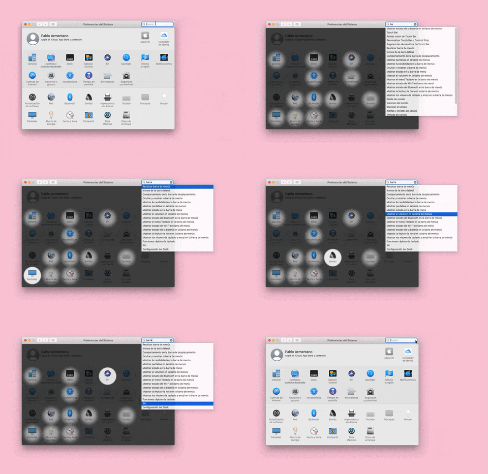
155. Menu Search Highlighting
This pattern highlights matching items within a dropdown menu as a user types into an associated search input, aiding in quick pathfinding and user selection.
16. Double Account Entrance

4. Floating Status Banner
A floating status banner presents non-blocking, transient messages to users, typically positioned at the top or bottom of the viewport. It delivers immediate feedback or critical updates without interrupting the user's primary workflow.

6. Modal Blackout w/ Form
This modal prompts users to log in with an existing account, offering clear options to proceed or use an alternative, ensuring a smooth authentication flow.
146. Intelligencer - Hamburger Menu
160. Pocket - Content Highlighting
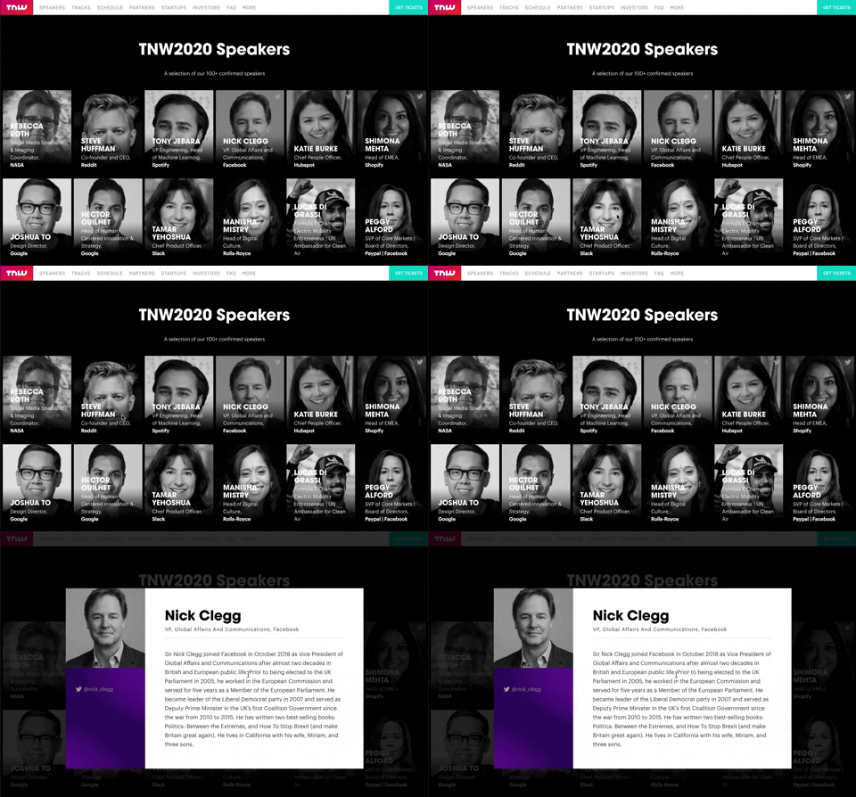
139. Transition: Zoom-Out on Hover
This transition subtly scales down an image on hover, providing visual feedback and highlighting interactive elements without obscuring content.

10. Dedicated Screen for Action Confirmation
This dedicated screen ensures users explicitly confirm or deny third-party access to their LinkedIn data, promoting transparency and control over personal information.