- Desktop (231)
- Tablet (5)
- Mobile (61)
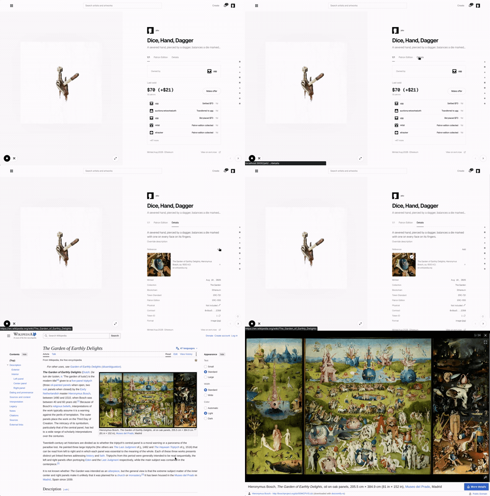
415. Metadata Pane w/ Tab Navigation | networked.art
This pattern provides a persistent side pane with tab navigation, allowing users to efficiently browse and manage detailed metadata for a selected item.

414. Live Cursor Chat | recent.design
This pattern enhances real-time collaboration by displaying other users' cursors and their typed messages, fostering a sense of shared presence and immediate feedback.

413. Onboarding Steps for User Adoption | Google Drive
This pattern guides users through initial setup with clear, actionable steps, fostering engagement and accelerating feature adoption.

412. Image Animation on Hover | MIT Press
This pattern uses a subtle animation on hover to draw attention to an image, enhancing user engagement and highlighting interactive elements.
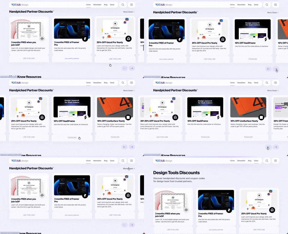
411. Ticket Carrousel | TOOOLS.design
Users can browse a curated selection of offers by clicking pagination arrows, enabling efficient discovery and decision-making.
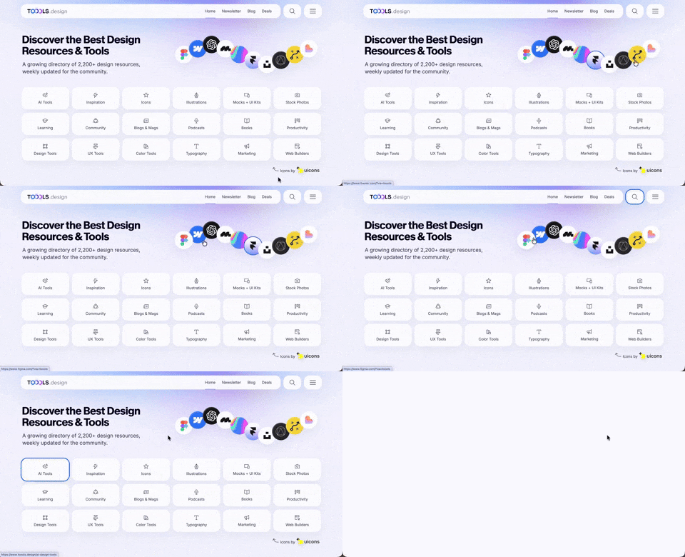
410. Hero Interactive Background | TOOOLS.design
This pattern uses an animated, interactive background to engage users and visually highlight featured content, enhancing initial appreciation and pathfinding.

409. Customize Toolbar (2-pane interaction) | YouTube
Users can personalize their toolbar by toggling specific buttons on or off, enhancing workflow efficiency and tailoring the interface to their needs.
Uink Digital Agency
Specilist on building and launching digital products. Let's talk!
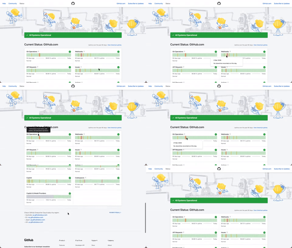
408. Status Page per Hour Indicators | Github
Users can quickly assess system health over time via color-coded hourly indicators, revealing operational status and outage events at a glance.

406. Fixed Bottom-Right Chat Bubble | Google Analytics
Offers always-available, AI-powered guidance and support through a fixed bottom-right chat

405. Ferrari Luce Website | LoveFrom
This pattern describes a desktop web landing page, featuring a fixed navigation bar, footer, and interactive elements such as carousels, buttons, and hypertext links. It integrates animations, video, and anchor scrolling to create an engaging user experience. Notable behavior: Animation; Carrousel; Fixed on Scroll.

404. Sidebar Backdrop Menu | Shadcn Studio
This pattern provides a full-height, animated sidebar menu that slides in from the left, offering clear navigation options while dimming the main content for focused interaction.

403. File Upload and Background Loader | GIPHY
Users can easily upload files or paste URLs, receiving clear visual feedback and background loading indicators for a seamless experience.

402. Transition: Zoom-to-Dock for Minimize | Apple
This transition visually guides the user as a window minimizes, smoothly shrinking and moving to its new location in the dock, enhancing spatial awareness and system feedback.

401. In-App News Notification | Netlify
This pattern provides timely, relevant news and updates within the application, enhancing user awareness and engagement without interrupting core workflows.

400. 3D Button Shadow | Remotion
This pattern uses a subtle 3D shadow animation on hover to provide clear visual feedback, enhancing user awareness and guiding interaction.

397. Modal w/ Card Options | Google Vids
This modal presents users with clear, card-based options to initiate a task, guiding them efficiently through initial decision-making.

393. Colored Checkboxes
Users can easily select multiple communication preferences with visually distinct, colored checkboxes that provide immediate feedback on their choices.

392. SaaS for Construction Workers | NUQLEA
This pattern uses a dynamic carousel of images and text to showcase product features, engaging users with interactive content and clear calls to action.

390. Icon Software Landing Page | Nucleo Icons
This landing page effectively guides users to download icon management software by showcasing its intuitive interface and customization features.

389. Text Edit Inline Input | Toggl
Users can directly edit text content in place, providing a seamless and efficient way to update information without navigating away.

388. Drag & Drop and Checkbox to Select Multiple Item | Google Gmail
Users can efficiently organize multiple items by dragging and dropping them into a target category, enhancing content management and task completion.

386. Progressive Content Loader | Notion
This pattern uses skeleton screens to progressively load content, providing immediate visual feedback and reducing perceived wait times for users.
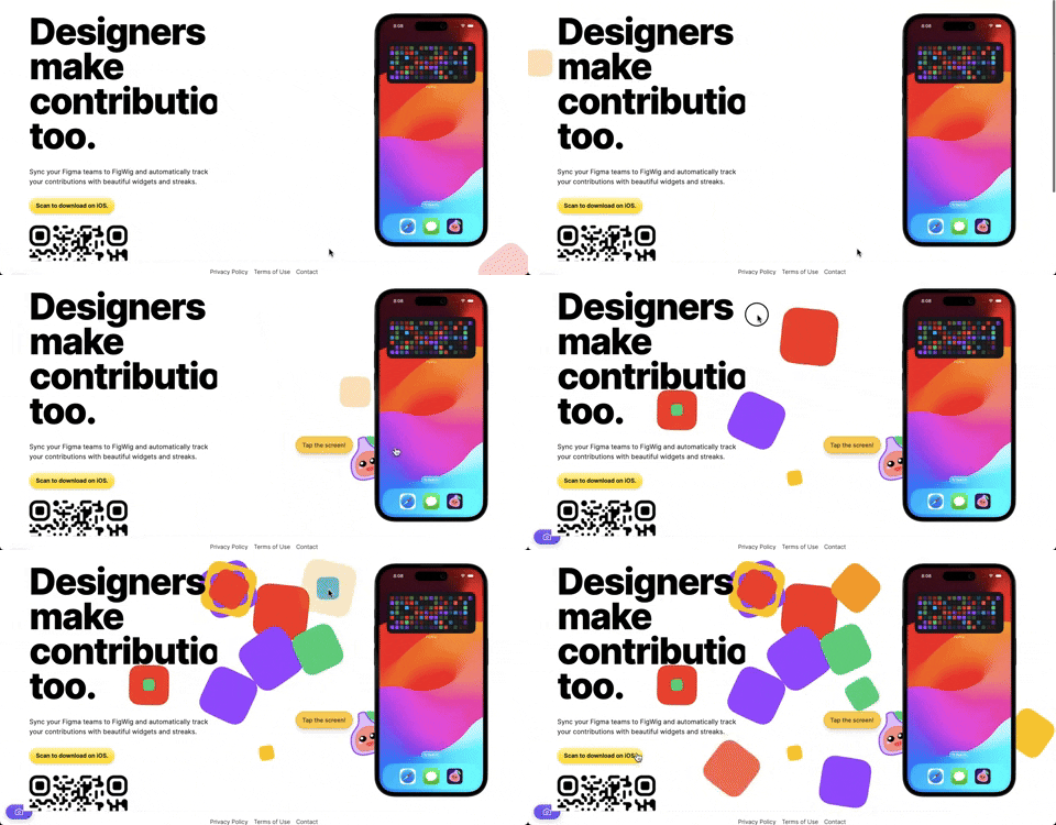
382. Interactive Background Animation
This pattern uses subtle, interactive background animations to engage users and provide dynamic visual feedback as they scroll or interact with the page.

379. Dropdown Filters | Google Drive
Dropdown filters enable users to quickly refine content views by selecting specific criteria from a compact, accessible menu.

378. Modal Blackout w/ Animation | Twitter-X
This pattern uses an animated blackout modal to focus user attention on critical information or actions, ensuring clear decision-making.
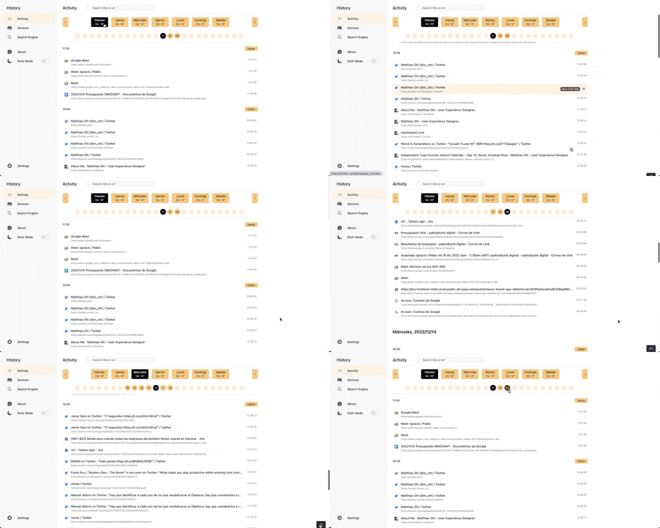
363. Back to Top on scroll | Better History
This pattern allows users to quickly navigate to the top of a long list by clicking a fixed "Back to Top" button that appears on scroll.
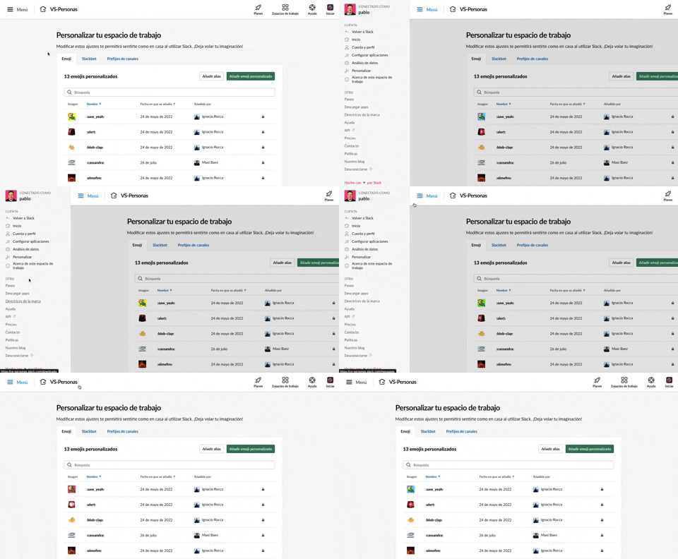
375. Toggle Sidebar Menu | Slack
Users can toggle a persistent sidebar menu to reveal or hide navigation options, optimizing screen space while maintaining easy access to key features.
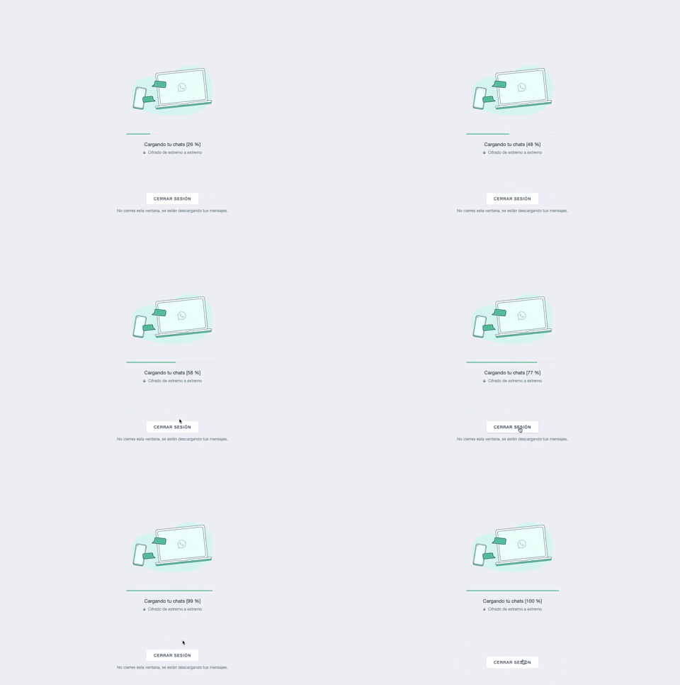
361. Progress Bar Loading | WhatsApp
This progress bar visually informs users about the loading status of their chats, providing a clear percentage to manage expectations during data synchronization.
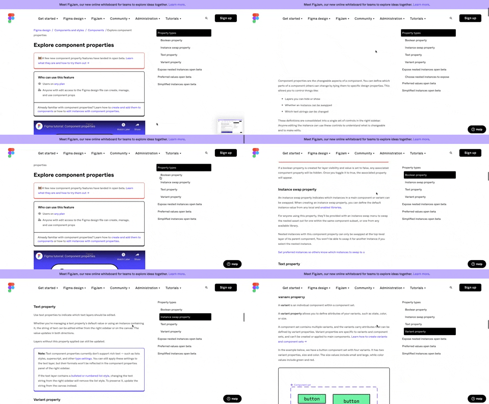
360. Page Outline Menu | Figma
This menu provides an interactive outline of page content, allowing users to quickly navigate to specific sections and understand the page structure at a glance.
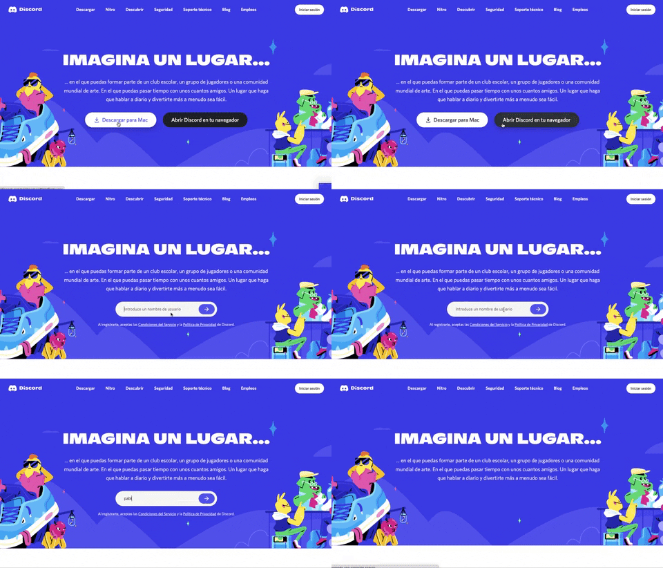
359. Button to Input Transition | Discord
This pattern allows users to seamlessly transition from a clear call-to-action button to an input field, streamlining the path to engagement.
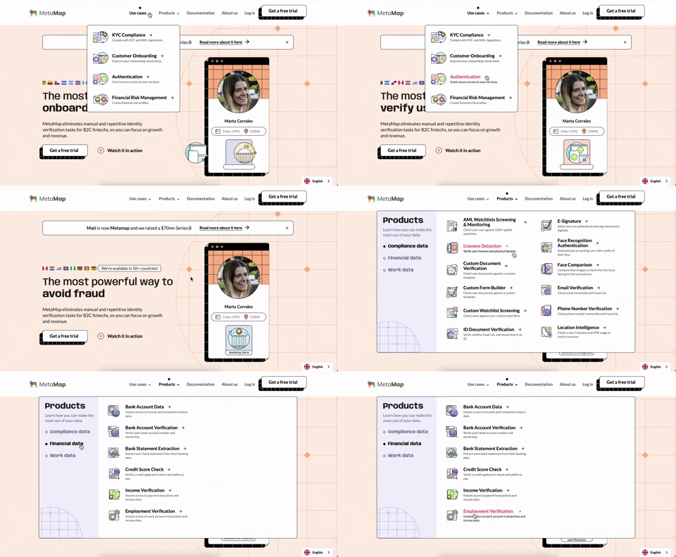
356. Multi-Layout Topbar Menu | MetaMap
This topbar menu uses a dropdown to reveal categorized links, enabling users to quickly navigate to relevant sections and understand the product's diverse offerings.
355. Feature Presentation Tooltip | Jira
A feature presentation tooltip, as seen in Jira, guides users through new functionalities or important updates. It often appears during onboarding or to raise awareness, utilizing tooltips with hypertext links and pagination for multi-step tours on both desktop and web interfaces.
354. Floating Form with Steps | Figma
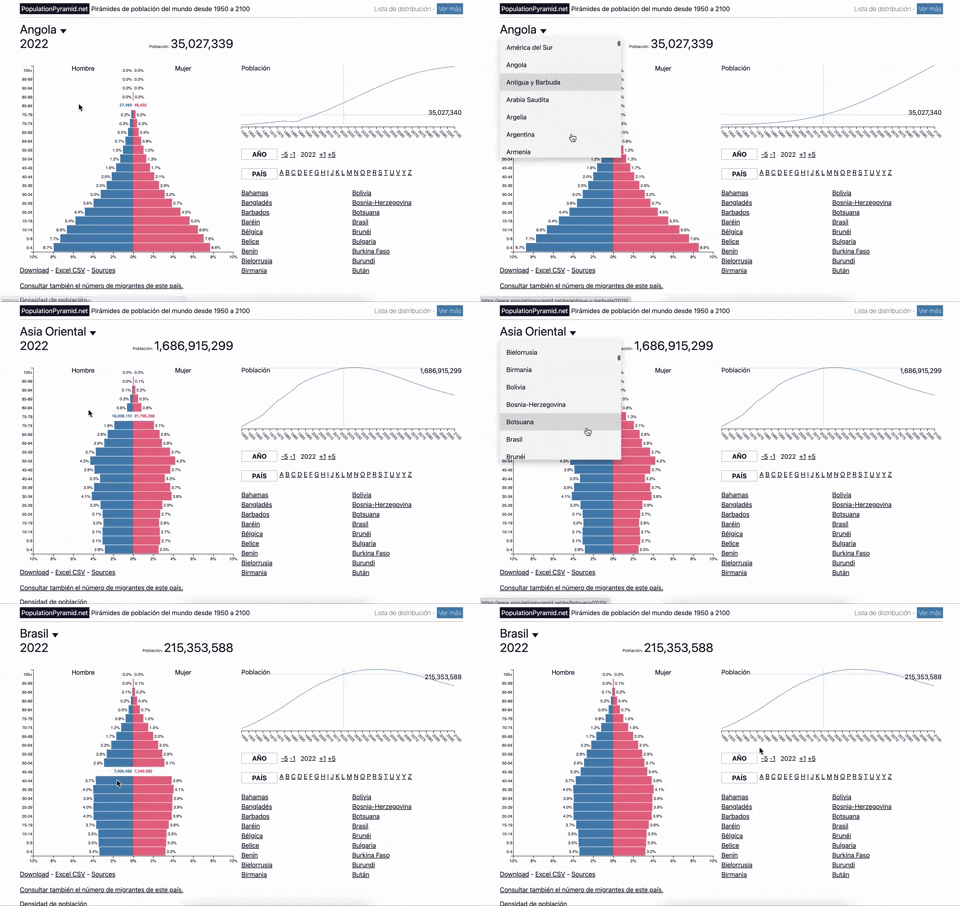
353. Visualizations with live filters | PopulationPyramid
Users can dynamically filter population data by country and year, enabling quick comparisons and insights into demographic trends.
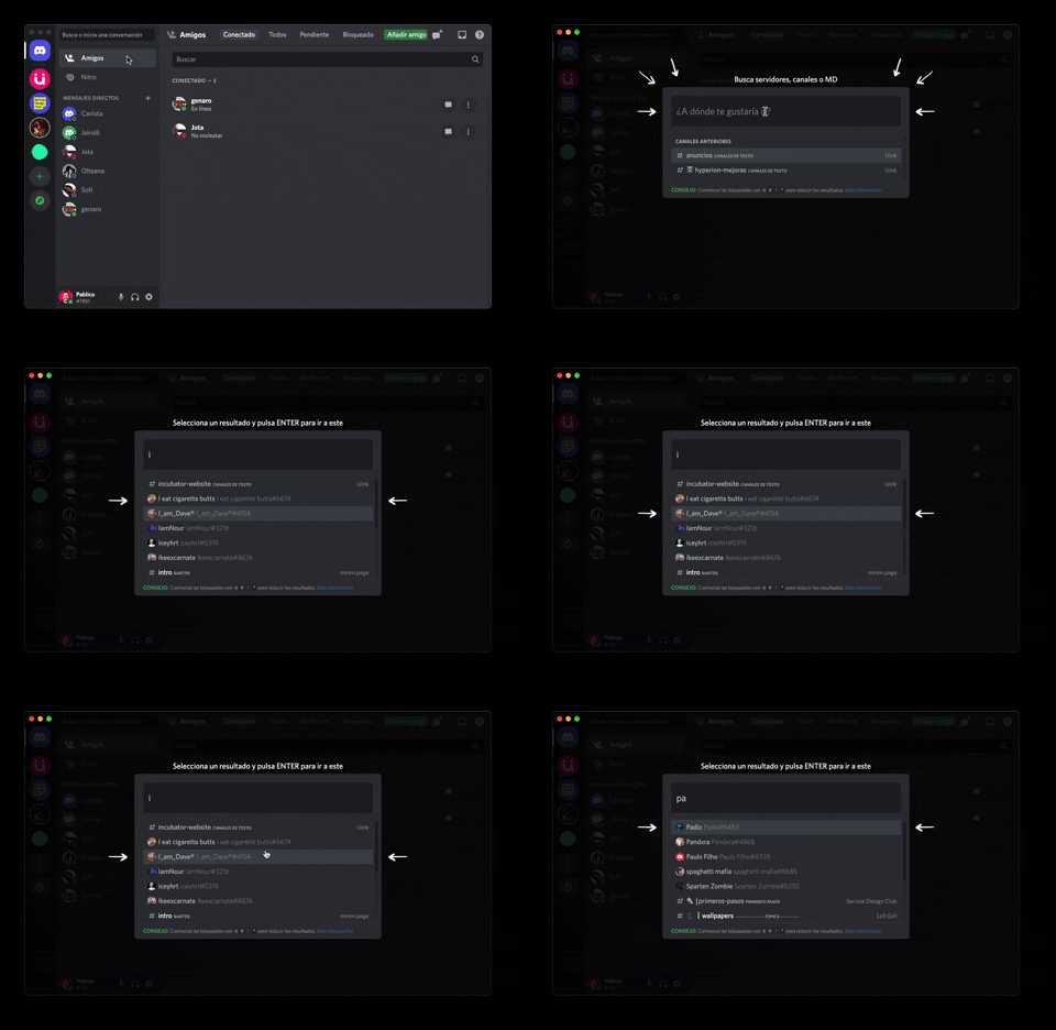
362. Modal Blackout w/ Form & Animations | Discord
A modal with a blackout overlay and animated transitions provides a focused input form, ensuring users can quickly add friends without distraction.
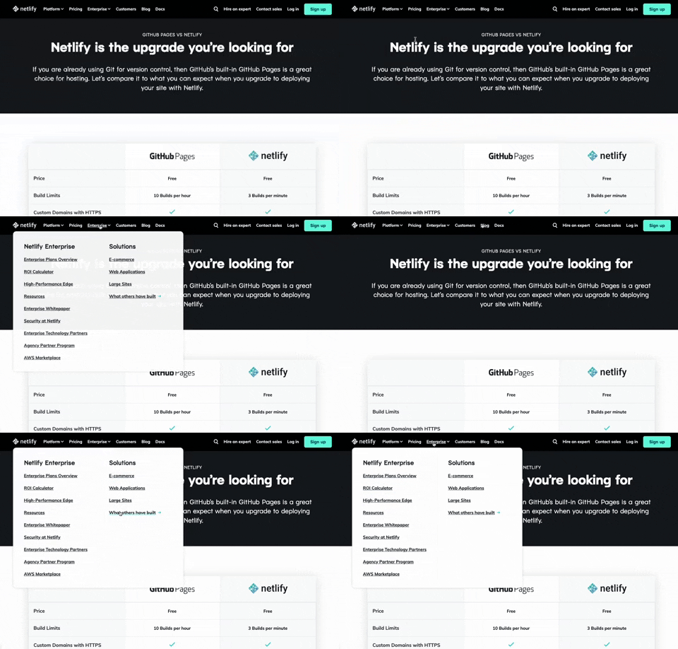
350. Multi-layout Topbar Menu | Netifly
This topbar menu dynamically adjusts its layout and content, offering users clear navigation and relevant options as they explore different sections of the site.
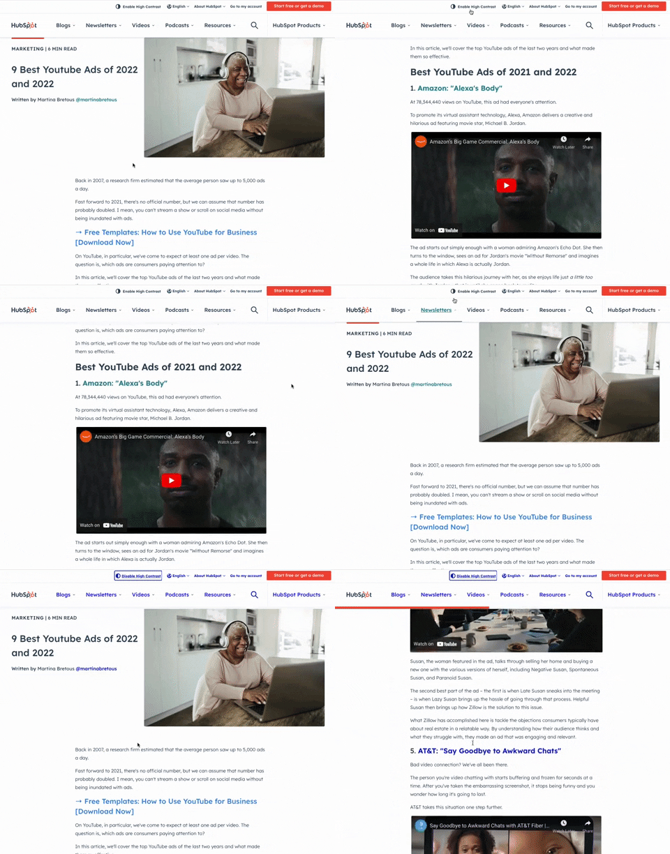
349. Toggle High Contrast | HubSpot
Users can toggle high contrast mode to improve readability and accessibility, enhancing the visual experience for those with low vision.

359. Toggle List/Grid View | Google Drive
Users can switch between list and grid views to optimize content display for their preference, enhancing readability and navigation.
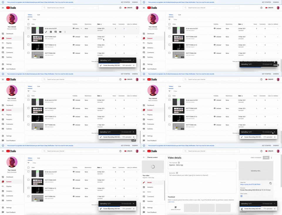
347. Floating Progress Bar | YouTube
This floating progress bar provides persistent, non-intrusive feedback on background tasks, allowing users to monitor progress while continuing other work.
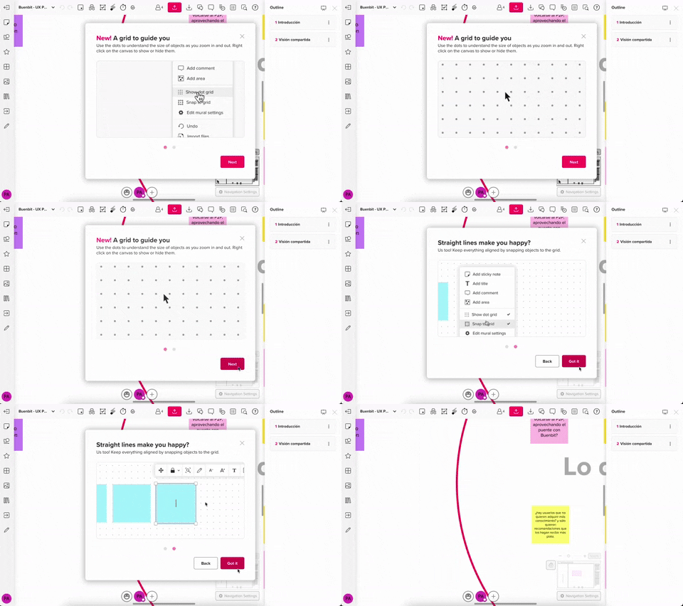
357. Modal w/ Steps & Animation (No blackout) | MURAL
This modal guides users through multi-step processes with clear instructions and animated transitions, enhancing awareness without obscuring the underlying content.
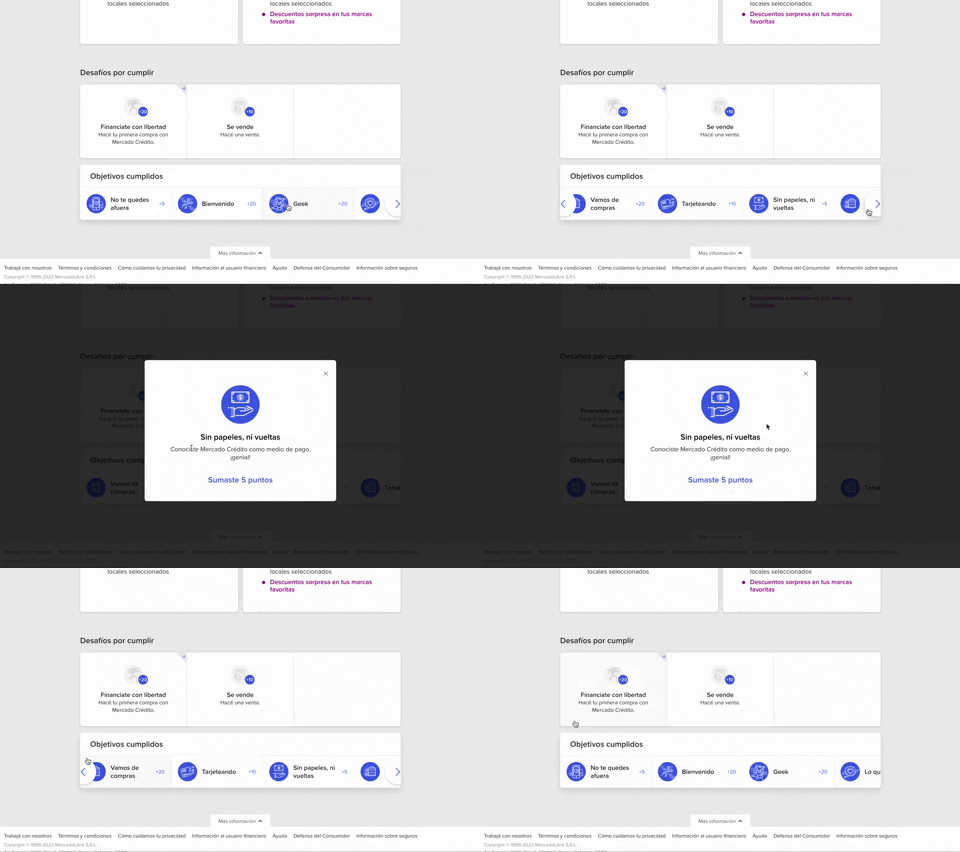
344. Horizontal Item Slider | MercadoLibre
This horizontal item slider allows users to effortlessly browse a curated selection of items, enhancing discoverability and engagement with minimal scrolling.
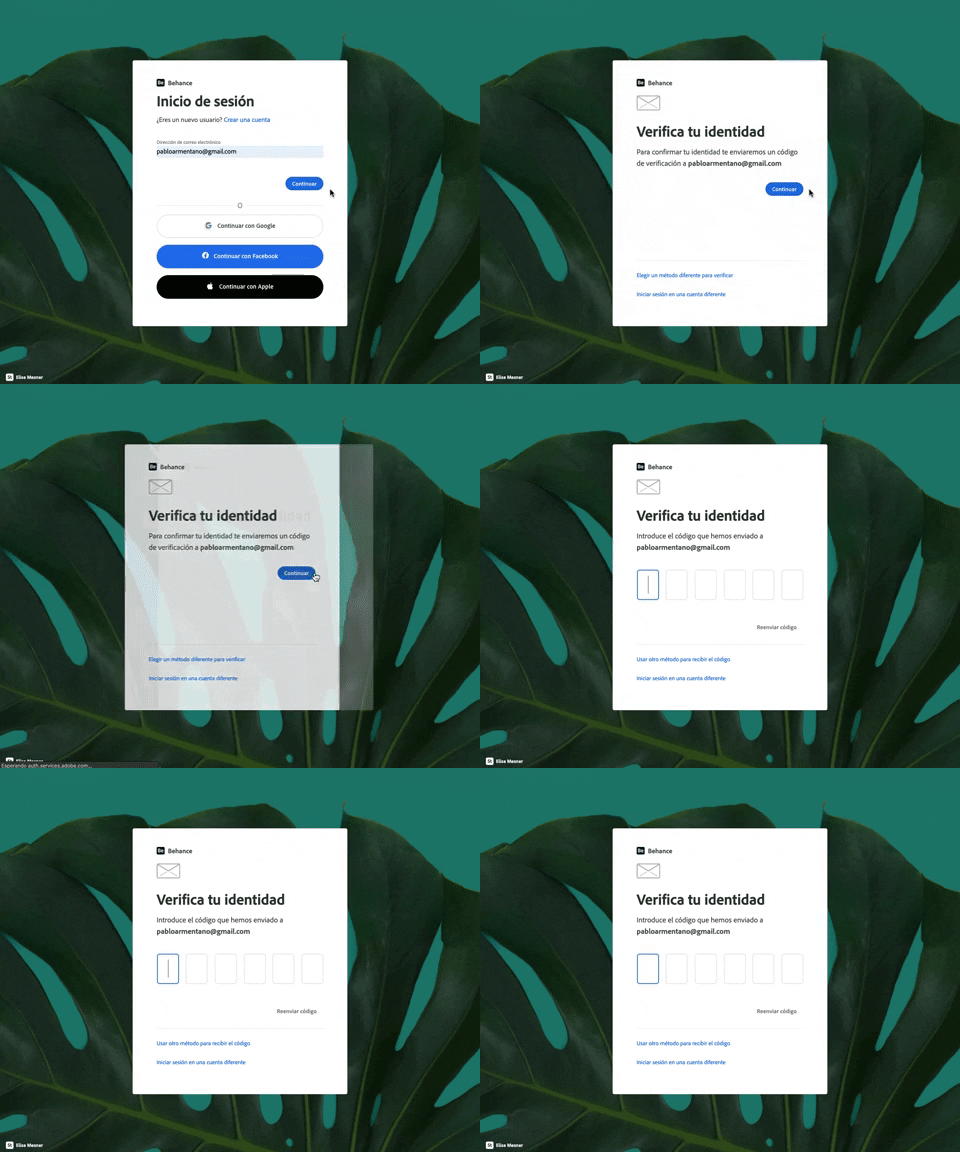
343. Login with Code Validation | Behance
Users input their email for login, then receive and enter a validation code to securely access their account.
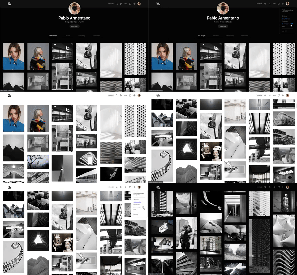
342. Light-Dark Mode Switcher | Savee
Users can instantly toggle between light and dark display modes, enhancing visual comfort and accessibility based on their preference or environment.
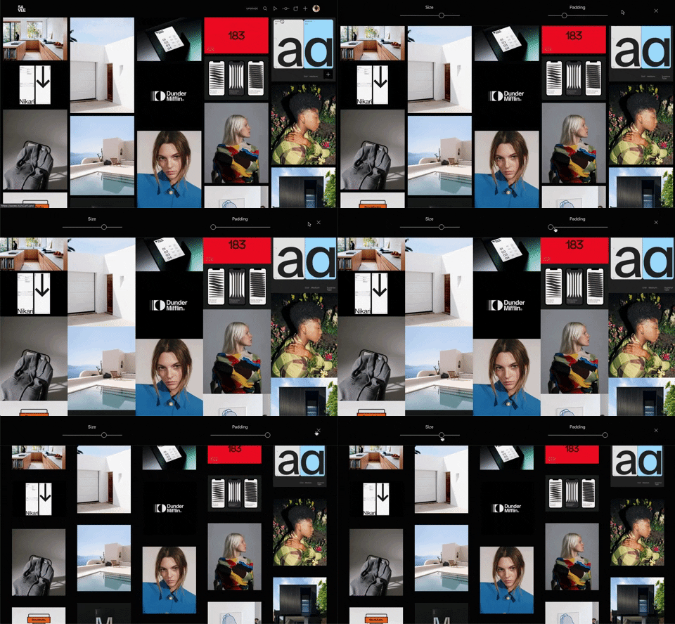
341. Image Grid Customization Sliders | Savee
Users can dynamically adjust the number of columns and spacing in an image grid using intuitive sliders, enhancing visual organization and content exploration.
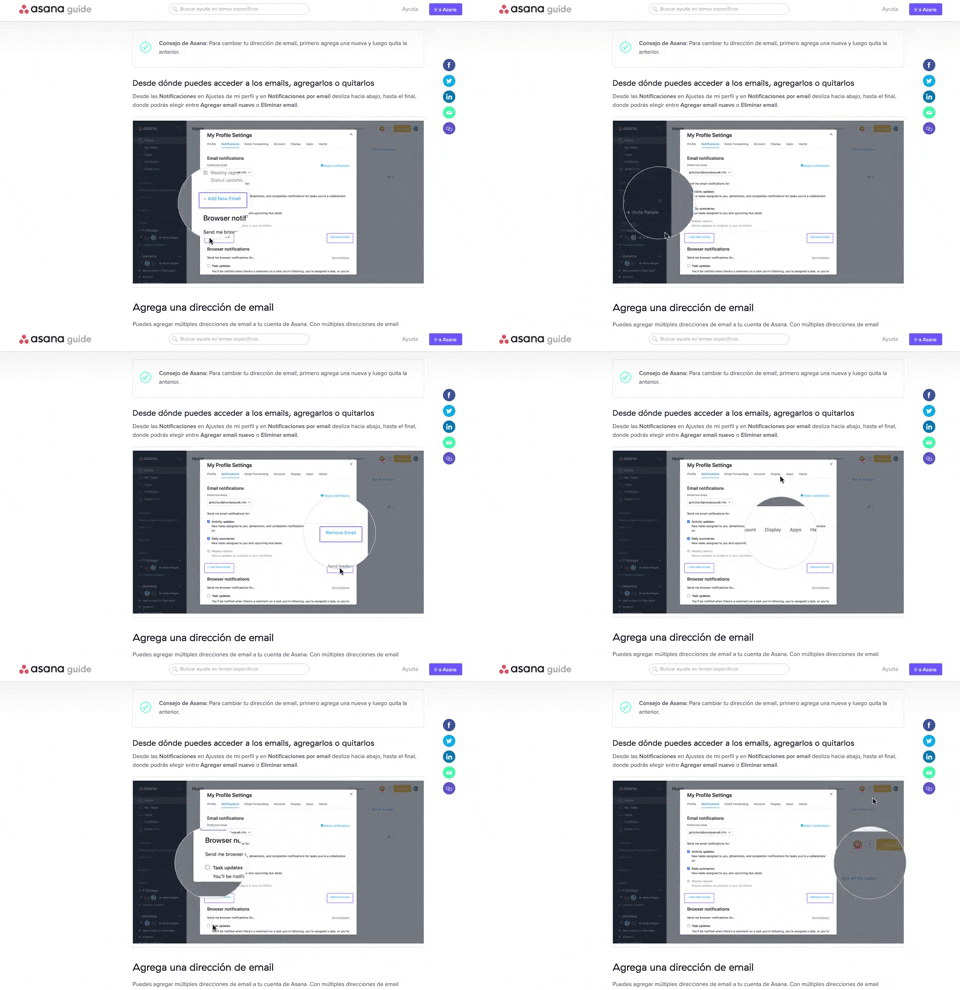
340. Zoom/Magnifier Over Image | Asana
This pattern enhances clarity by dynamically magnifying specific image regions, guiding users to key details and improving comprehension of visual instructions.
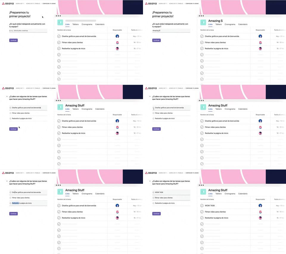
339. Platform Onboarding Simulator | Asana
This pattern guides users through initial setup by simulating product features, allowing them to visualize outcomes and make informed decisions before committing.

346. Sidebar Menu With Collapsable Items (Show More) | Google Chat
This sidebar menu allows users to expand and collapse sections, efficiently managing screen space while providing access to numerous navigation options.

345. Vertical Accordion for FAQs | lumenalta
This vertical accordion allows users to efficiently reveal or hide detailed content sections, optimizing screen space and improving navigation for FAQs or contact information.
336. Floating Popover on Click
A UI pattern where a floating popover element appears adjacent to a trigger element upon a click interaction, providing additional context or actions without navigating away.
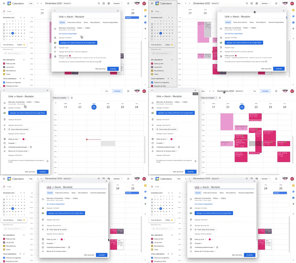
343. Modal/Dialog Drag & Drop to Fixed Position | Google Calendar
Users can drag a modal dialog to a fixed side panel, allowing them to view and interact with underlying content without losing context.
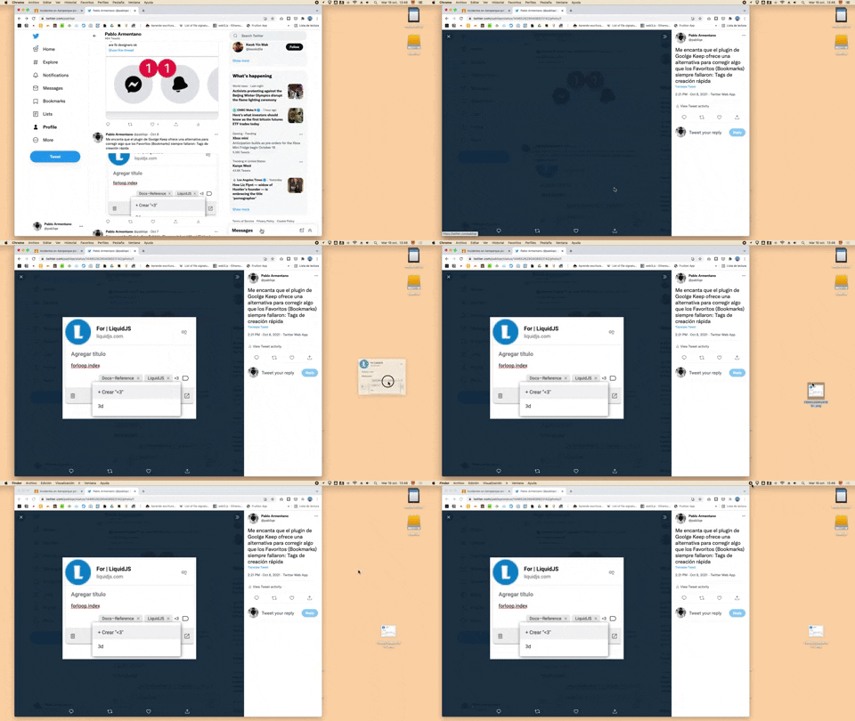
332. Drag & Drop to Create File from Web Image | Apple
Users can effortlessly create a new file on their desktop by dragging and dropping an image directly from a web browser.

322. Search on Menu Items | Apple
This pattern integrates a search input directly within a menu, typically a dropdown, enabling users to quickly filter and locate specific menu items. It enhances pathfinding and awareness, commonly found in desktop applications with navigation bars. Notable behavior: Typing; Filtering; Filtered Menu Items.
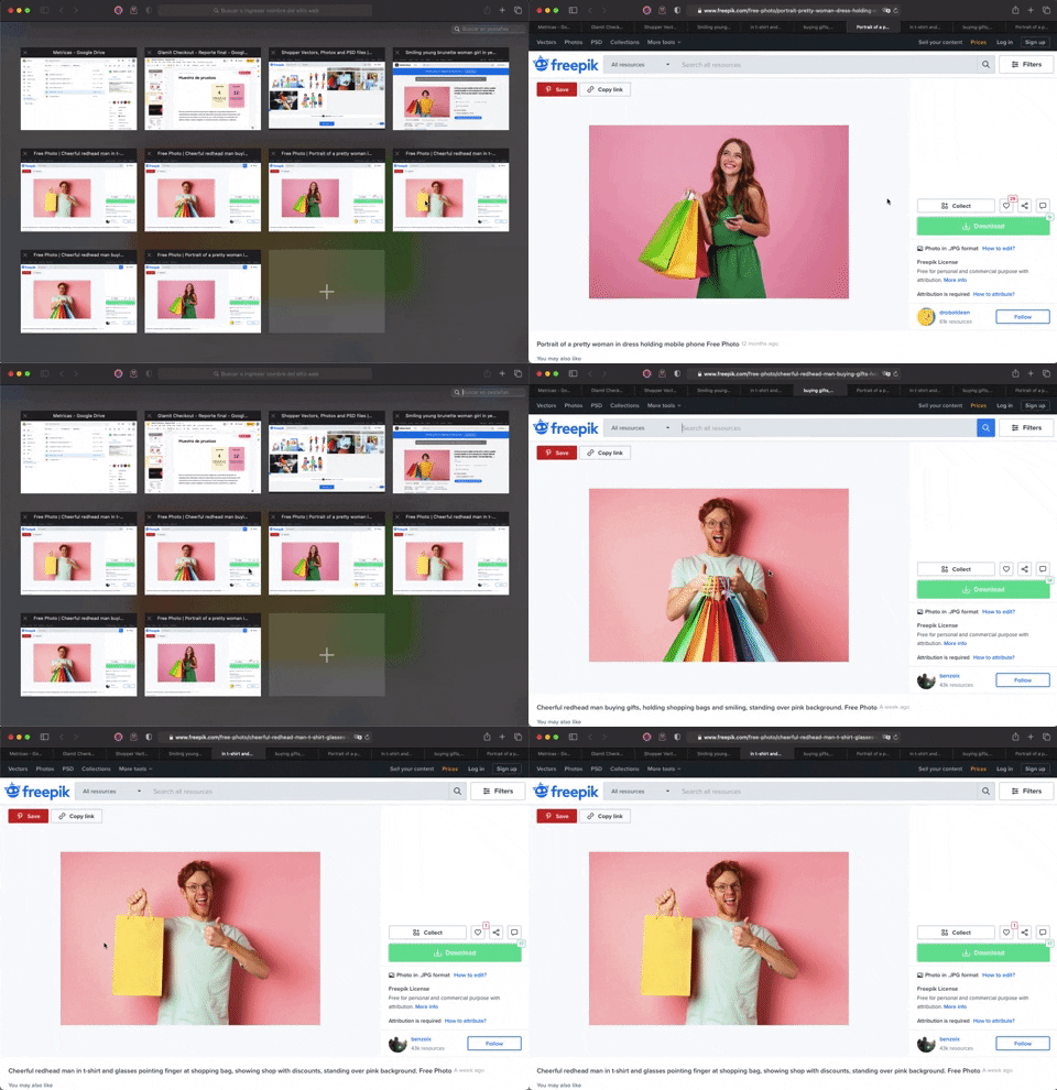
336. Transition: Zoom-In/Out for Browser Windows | Apple Safari
This transition allows users to fluidly zoom between a grid of browser tab thumbnails and a full-screen view, enhancing navigation and context switching.
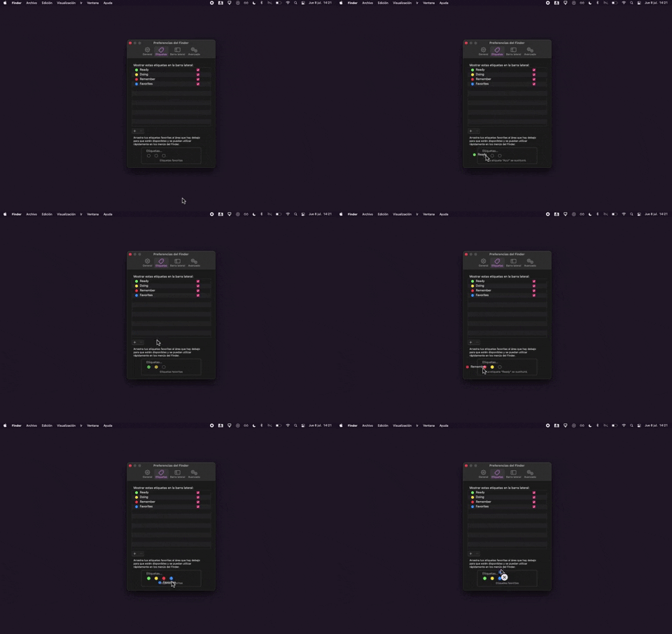
325. Drag & Drop Tag Colors to Slots | Apple
Users can intuitively assign color-coded tags to designated slots via drag-and-drop, enhancing organization and quick visual identification of items.
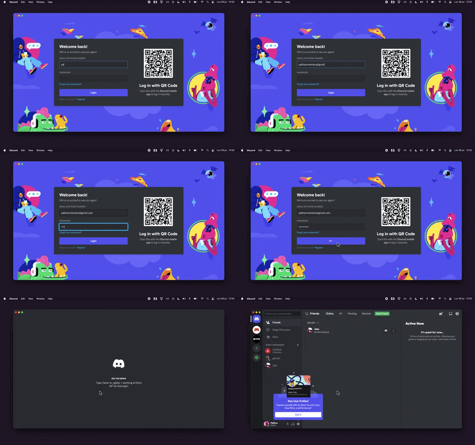
320. Sign In with Loading Tips | Discord
This sign-in pattern offers both traditional email/password input and a convenient QR code scan, enhancing user flexibility and reducing login friction with engaging loading tips.
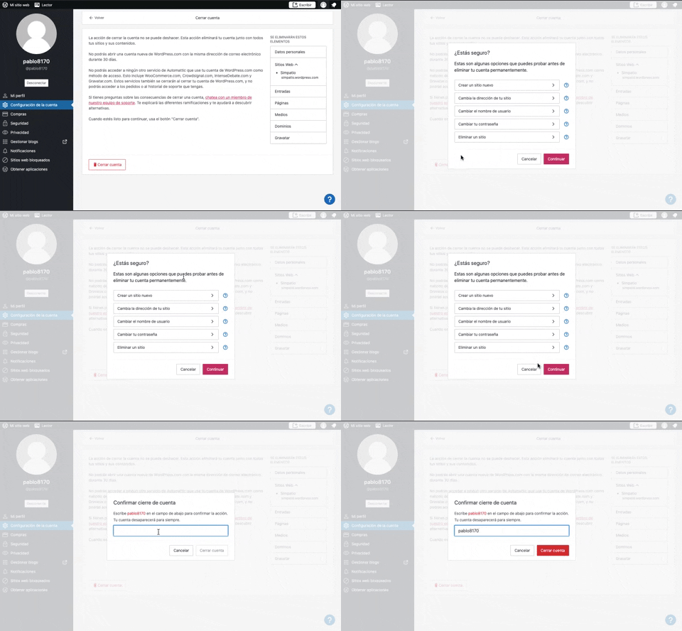
319. Modal Blackout w/ Multiple Choice | Wordpress
This pattern uses a modal blackout to confirm a user's intent to close an account, ensuring they understand the irreversible consequences before proceeding.

315. PIN Reminder | Signal
This pattern uses a persistent banner to remind users to verify their PIN, enhancing security and recall without interrupting core app functionality.
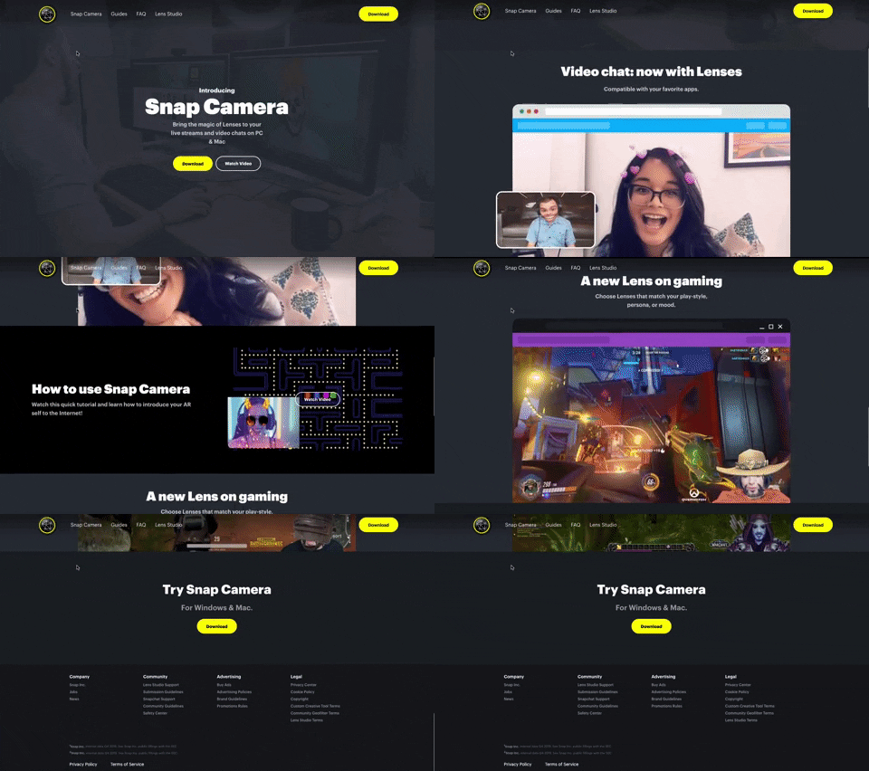
314. Snap Camera | Snapchat
A web landing page for the Snap Camera product, featuring a fixed navigation bar, interactive buttons, and animated video content to showcase its features and encourage user engagement. Notable behavior: Scrolling; Button Click; Fixed Header.
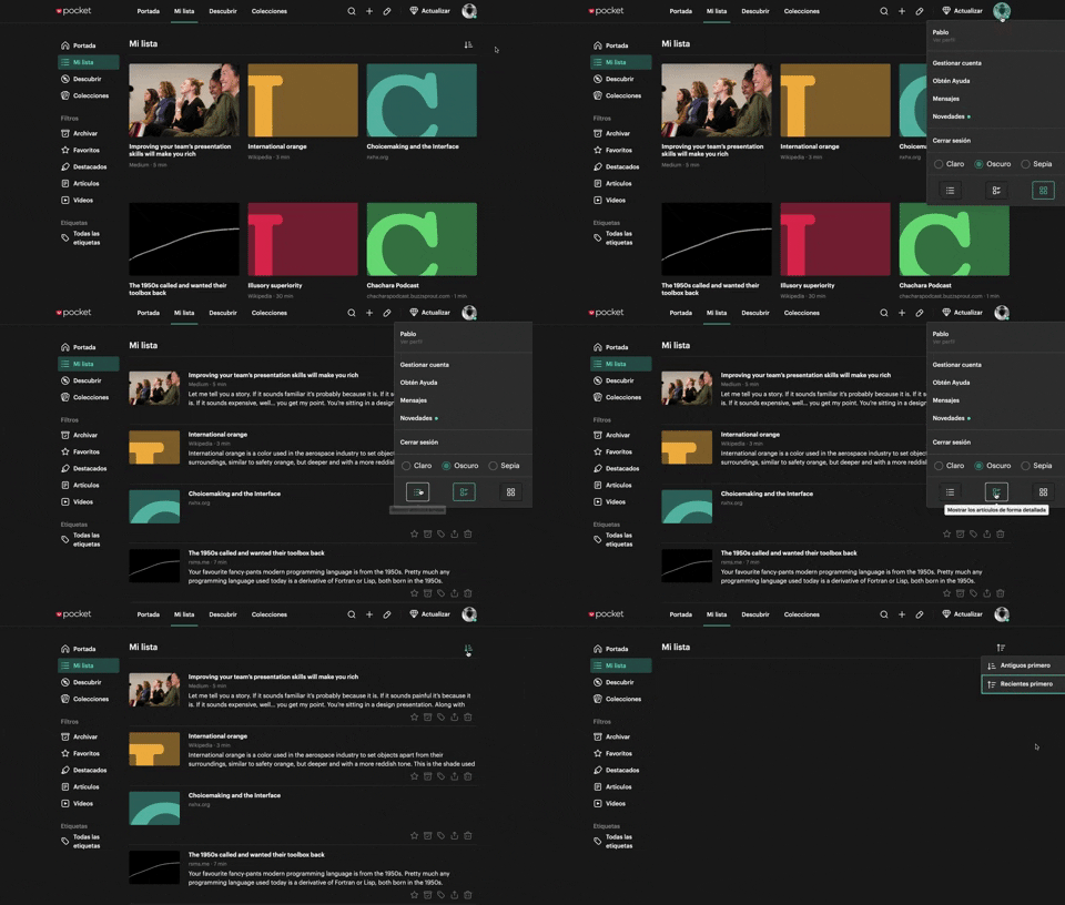
312. View Switcher | Pocket
Users can effortlessly switch between grid and list views of content, enhancing readability and personalizing their browsing experience.
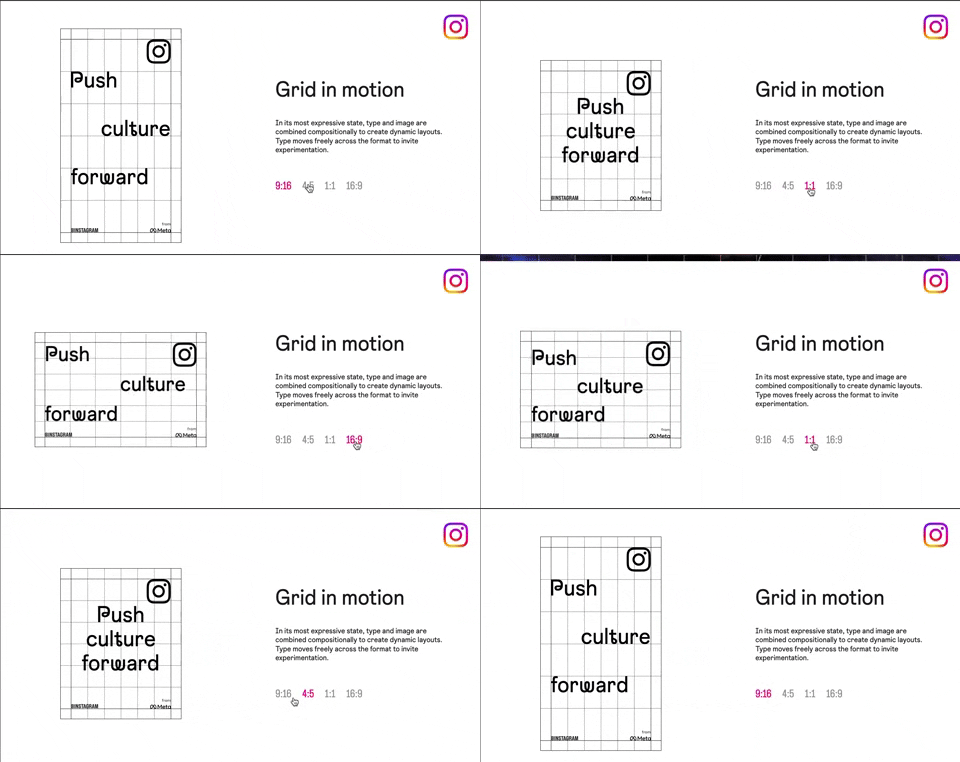
318. Animated Illustration with Menu | Instagram
Users can dynamically adjust content aspect ratios via a clickable menu, providing flexible viewing experiences and enhancing content adaptability.
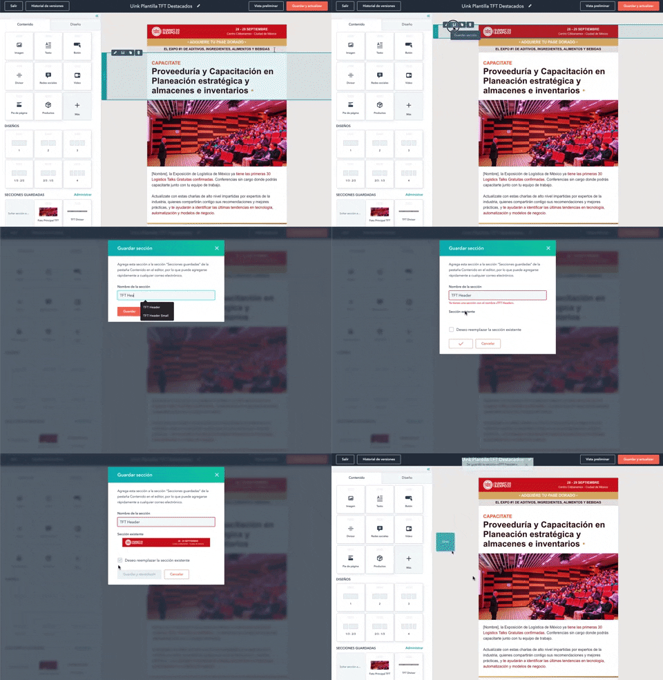
316. Modal Blackout for Delete Confirmation | About.me
This pattern uses a modal blackout to confirm a delete action, ensuring users are fully aware and can prevent accidental data loss.
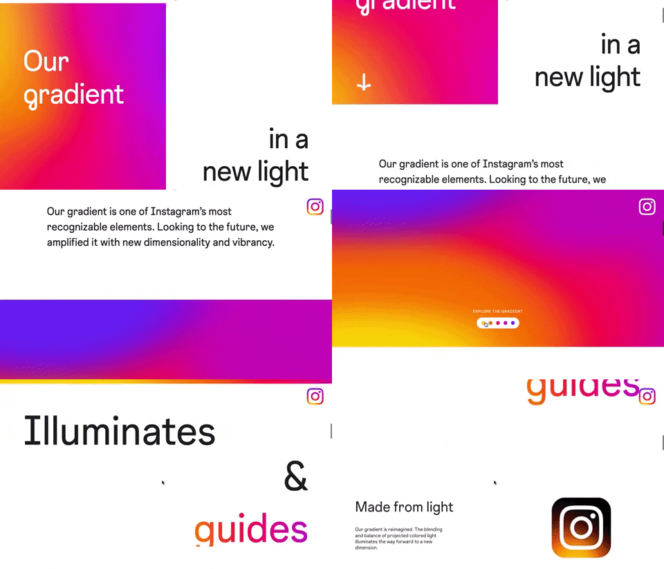
309. Brand Gradient | Instagram
This pattern uses a dynamic, animated brand gradient to visually engage users and highlight key messages as they scroll, enhancing brand recognition and content flow.
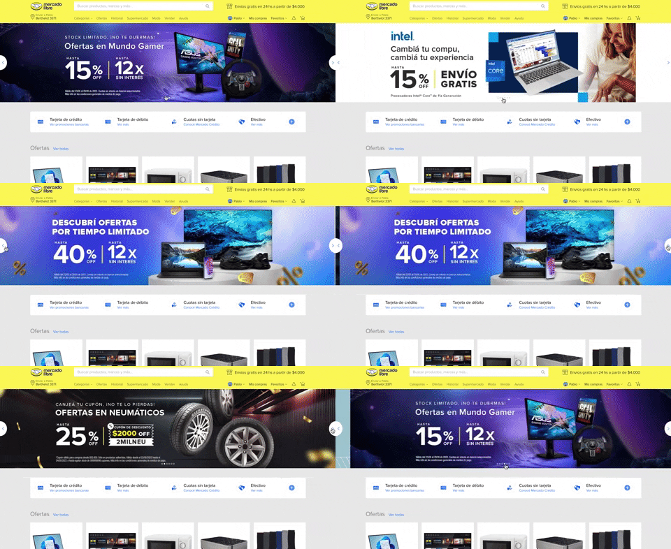
314. Hero Slider | MercadoLibre
Users can effortlessly browse featured promotions and products through a dynamic hero slider, enhancing awareness and guiding their pathfinding.
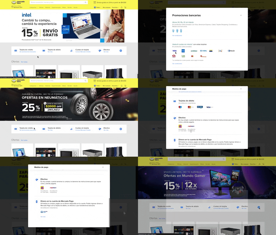
313. Modal Blackout w/ Scroll | Mercadolibre
This pattern displays a scrollable modal over a darkened background, allowing users to focus on its content while retaining context of the underlying page.
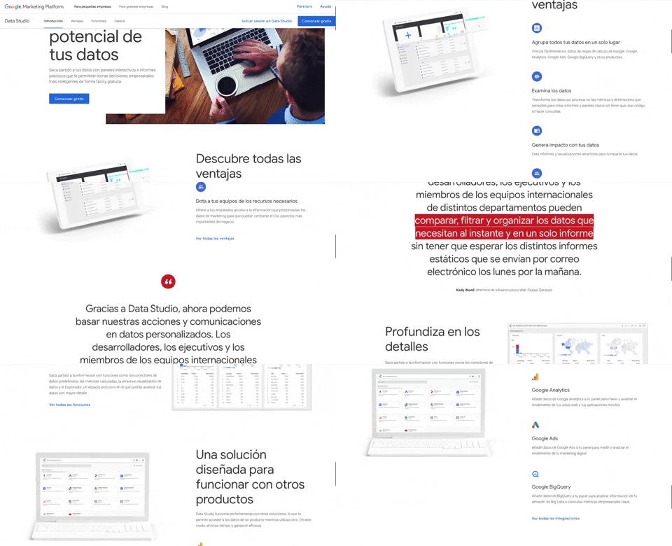
312. Landing Page | Google Data Studio
A fixed navigation bar ensures key actions like "Comenzar gratis" remain accessible as users scroll, improving discoverability and conversion.
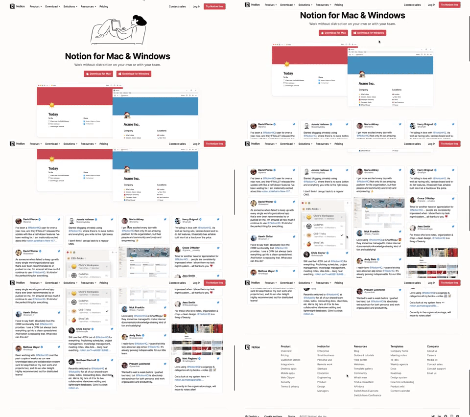
311. Landing Page for App Download | Notion
This landing page guides users to download the application for their specific operating system, simplifying the installation process.

308. Spinners for Module Loading | Twitter
This spinner provides visual feedback during module loading, reassuring users that the system is actively processing and preventing perceived delays.

307. Tooltip on Hover | Notion
Hovering over a truncated title reveals its full text in a tooltip, providing complete context without cluttering the interface.
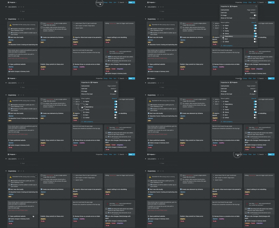
306. Drag & Drop for Reordering List Items (Mouse) | Notion
Users can intuitively reorder list items by dragging and dropping them, providing a direct and efficient way to customize their view.
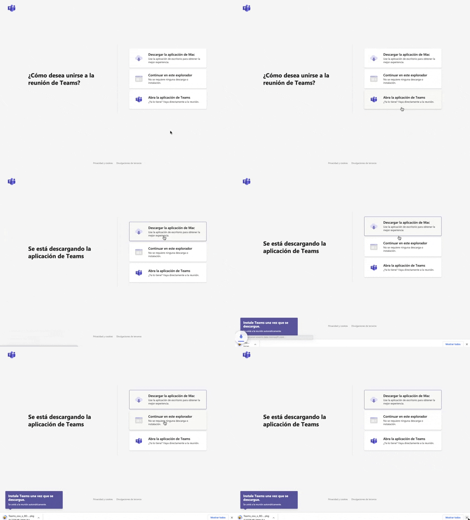
305. Button Combo for App Download | Microsoft Teams
This pattern offers users clear choices to join a meeting, enabling them to download the app, continue in the browser, or open the existing application for optimal experience.
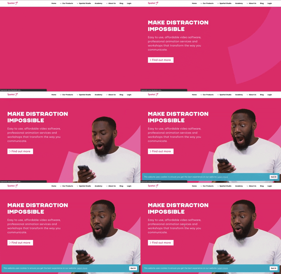
303. Background Animation (on Load)
A dynamic background animation on page load engages users immediately, providing visual interest and a sense of activity while content renders.
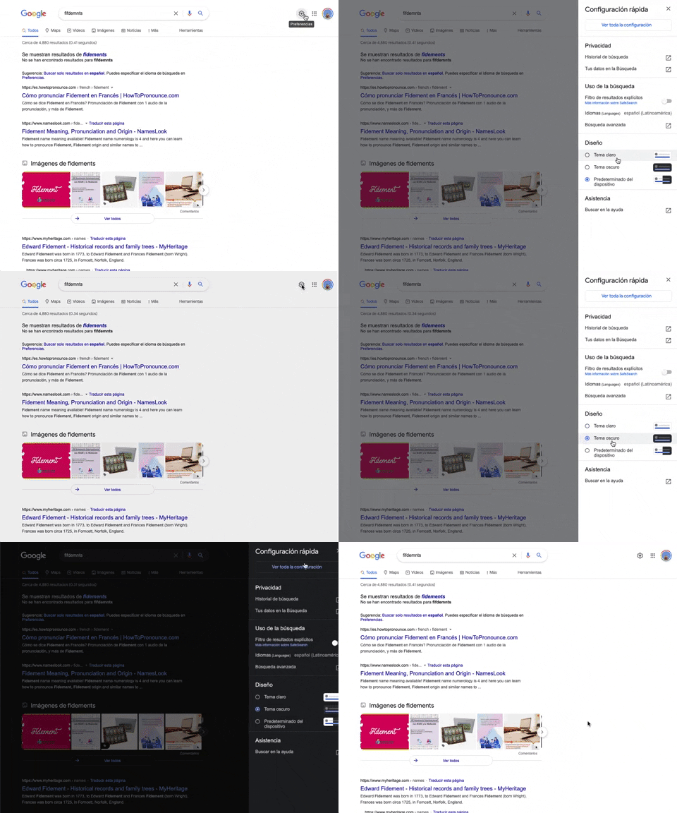
302. Theme Switcher in Side-drawer | Google Search
Users can quickly toggle between light and dark themes via a side-drawer, enhancing visual comfort and accessibility without leaving the current page.
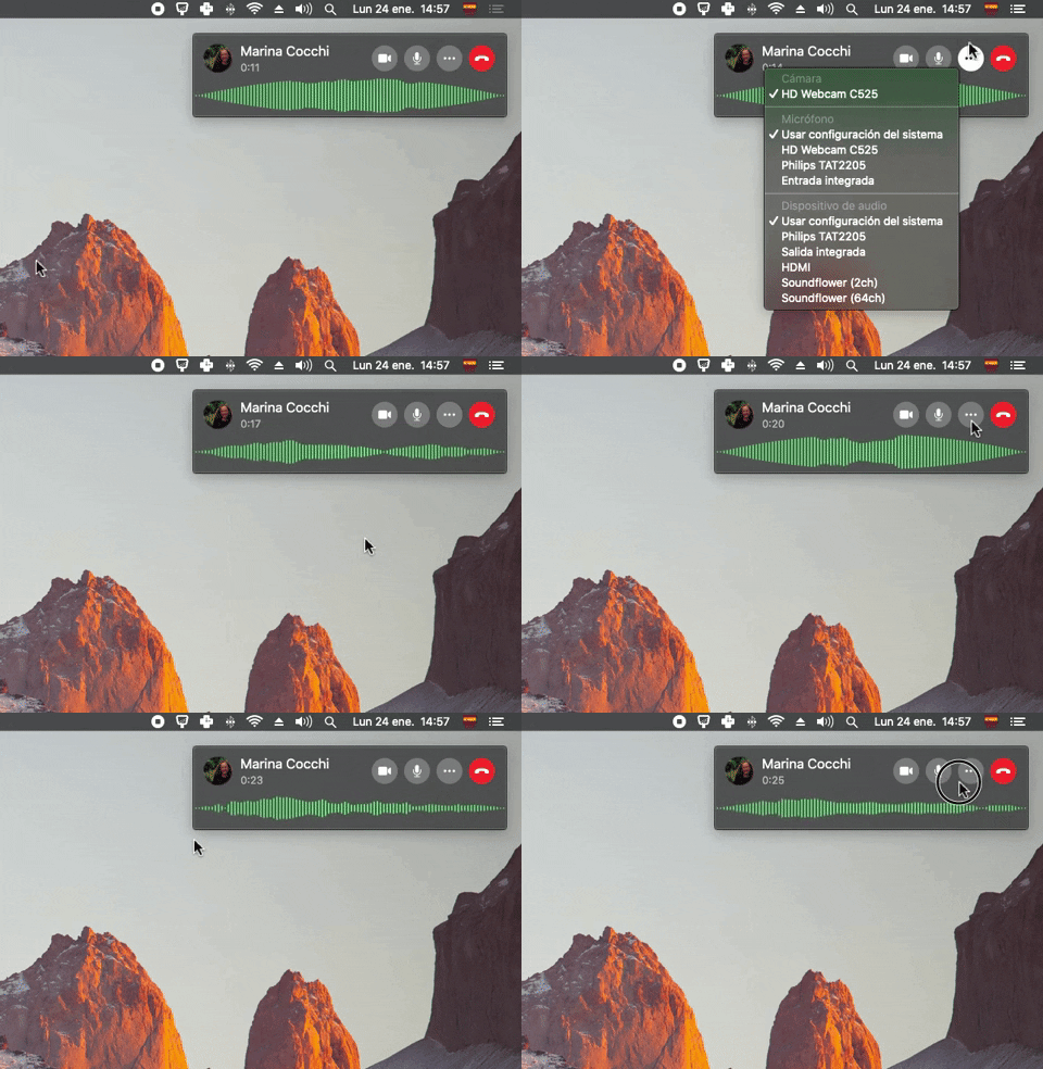
300. Sound Bars Graph | Apple
This pattern displays real-time audio levels as a dynamic graph, providing immediate visual feedback on sound input during a call.
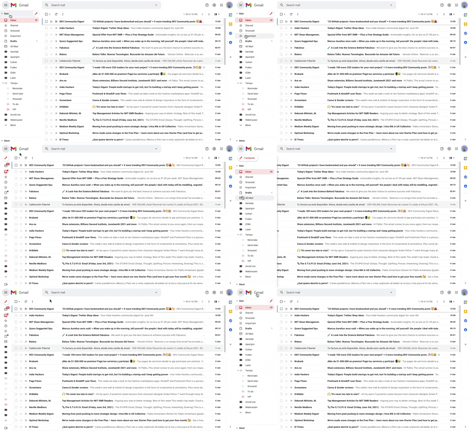
293. Collapsable Sidebar Menu | Google Gmail
This collapsible sidebar menu allows users to expand or hide navigation options, optimizing screen real estate while maintaining easy access to key sections.
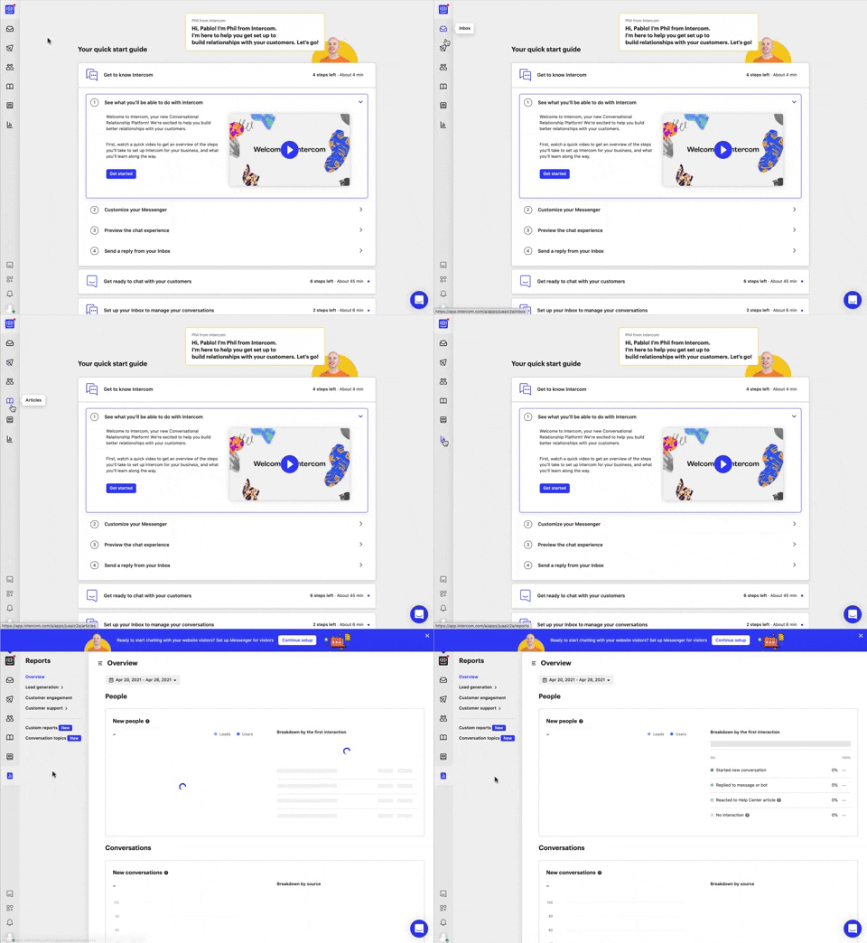
292. Vertical Icon Menu | Intercom
This vertical icon menu provides quick access to key sections, revealing descriptive tooltips on hover to aid navigation and improve user pathfinding.
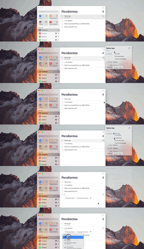
290. Floating Popover on Click | Apple
This pattern reveals a floating popover on click, providing immediate, context-specific information or actions without navigating away from the current view.

286. Background Animation on Scroll | Apple
This pattern uses a fixed background image that animates and shifts as the user scrolls, creating a dynamic and engaging visual experience.

279. Collapsable Layout Sidebars | Slack
Users can collapse and expand layout sidebars to optimize screen space, enhancing focus on primary content while maintaining quick access to navigation.

268. Drag & Drop to Upload File | GIPHY
Users can effortlessly upload files by dragging them from their desktop directly into a designated drop zone within the application.
_07.10.33_p._m..png?table=block&id=1b4e4bae-3d76-8055-baf9-d28c23cd351f&cache=v2&width=960&quality=80)
275. Popover on Hover | Miro
A popover on hover reveals contextual information or actions in a temporary overlay, enhancing user awareness without disrupting the main workflow.

274. Interactive Background Animation | Github
This pattern uses an interactive background animation to engage users and provide visual feedback as they navigate or interact with elements on the page.
264. Interactive Background Animation
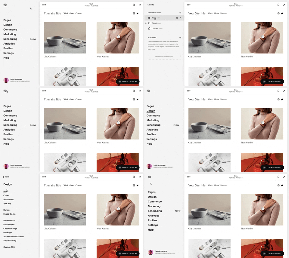
259. Multi-depth Sidebar Navigation | Squarespace
This multi-depth sidebar navigation allows users to quickly traverse complex information hierarchies, improving discoverability and reducing cognitive load.
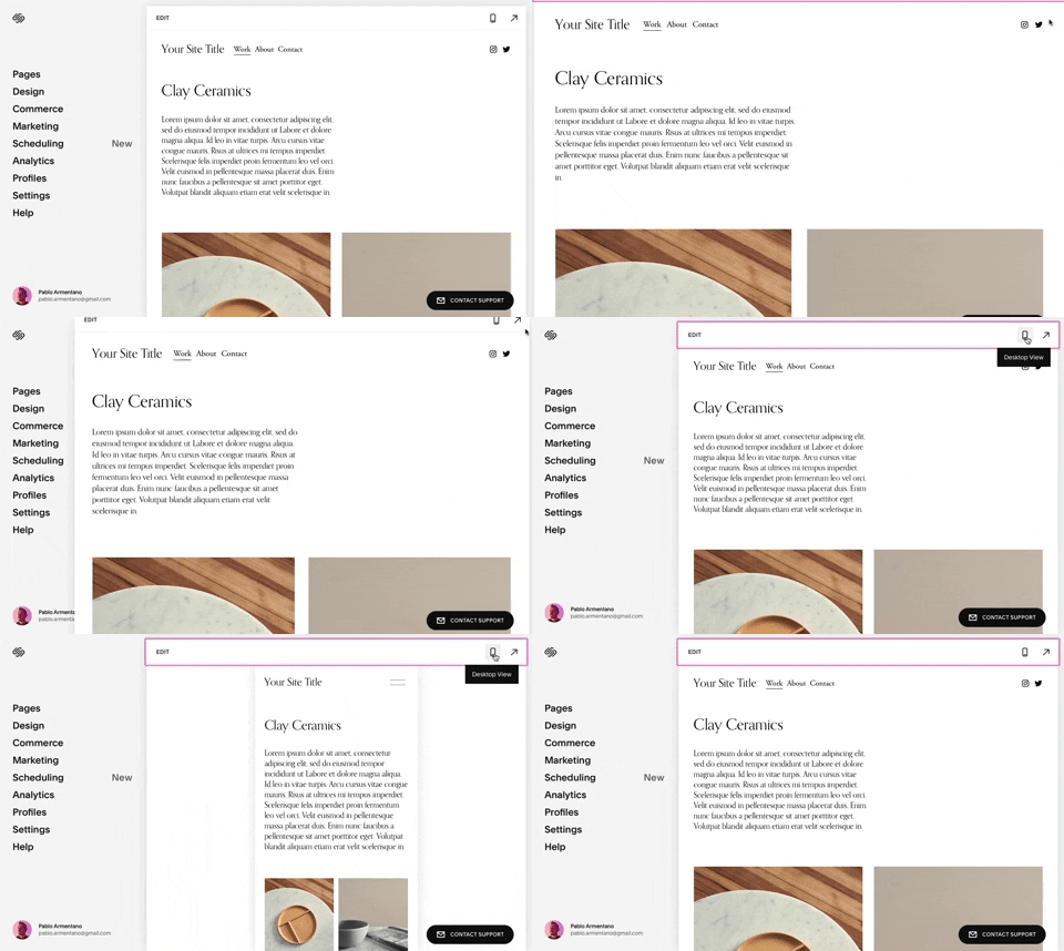
258. Adaptable Viewport Size | Squarespace
Users can dynamically adjust the content preview area, allowing them to visualize their website across various screen sizes for optimal responsiveness and design fidelity.
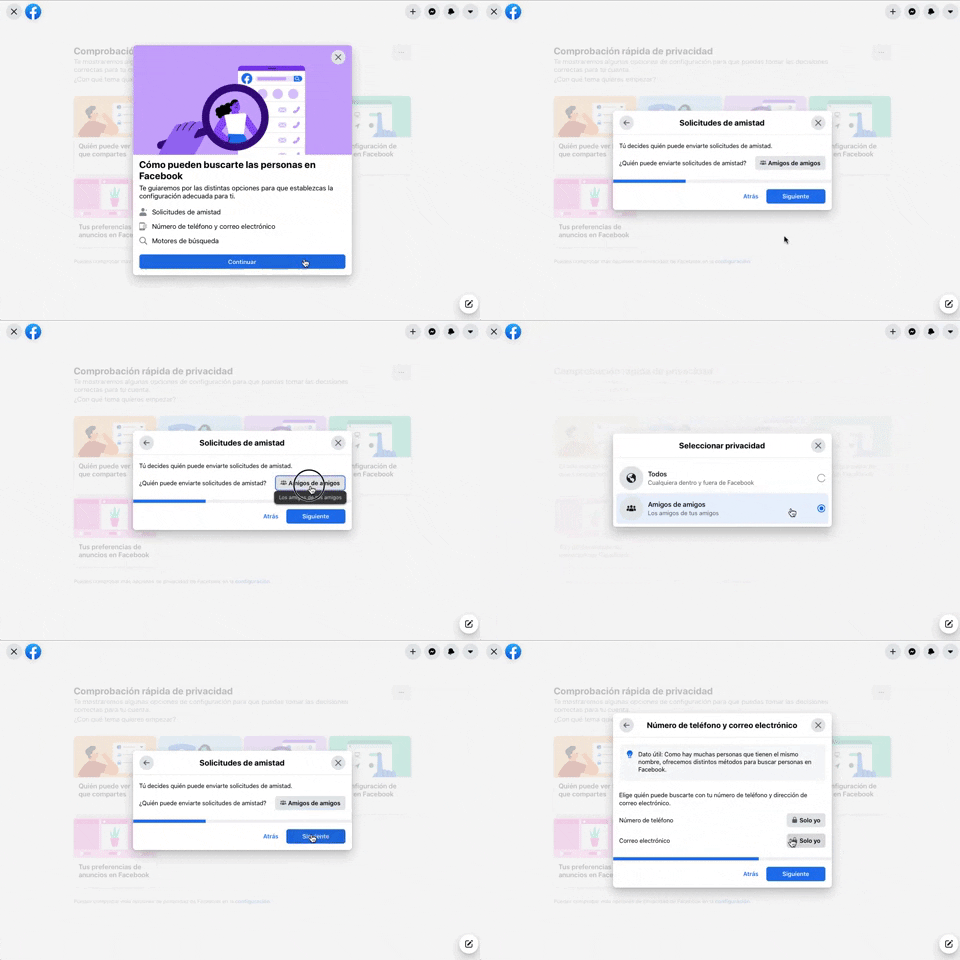
256. Modal Blackout w/ Forms & Steps | Facebook
This modal blackout pattern guides users through multi-step forms, ensuring focused input and clear progression for critical decisions.
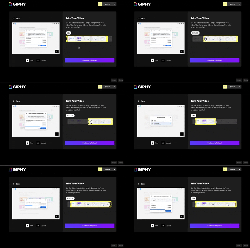
243. Trim Video Slicer | GIPHY
Users can precisely trim video segments using a draggable timeline with visual thumbnails, enabling efficient content selection and faster processing.

254. Toggle Sidebar Menu (Mouse) | Notion
Users can toggle the sidebar menu to hide or reveal navigation, optimizing screen space for content focus or quick pathfinding.
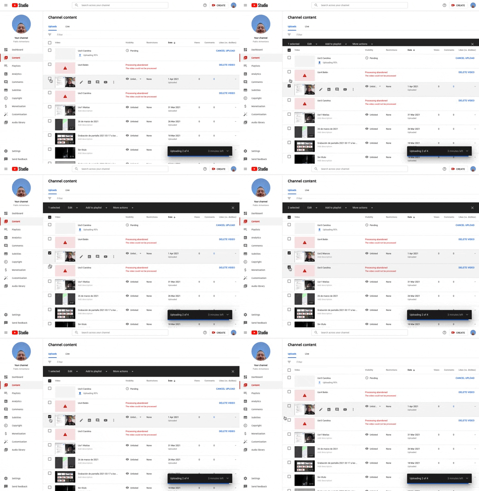
253. Table Row Selector | Youtube
Users can efficiently select multiple table rows by clicking checkboxes, enabling bulk actions and streamlining content management workflows.
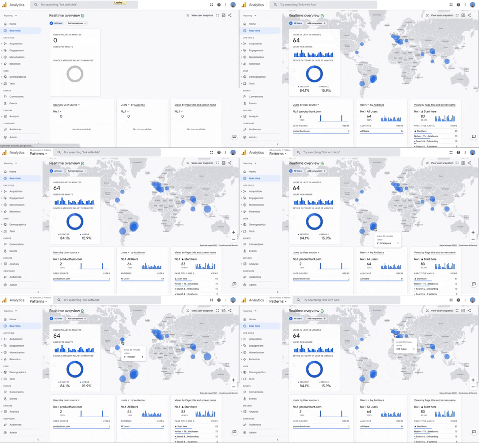
251. Progressive Layout Loader | Google Analytics
This pattern provides immediate visual feedback during page loads, progressively revealing content to reassure users that the system is actively processing their request.
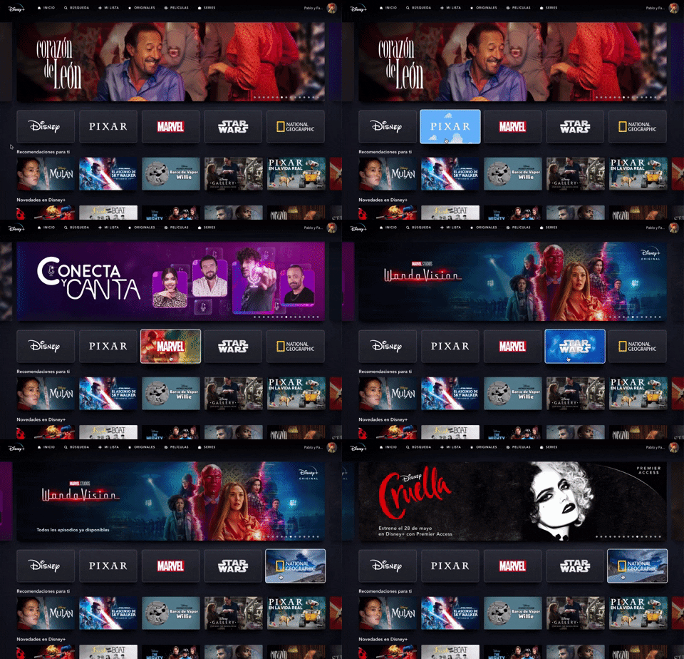
235. Background Animation (on Mouse Hover) | Disney+
This pattern uses a subtle background animation on hover to provide visual feedback, guiding users to interactive elements and enhancing discoverability.
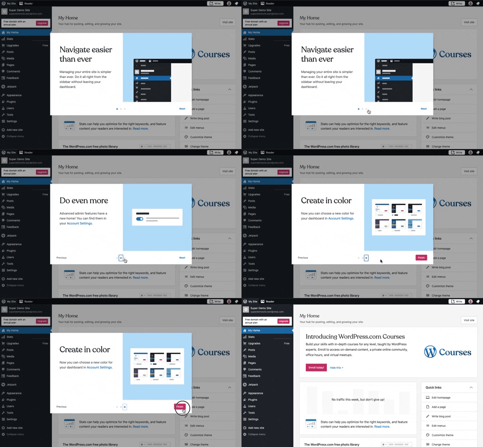
241. Modal Blackout w/ Steps | Wordpress
This multi-step modal guides users through key features with clear explanations and visual cues, ensuring a smooth onboarding experience.
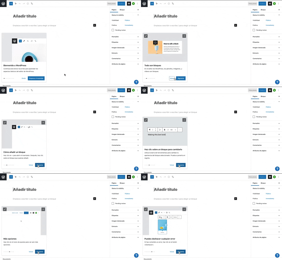
231. Floating Dialog Popover w/ Steps | Wordpress
This pattern guides users through a multi-step onboarding or feature tour with a dismissible, paginated floating dialog, enhancing discoverability and adoption.
_15.13.40.png?table=block&id=1afe487c-9060-4656-bab2-1545d8a9131e&cache=v2&width=960&quality=80)
229. Top Banner for Design Changes | Google Meet
A top banner informs users about new design changes, offering a clear link to "Obtener más información" for those seeking further details.
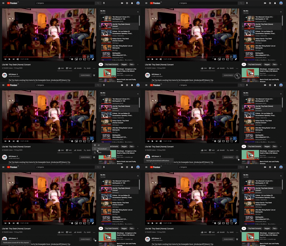
228. Notification Bell Status | Youtube
Users can quickly check and manage their notifications by clicking the bell icon, revealing a dropdown with recent alerts and an option to clear them.
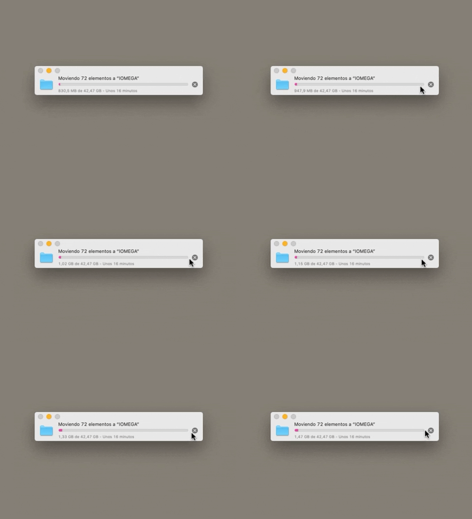
223. Stop Operation Progress | Apple
This pattern allows users to cancel an ongoing operation, like a file transfer, by clicking a clear "X" icon, providing immediate control over system processes.
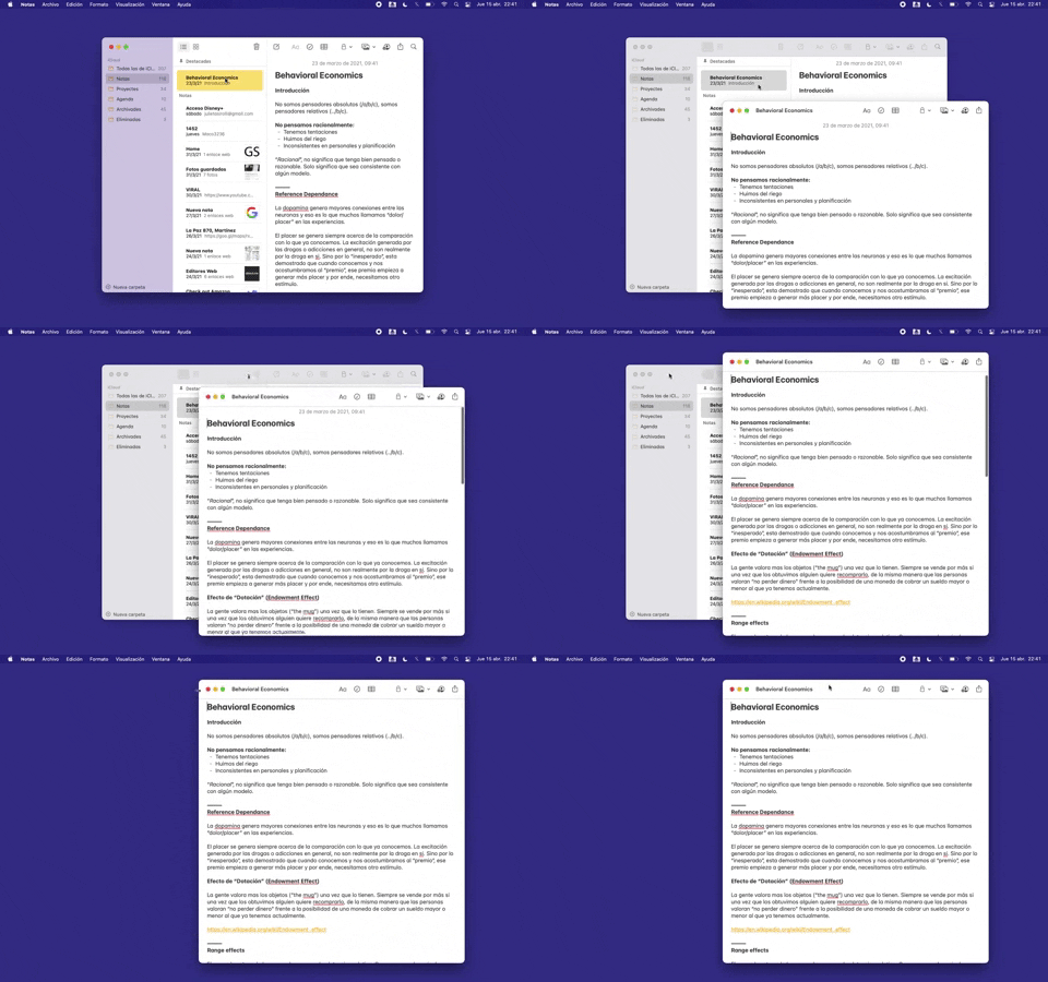
228. Open in New Window (Doble Click) | Apple Notes
Users can double-click an item to open its content in a new, independent window, enabling parallel viewing and enhanced multitasking.
_16.00.46.png?table=block&id=64a4f84d-2f69-4a08-86e4-8fa4fe9dcdf7&cache=v2&width=960&quality=80)
222. Floating Banner on User Input | Twitter
This pattern displays a floating banner over existing content, allowing users to compose new input without losing context of the underlying page.
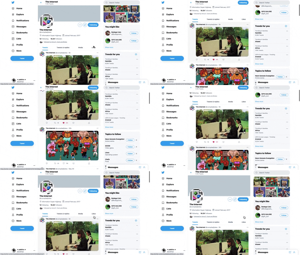
221. Stacked Action Button | Twitter
This pattern keeps primary actions readily accessible by stacking them vertically, ensuring users can quickly initiate key tasks without scrolling.
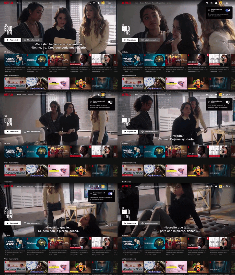
214. Information Toggle | Netflix
A UI pattern, exemplified by Netflix, that allows users to toggle the visibility of additional information, often within a navigation or content browsing context, such as revealing details about a video thumbnail via a dropdown or button interaction. Notable behavior: Click; Toggle; Expanded.
212. Automatic Background Animation (on Load)
217. Vertical Icon Menu (duplicated)
_23.27.14.png?table=block&id=bf025abf-95bb-4aef-8c5c-fbba4df15c67&cache=v2&width=960&quality=80)
208. Checkbox for User Confirmation | Google Workspace
A checkbox provides clear visual confirmation of a completed step, guiding users through onboarding or multi-stage processes with immediate feedback.
_22.41.58.png?table=block&id=230850ed-d5a6-4973-aa55-1576bc51cd42&cache=v2&width=960&quality=80)
145. Communication Preferences on Sign Up Flow | Google Workspace
This pattern gathers essential user contact information, including first name, surname, and email address, to facilitate account creation and future communication.
_19.04.51.png?table=block&id=c9b88fac-62bb-47ff-966c-7ff44c98dbdd&cache=v2&width=960&quality=80)
66. Actionable Empty State | Google Drive
This empty state provides a clear call to action, guiding users to initiate content creation and overcome initial blank canvas paralysis.
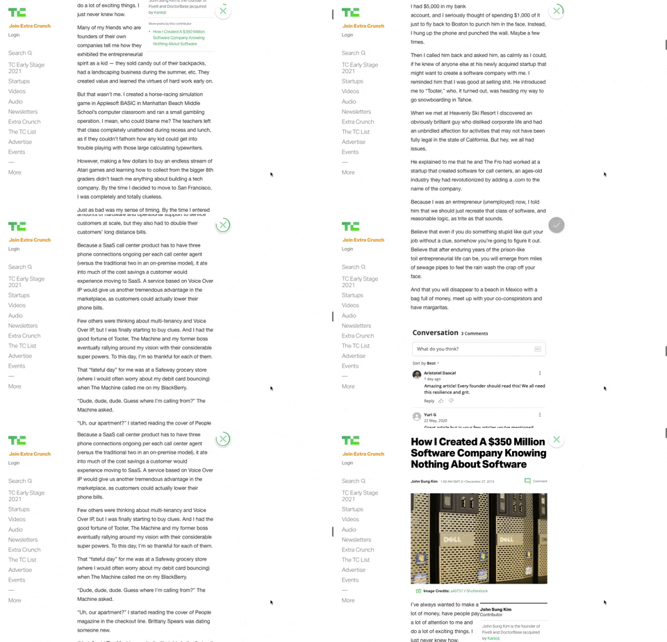
91. Bubble Status Reading | TechCrunch
This pattern provides a fixed, animated bubble that indicates reading progress, helping users understand their position within long articles and enhancing content appreciation.
_23.36.31.png?table=block&id=22445216-099c-4354-bc23-e3a914fa931f&cache=v2&width=960&quality=80)
83. Rewards Notification on Topbar | Stackoverflow
This pattern uses a notification badge on the top bar to alert users to new rewards, which can be viewed in a dropdown menu for easy access and appreciation.
_23.24.56.png?table=block&id=06f060c5-b44d-4082-9d62-b7c0189bcb6b&cache=v2&width=960&quality=80)
203. Password Expiration on Login | Mailchimp
This pattern prompts users to re-enter their password when a session expires, ensuring security while allowing them to quickly resume their work.

76. List Widget Customization | Apple Reminders
Users can effortlessly organize and filter list items by category and status, enhancing task management and focus within a customizable interface.
_12.03.02.png?table=block&id=308eebf9-c4aa-4879-a6b9-62970b2cc7d2&cache=v2&width=960&quality=80)
199. Sidebar Emptystate | Google Drive
This sidebar empty state introduces new features with a clear illustration and call to action, guiding users to discover and adopt new functionalities.

201. Modal Blackout w/ Actions | Google Chrome
This modal blackout pattern informs users about enhanced ad privacy, offering clear choices to manage settings or accept changes with distinct action buttons.

198. Take action on Music Claims | Youtube Studio
This pattern allows users to review copyright claims on their videos, understand the impact, and select appropriate actions to resolve issues.
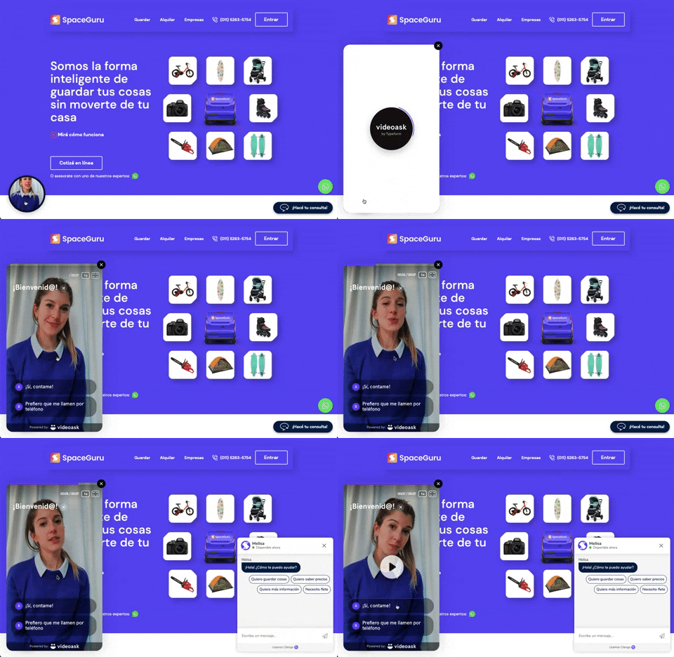
196. Video Story on Website | SpaceGuru
A floating video story provides users with a dynamic, engaging explanation of a product or service, enhancing understanding and encouraging further interaction.
_17.34.19.png?table=block&id=bb480019-2512-4680-a973-55a0f95a7000&cache=v2&width=960&quality=80)
148. Half-page Illustration Slider | Google Meet
This pattern uses a prominent, half-page illustration with a slider to visually guide users through key features or benefits during onboarding.

190. Ask Email for Playing Video
This pattern allows users to watch a free video episode, encouraging engagement and potential subscription by offering a taste of premium content.
_10.03.52.png?table=block&id=ad3ab3c8-6c9a-4429-9994-30afeb682d3f&cache=v2&width=960&quality=80)
189. Illustration (Meme) on Empty State | Webflow
This empty state uses a humorous meme and a guiding text to playfully direct users toward the primary action button, encouraging engagement.

188. Color shapes for Colour-blind | Trello
This pattern allows users to toggle a colorblind-friendly mode, enhancing accessibility by adding distinct shapes to color labels for improved differentiation.
_15.51.37.png?table=block&id=46f3fdc7-c396-4041-8e50-897e5014ee51&cache=v2&width=960&quality=80)
115. Browser Background Customization | Apple Safari
Users can personalize their browser's start page by selecting a custom background image, enhancing visual appeal and personal connection.
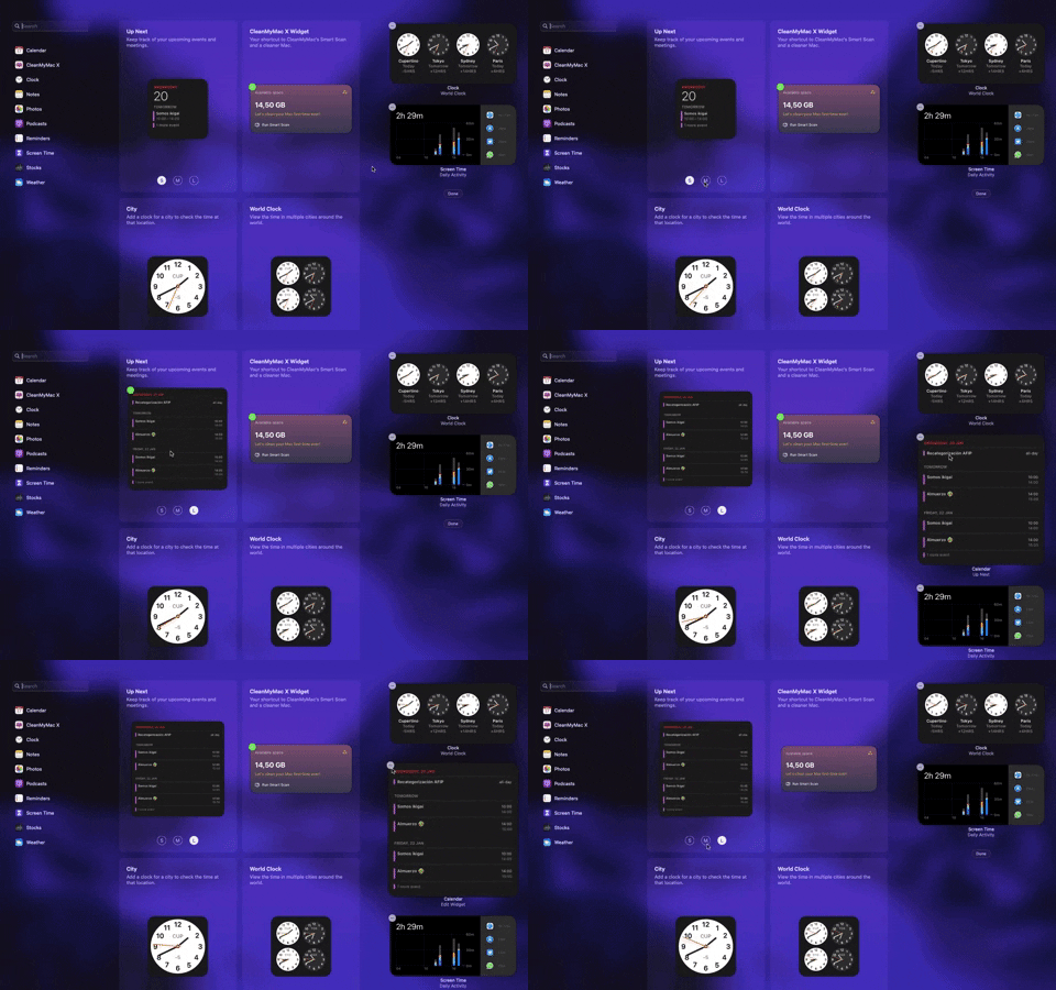
205. Full Screen Widget Customization | Apple
Users can easily personalize their full-screen widget layout by dragging and dropping elements, enhancing their dashboard's utility and visual organization.

182. Static Tooltip for Text Formatting | Google Sites
This pattern provides immediate, context-sensitive text formatting options via a static tooltip, enabling users to efficiently style selected content without navigating away.
164. Static Tooltip on Menu
A static tooltip on a menu provides immediate, contextual information for menu items. It typically appears on hover or focus, enhancing user understanding of an item's function or details without requiring an explicit click.

10. Dedicated Screen for Action Confirmation | Linkedin
This dedicated screen ensures users explicitly confirm or deny third-party access to their LinkedIn data, promoting transparency and control over personal information.

179. Stylized Feature Highlighting | Google Drive
This pattern uses an overlay with a stylized, partially transparent shape to draw attention to a new feature, offering options to engage or dismiss.
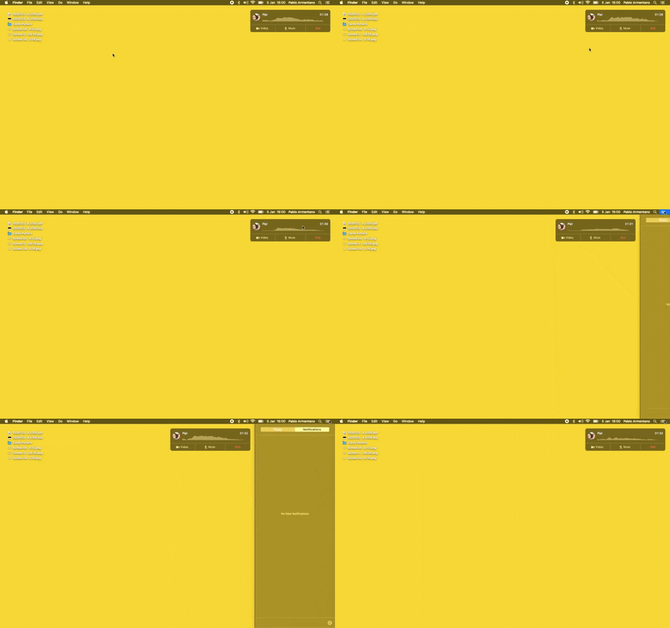
23. Floating Voice Widget with Actions | Apple
This floating voice widget provides persistent awareness of an active call, allowing users to quickly mute, unmute, or end the conversation without interrupting their workflow.

181. Plan Upgrade Flow | Linkedin
This pattern guides users through a personalized plan upgrade flow by asking about their intent, offering tailored recommendations, and allowing them to view all options.
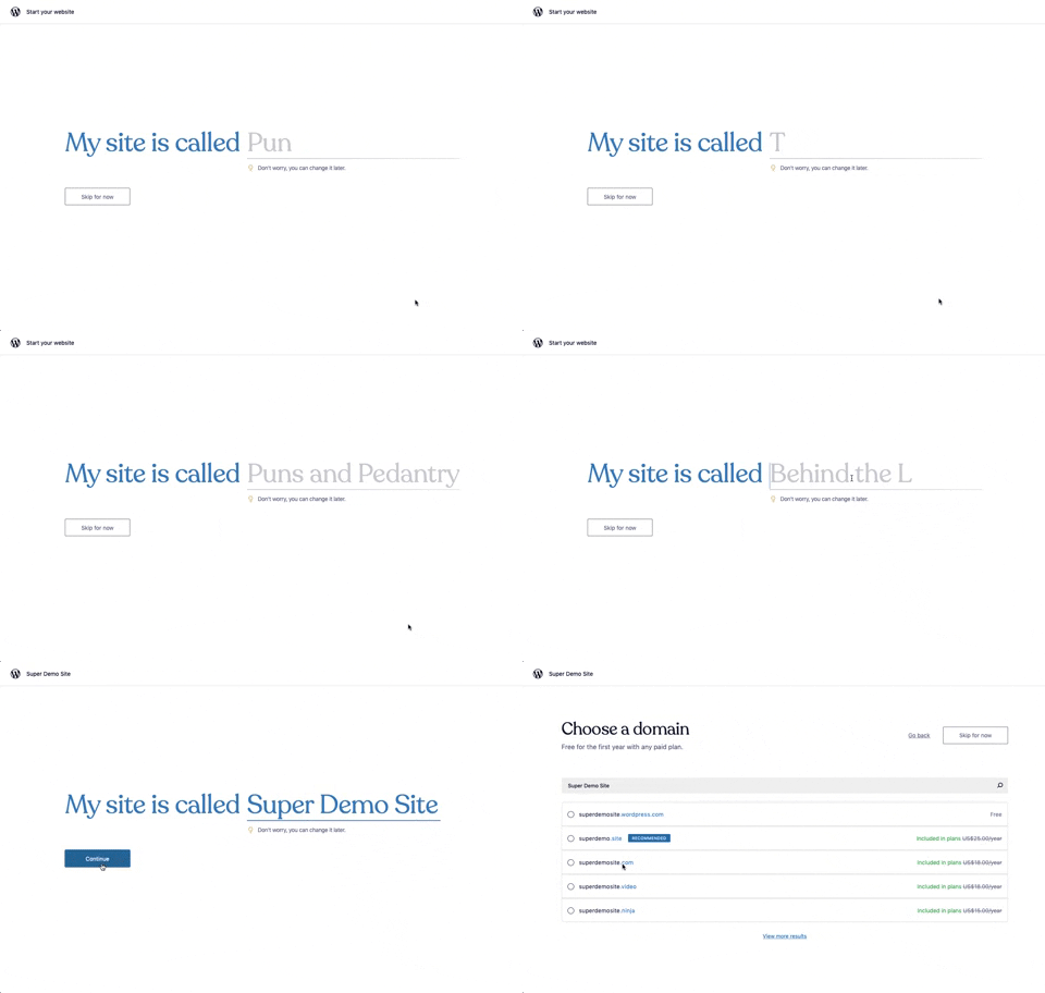
176. Natural Inputs with Suggestions | Wordpress
This pattern guides users to quickly name their site by offering real-time suggestions as they type, streamlining the initial setup process.

173. Share Invitation to Live Movie | Disney+
Users can invite up to six friends to a synchronized viewing experience, fostering shared enjoyment and social interaction around media content.

173. Onboarding Action Tooltip | Toggl
This onboarding action tooltip guides users to sign in with Google, streamlining the login process and reducing friction for new or returning users.
_00.32.31.png?table=block&id=99d40e79-c293-4cc7-a954-2f94c0c543a9&cache=v2&width=960&quality=80)
172. Search Results Recommendation | PedidosYa
This pattern uses a tooltip to highlight "Top Recommended Restaurants," informing users that the displayed selection is personalized based on proximity, order history, and ratings.

171. Multi-browser Sign In | Slack
This pattern streamlines desktop app sign-in by redirecting users to a web browser for authentication, then seamlessly returning them to the application.
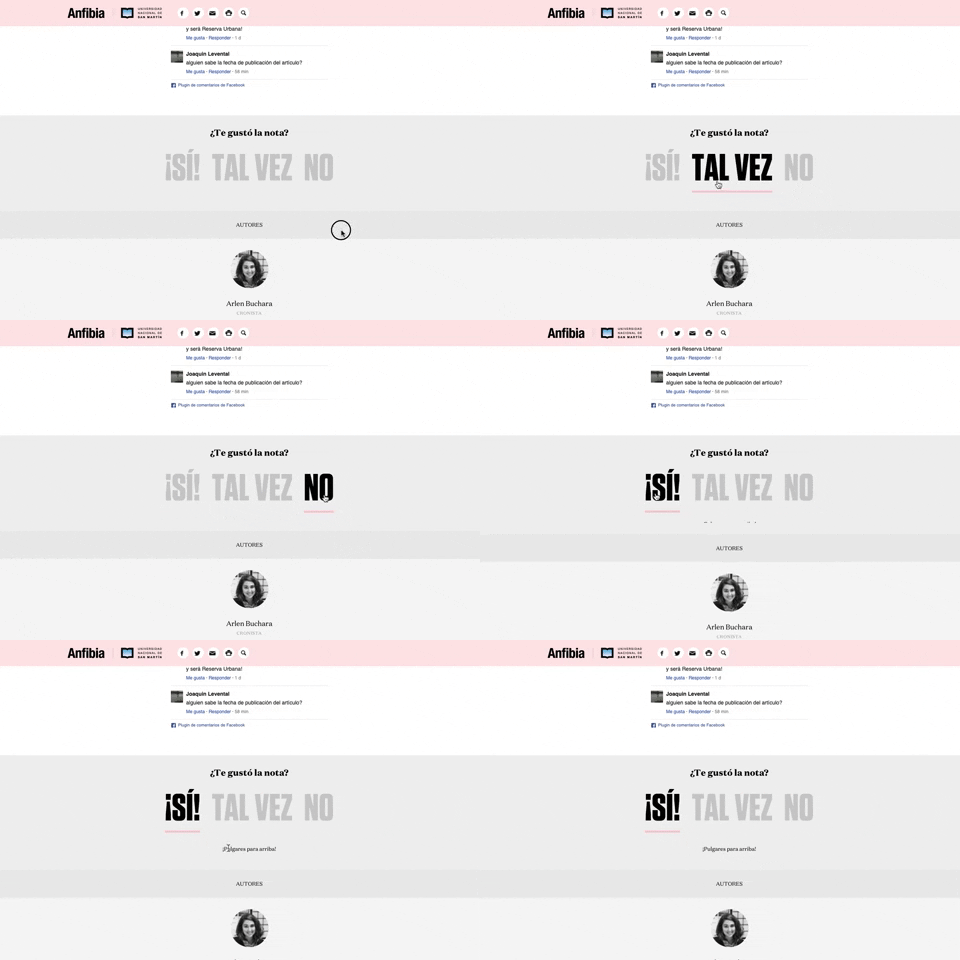
168. Natural Article Rating | Anfibia
This pattern allows users to quickly rate an article with a natural language choice, providing immediate feedback and enhancing content engagement.
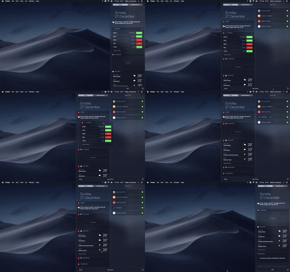
138. Widget Customization Sidebar (2-pane) | Apple
Users can quickly access and customize widgets in a two-pane sidebar, enhancing productivity by providing relevant information at a glance.
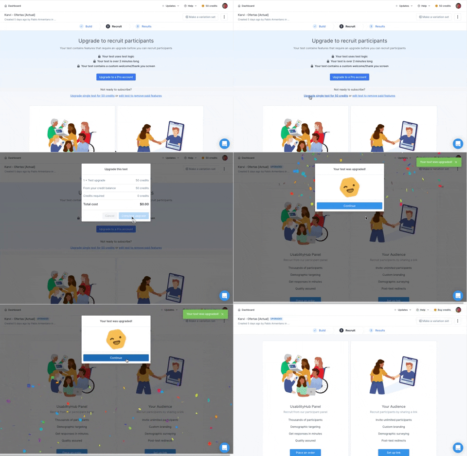
166. Animation: Confetti Explosion | UsabilityHub
A celebratory confetti explosion visually confirms successful user actions, enhancing positive reinforcement and delight.

203. Two-step Download Flow | Google Chrome
This pattern offers users a clear, two-step download process, first presenting a prominent "Download" button and then a secondary, fixed-on-scroll button for consistent access.
_16.58.20.png?table=block&id=dd8cc4d8-bc45-4c07-abde-f9342989a555&cache=v2&width=960&quality=80)
54. Modal for Language & Region Picker | Google
This modal allows users to efficiently search for and select a preferred language from a comprehensive list, enhancing personalization and accessibility.

160. Content Highlighting | Pocked
Users can highlight and save specific text within an article, enabling focused review and easy access to key information later.

159. Natural Language Form | Wix
This pattern describes a form interface that allows users to input information using natural language, often seen in onboarding flows on web and desktop platforms. Notable behavior: Natural language input; Form submission; Input validation.
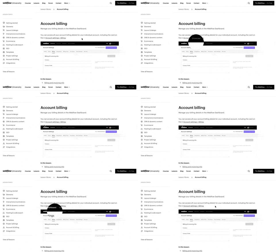
157. Magnifying Glass on Images | Webflow
Users can magnify embedded images by hovering over them, revealing crucial details and improving comprehension without navigating away.
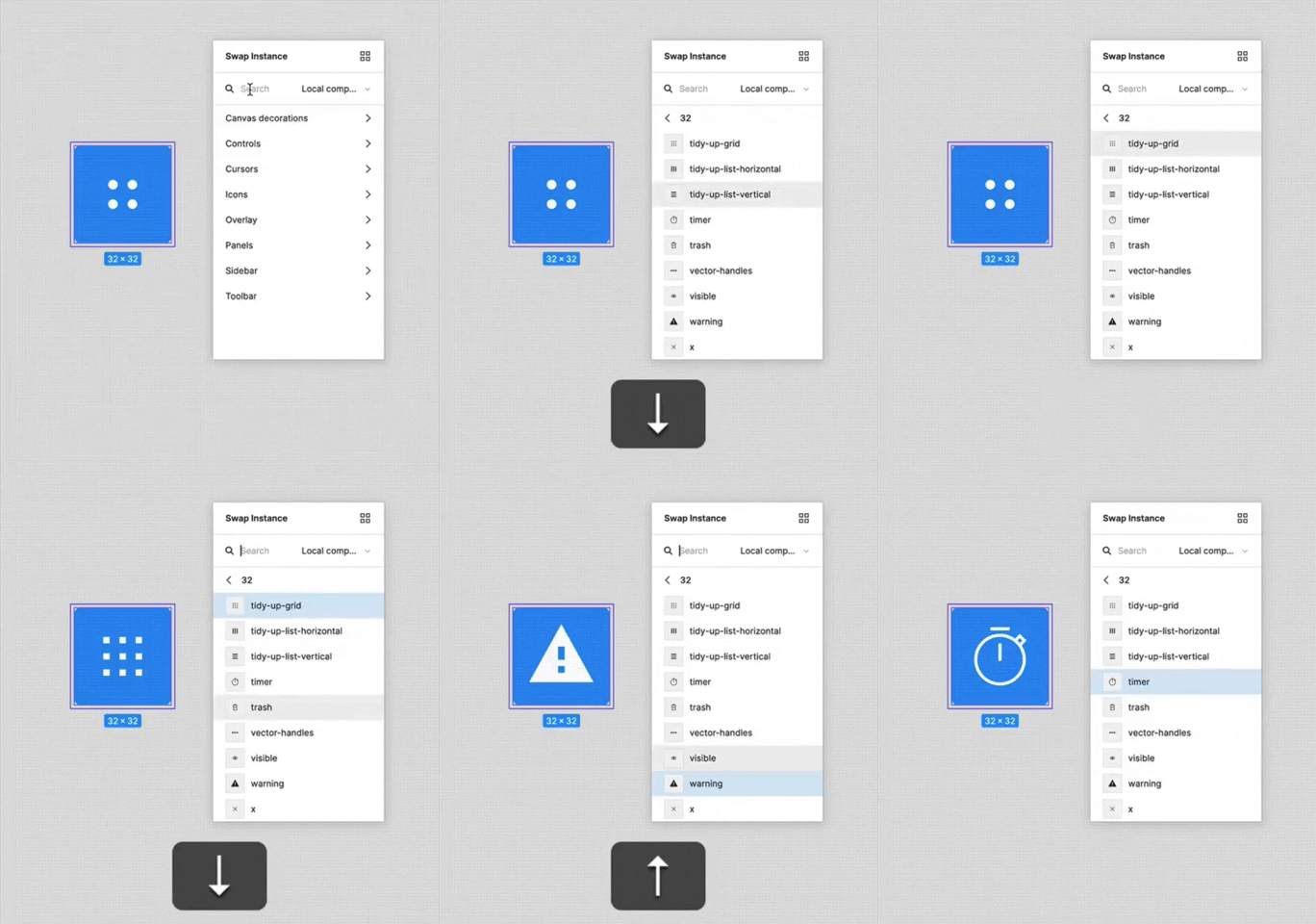
156. Keyboard Navigated Menu | FigmaEe
This pattern enables users to efficiently navigate and select menu items using keyboard arrows, enhancing accessibility and speed for power users.
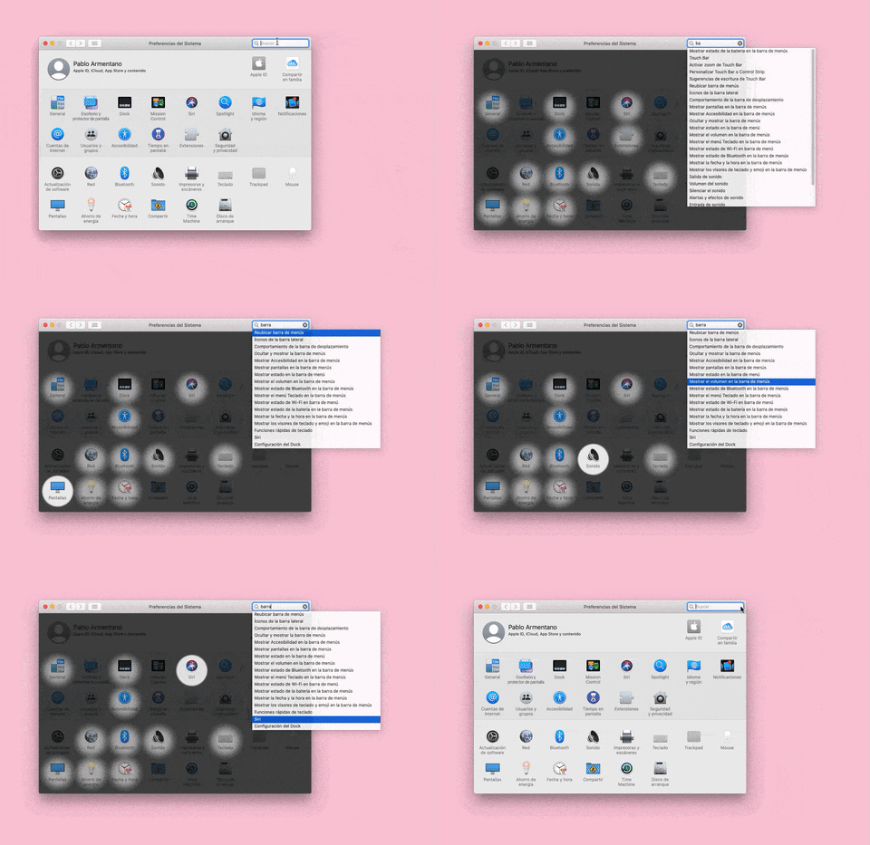
155. Menu Search Highlighting | Apple
This pattern highlights matching items within a dropdown menu as a user types into an associated search input, aiding in quick pathfinding and user selection.
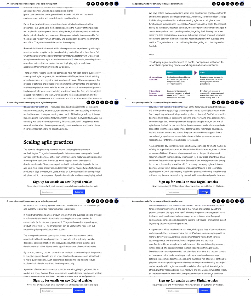
158. Bar Reading Status
A UI element, typically a bar, that visually indicates the user's reading progress or status within a document or page. Often integrated into a fixed navigation bar, it enhances awareness and helps users track their position. Notable behavior: Progress State; Fixed on Scroll.

149. Security Top-banner | Youtube Studio
This top-banner informs users about security risks and prompts them to take action, enhancing account safety and providing clear options to "Get Started" or "Dismiss".

148. Search Bar Fade-out | Youtube Studio
This pattern allows users to quickly search their content with a prominent search bar that reveals recent searches and relevant suggestions upon interaction.

29. General Form Errors Banner | Mailchimp
This banner provides a clear, concise message to users, offering an alternative action to streamline the process of adding multiple subscribers.

146. Floating Banner for Pricing/Subscription (3-tier) | Intelligencer
This floating banner offers a persistent, non-intrusive call to action for subscription, allowing users to easily access pricing details while browsing content.

144. Meeting Guest Warning | Google Meet
This pattern provides a host with immediate control over who joins a meeting, enhancing security and ensuring only authorized participants can enter.

143. Platform Sign-in/up | Dropbox
This pattern enables users to quickly create a new account or sign in to an existing one, streamlining access to platform features.
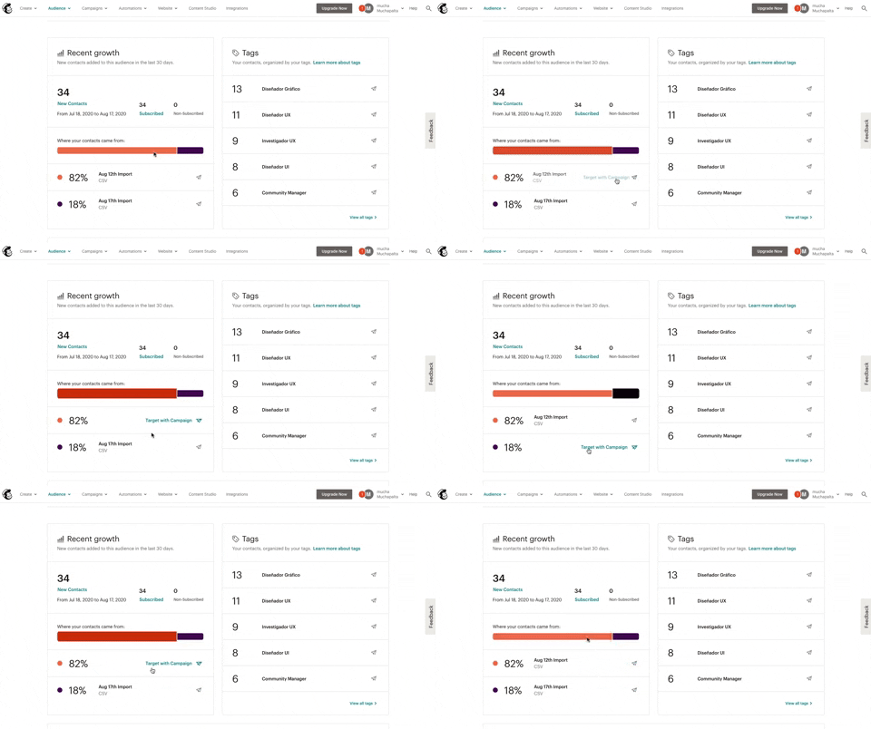
139. Synced Hover Animations | Mailchimp
This pattern uses synchronized hover animations to highlight related data points across different UI elements, enhancing user awareness and decision-making.
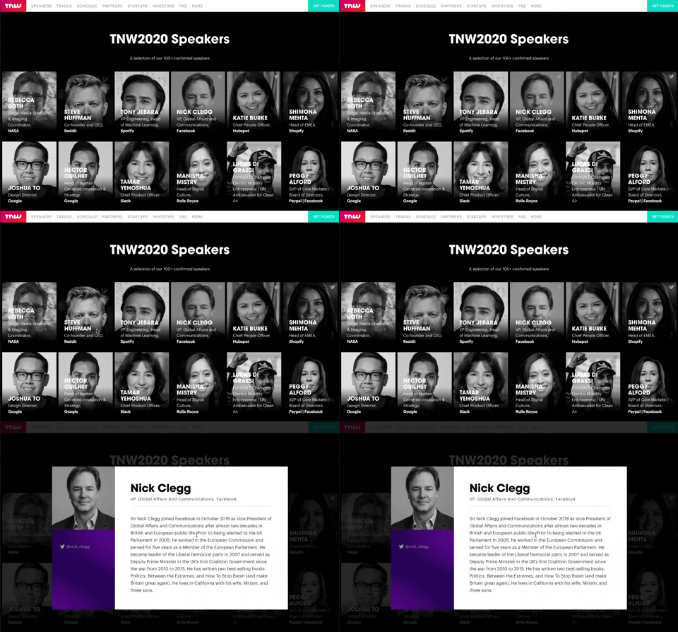
139. Transition: Zoom-Out on Hover
This transition subtly scales down an image on hover, providing visual feedback and highlighting interactive elements without obscuring content.

138. Read Modes
Users can adjust text size and font for optimal readability, enhancing accessibility and personalizing their content consumption experience.
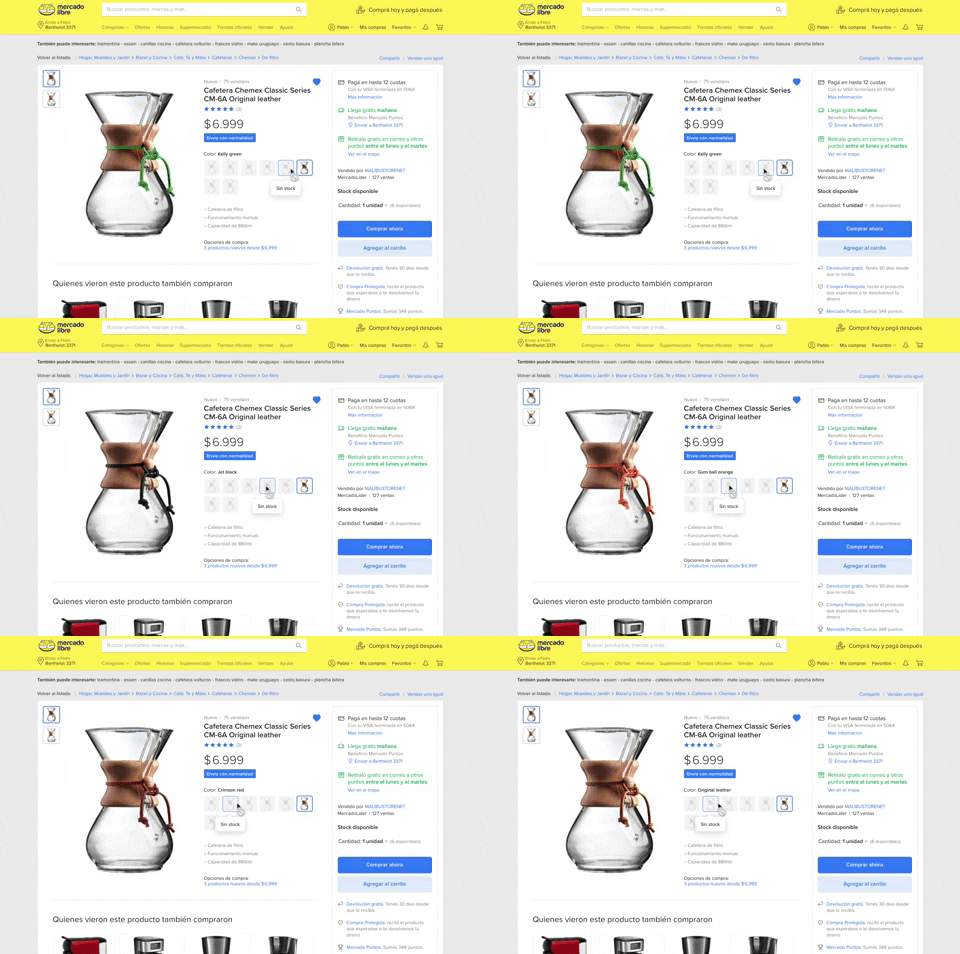
137. Product Color Selector | Mercadolibre
Users can effortlessly browse and select product variations by color, with immediate visual feedback and clear stock availability, streamlining their purchasing decision.

133. Website-Browser Notification Reminder | Facebook
This pattern reminds users that they can enable desktop notifications by clicking the lock icon in the browser's address bar.
132. Store Tooltip Reminders | Amazon
This pattern uses tooltips to provide reminders or onboarding information within a store context, often including hypertext links for further action or navigation. It is primarily designed for desktop web environments to enhance user awareness.
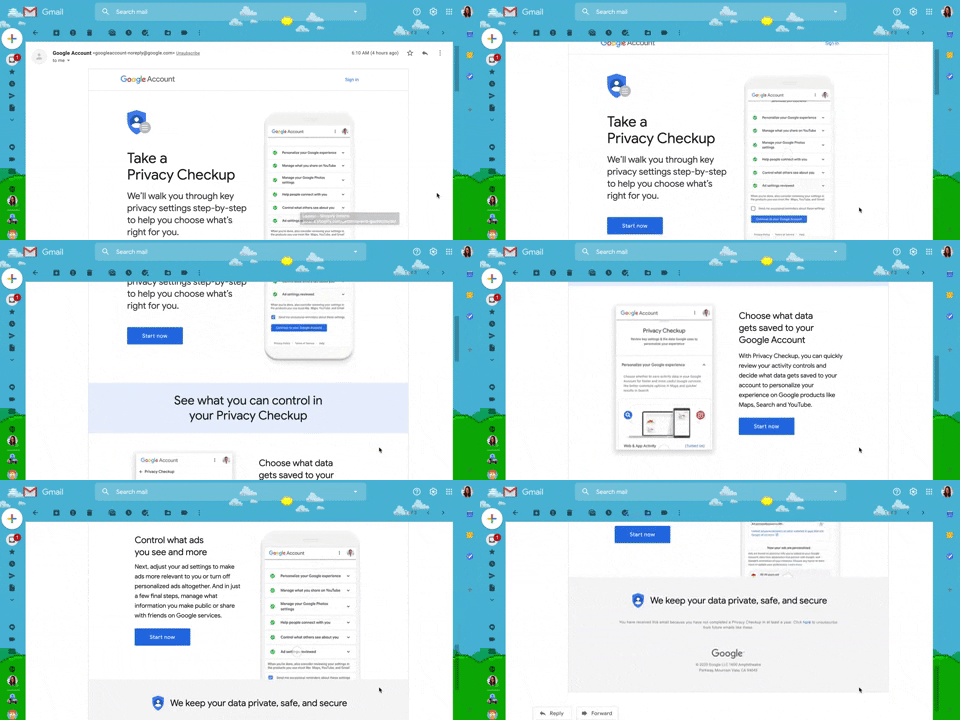
130. Animated Email Page | Google Gmail
This pattern uses subtle animations within an email to guide users through a privacy checkup, enhancing engagement and clarity for important account actions.

126. In-front Site Terms | WeTransfer
This pattern presents a prominent, in-front modal to users, requiring explicit acceptance of terms and conditions before they can proceed with site interaction.

125. Product Highlights
This pattern uses interactive hotspots on a product image to reveal key features and benefits, allowing users to explore details without leaving the main page.

124. Critical Changes Warning | Slack
This pattern provides clear warnings and explanations for critical actions, ensuring users understand the irreversible consequences of their choices before proceeding.
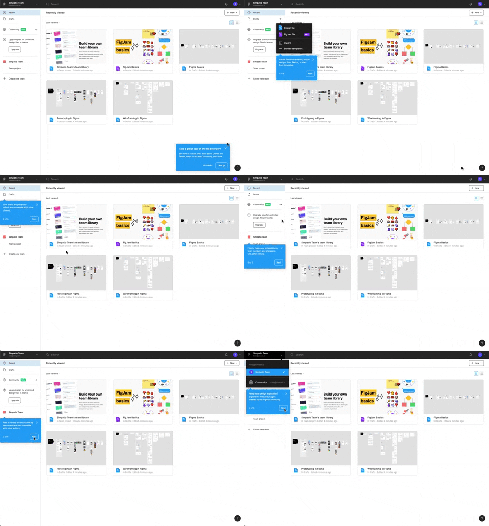
122. Automatic Popover with Steps | Figma
This pattern guides users through key features with a multi-step popover, ensuring a smooth onboarding experience and quick feature discovery.
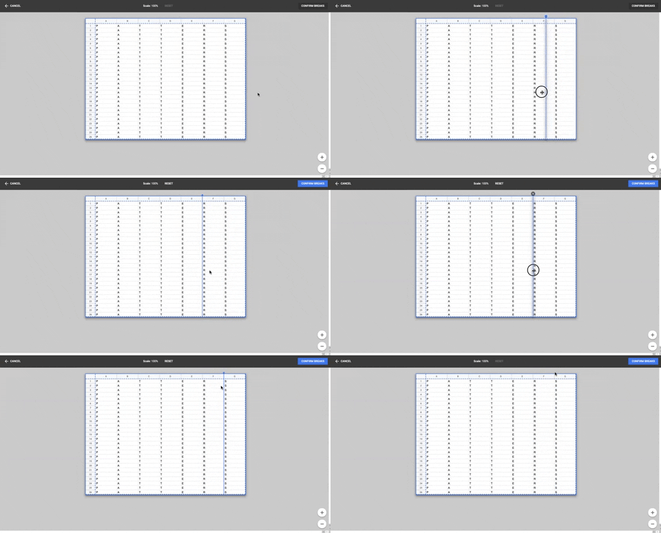
86. Table Column Slicer | Google Drive
Users can precisely define column breaks within a data table, enabling flexible data organization and improved readability for complex datasets.

119. Site Cookie Management | PrestaShop
This pattern presents a clear cookie consent pop-up, allowing users to accept or manage cookie preferences for a transparent and compliant browsing experience.

77. Sign Up Flow with Pricing Step | Whereby
This pattern guides users through a multi-step signup process, including a clear pricing selection, to onboard them efficiently and transparently.

12. Pricing Comparison (3-tier) | Framer
This pattern helps users compare three distinct pricing tiers, highlighting features and costs to facilitate an informed subscription decision.
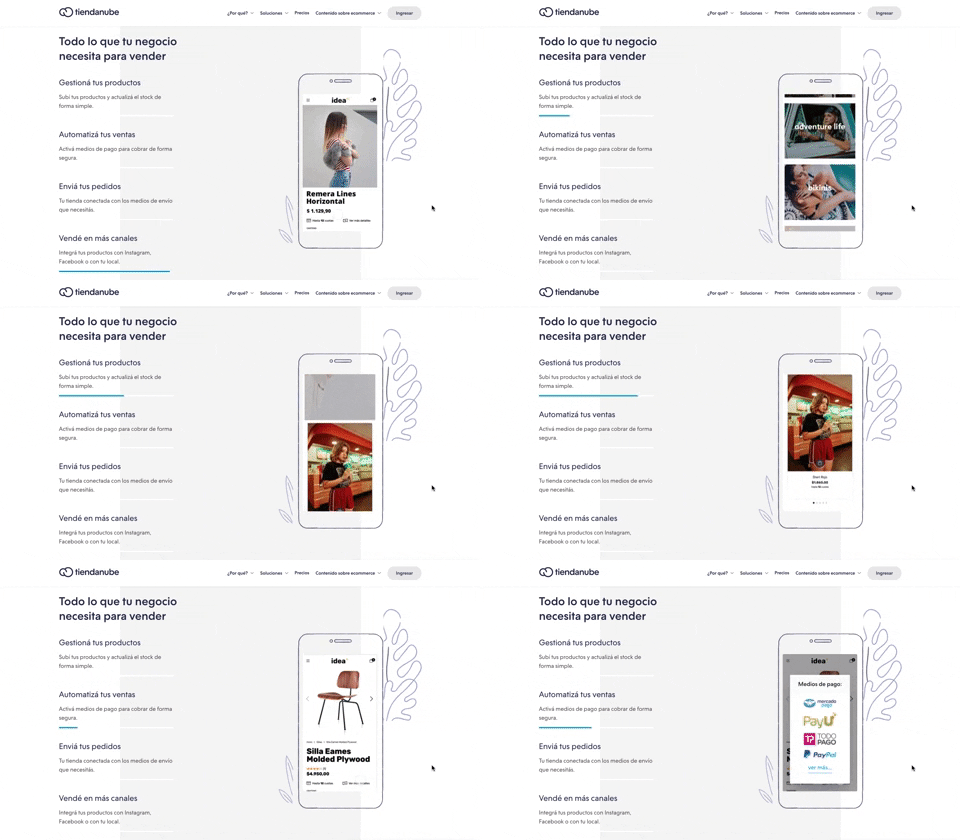
116. 2-pane Automatic Slider | Tiendnube
This pattern automatically cycles through content in a two-pane layout, allowing users to passively discover key features or products without direct interaction.

115. Hover Instructions | Buffer
This pattern uses a placeholder text field to prompt users to share content, enhancing discoverability and guiding their initial interaction.

114. News Swiper | MIT
This pattern allows users to effortlessly browse a carousel of news or definition cards, providing quick access to multiple content pieces with clear navigation.

112. Share on Social Networks | MIT Sloan
This pattern enables users to effortlessly share content across popular social networks and via email, boosting content reach and engagement.

111. Magazine Subscription | MIT Sloan
This pattern allows users to compare subscription tiers and their benefits side-by-side, enabling an informed decision before committing to a purchase.

116. User Feedback on Web Content | Google Search
This pattern allows users to provide feedback on web content, enabling them to report issues or suggest improvements directly within the interface.

105. Floating Tooltip Blackout | Zoho Mail
This pattern presents a floating tooltip with a dim overlay, guiding users to initiate or schedule a meeting with clear options and keyboard shortcuts for efficiency.

104. Creating & Customization Workspace | Slack
Users input their company or team name into a text field, with a character counter providing real-time feedback and ensuring compliance with length requirements.

189. Feature Preview on Menu | Github
This pattern highlights new or experimental features within a dropdown menu, allowing users to discover and opt-in to upcoming functionalities.

207. Downloading Desktop App | Loom
This pattern informs users that a desktop application is downloading, providing clear instructions and a progress indicator to manage expectations and guide the next steps.

100. Floating Tooltip/Dialog | Google Sites
A floating tooltip or dialog provides contextual information or prompts user action without disrupting the main workflow, enhancing discoverability and engagement.

99. Topbar Dropdown Menu | Letterboxd
Users can quickly access account-specific options and site navigation through a persistent topbar dropdown menu, enhancing pathfinding and personalization.

98. Features on Signing-up | Vercel
This pattern showcases key product features and social proof alongside clear sign-up options, helping users quickly understand value and commit.

96. Encouraging Allowing Ads | WeTransfer
This pattern respectfully requests users to disable their ad blocker, explaining that the service is free to use but relies on ads for operation.
190. Delete Confirmation w/ Name (moved)
A modal dialog pattern requiring the user to explicitly type the name of an item to confirm its deletion, enhancing user awareness and preventing accidental data loss. Notable behavior: Text input; Button click (confirm/cancel); Modal open.

94. Top Primary Banner | Google Ads
A top primary banner provides crucial, timely information and calls to action, ensuring users are immediately aware of important updates or opportunities.

93. Top Secondary Banner | PATREON
This banner provides timely, relevant information and a clear call to action, ensuring users are aware of important updates or opportunities.

91. Settings for Account Privacy | Twitter
Users can manage their account's discoverability and contact settings, controlling who can find them via email or phone number for enhanced privacy.

90. In-product Top Primary Banner | mailgun
This banner provides critical, timely information to users at the top of the page, ensuring high visibility for important updates or alerts.

89. Bottom Page Fake-News Warning
This pattern provides a dedicated section at the bottom of a page to combat misinformation by directing users to reliable, expert-backed content.

88. Fake-News Warning | Medium
This warning banner informs users that content is not fact-checked, promoting critical thinking and directing them to authoritative sources for sensitive topics.

41. Context Banner Card | Google Gmail
A context banner card proactively alerts users to potential risks or important information within an email, empowering them to make informed decisions about interaction.

84. Pandemic Warning Message on Map | Google Maps
This pattern displays a prominent, actionable warning message within the map's search results, ensuring users quickly access critical, up-to-date information about a pandemic.

83. Banner on News Page | Medium
A prominent banner provides users with critical, timely information and direct links to trusted external resources, enhancing awareness and facilitating access to vital updates.

42. Modal for Tags Editing | Google Keep
This pattern allows users to efficiently manage and organize their content by editing, adding, or removing tags through a dedicated modal interface.

81. Saving Favourites as Guest | MercadoLibre
Users can easily save items to a favorites list by clicking a heart icon, even as a guest, promoting future engagement and purchases.

80. Input Validation Status | Noun Project
This pattern provides immediate feedback on user input, guiding them to correct errors and successfully complete forms or tasks.

79. Out of downloads | Freepik
This pattern informs guest users they've reached their daily download limit, prompting them to register or log in to continue accessing resources.

63. Contextual Back Navigation Bar | GitHub
This pattern provides a clear, persistent navigation bar at the top of the screen, allowing users to quickly return to previous views or access key sections.

61. Section Dropdown
Users can select a specific version of a product or guide from a dropdown menu, ensuring they access relevant, up-to-date information.

57. Encouraging Newsletter Sign-up | IDF
This pattern uses a modal dialog to offer a free ebook in exchange for an email address, encouraging newsletter sign-ups and lead generation.
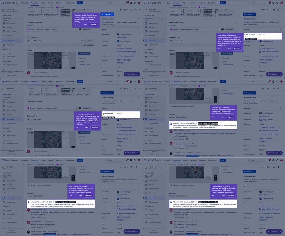
56. Floating Tooltip with Steps and Blackout | JIRA
This pattern guides users through multi-step onboarding or feature discovery with a focused, sequential tooltip and a dimmed background.

55. Contextual Form Input Errors | Zoom
This pattern provides immediate, contextual feedback for form input errors, guiding users to correct mistakes efficiently and complete their tasks without frustration.

54. Browser Reader Mode | Apple Safari
Users can activate Reader Mode to strip away distracting elements like ads and navigation, focusing solely on the article's content for improved readability.

50. Food Order Receipt | Uber Eats
This pattern provides a clear, detailed summary of a food order, including items, prices, and delivery information, ensuring users have a complete record of their purchase.

47. Workspace Types | Notion
Users select their intended use case from distinct options, streamlining their onboarding experience with tailored content and features.

45. Webapp Video Loader | Youtube
This loader provides visual feedback to users that content is loading, maintaining engagement and reducing perceived wait times by showing the layout structure.

43. File Upload Status | Google Drive
This pattern provides real-time feedback on file upload progress and status, allowing users to monitor, manage, and resolve potential issues efficiently.

39. Dismissed Bottom Popup | Youtube
This dismissible bottom-anchored popup informs users about critical information, offering options to dismiss or learn more without disrupting primary content viewing.

38. Video Statusbar | Youtube
The video status bar provides crucial playback controls and time information, enabling users to precisely navigate and manage their viewing experience.

37. Branded Illustrations for Reinforcement | Mailchimp
This pattern uses a branded illustration within a modal to reinforce a user's action, providing a moment of delight and confirmation before a critical step.

36. Contact Segmentation
Users select target audience segments from predefined categories, enabling personalized content delivery and streamlined lead qualification.

35. Do Not Leave Popup | Google Ads
This pattern presents a modal dialog to users, highlighting the potential negative impact of an action to encourage reconsideration and prevent unintended consequences.

34. Premium gimmicks | Linkedin
This pattern entices users to upgrade to a premium subscription by blurring out valuable content, like profile viewers, and offering a free trial to unlock it.
16. Incremental pricing
Incremental pricing presents cost adjustments based on user selections or progression through steps. Users make decisions via toggle fields and buttons, influencing the final price.

32. Makes me feel | Mailchimp
This feedback form allows users to express their overall sentiment and provide detailed suggestions for improvement, fostering a direct channel for product enhancement.

31. Page Blocker Edition Warning | UsabilityHub
This pattern warns users about potential data loss when editing an active test, offering options to proceed cautiously or duplicate the test to preserve existing responses.

147. Linked Settings for User Permissions | Google Analytics
This pattern allows users to quickly understand and modify granular permissions for a selected user, ensuring precise control over access levels.

29. Wizard Generation Profile | About.me
This wizard guides users through a series of choices, enabling them to quickly define the purpose and desired interactions for their personal profile page.

28. Find your Workspace | Slack
Users enter their email to receive a confirmation link, enabling them to quickly find and join existing Slack workspaces or create new ones.

93. Welcome Screen with Background
This welcome screen uses a captivating background image to introduce new features, guiding users to engage with updated content immediately.

25. Apple - Two-factor Auth | Apple
This pattern enables users to securely access their Apple ID by entering their email, with an option to remember the account for future convenience.

63. Window Maximize Options (on Right Click) | Apple Music
Users can right-click the maximize button to access a dropdown menu, enabling quick window arrangement options like full screen or tiling to the left or right.

23. Suscription gimmicks | IDF
This pattern helps users choose a subscription plan by clearly comparing features and pricing, often leveraging social proof to build trust and encourage conversion.

22. First Mailing Campaign | Mailchimp
This onboarding flow guides new users through initial profile setup, collecting essential personal details to personalize their experience and facilitate future interactions.

21. Advanced Color Picking | Apple
This pattern allows users to precisely select colors from a spectrum, adjust saturation and brightness, and save custom swatches for efficient reuse.

36. Scroll Required for User Confirmation | GoogleS s
This pattern ensures users fully review important terms by requiring them to scroll through content before enabling a confirmation action.

19. Email Validation on Sign Up | Twitter
This pattern enables users to create an account by providing their name and email, with real-time validation ensuring data accuracy and a smooth onboarding experience.

6. Modal Blackout w/ Form | Vercel
This modal prompts users to log in with an existing account, offering clear options to proceed or use an alternative, ensuring a smooth authentication flow.

16. Double Account Entrance | Dropbox
This pattern offers users a clear choice between creating a new account or signing in, streamlining access and reducing decision fatigue.

14. App Bottom Popup | Dropbox
This pattern provides quick access to recent activity and featured items within a compact, dismissible overlay, enhancing user efficiency.

11. Likert in chat | Intercom
This pattern allows users to quickly rate a conversation using a Likert scale of emoji faces, providing immediate feedback within the chat interface.

150. Split OS Screens | Apple
Users can efficiently manage multiple tasks by splitting their operating system screen into distinct, resizable windows, enhancing productivity and multitasking capabilities.

10. Background Ads | WeTransfer
Background ads leverage the entire viewport to display engaging, full-screen advertisements, often featuring high-quality imagery or video, to capture user attention.

7. Accessibility Adjustments | sitepoint
The accessibility icon provides users with quick access to adjust display settings, enhancing readability and overall site usability.

117. Side Status Notification | Whatsapp
This pattern provides a persistent, non-intrusive notification in a sidebar, informing users of available updates and offering a direct call to action.

5. Website Promotional Top Banners | InVision
A prominent top banner informs users about new features or promotions, encouraging engagement with a clear call to action.

4. Floating Status Banner | Google Gmail
A floating status banner presents non-blocking, transient messages to users, typically positioned at the top or bottom of the viewport. It delivers immediate feedback or critical updates without interrupting the user's primary workflow.

3. Search Options on Focus | Apple Safari
Upon focusing the search bar, users are presented with a curated list of favorites, frequently visited sites, and Siri suggestions, streamlining navigation and discovery.

2. Feed Filter Tabs | Youtube
Users can quickly filter their video feed by topic using a horizontal row of clickable tabs, enhancing content discovery and personalization.