Patterns for Accessibility & Personalization
- Desktop (70)
- Tablet (1)
- Mobile (14)

409. Customize Toolbar (2-pane interaction)
Users can personalize their toolbar by toggling specific buttons on or off, enhancing workflow efficiency and tailoring the interface to their needs.

404. Sidebar Backdrop Menu
This pattern provides a full-height, animated sidebar menu that slides in from the left, offering clear navigation options while dimming the main content for focused interaction.

402. Transition: Zoom-to-Dock for Minimize
This transition visually guides the user as a window minimizes, smoothly shrinking and moving to its new location in the dock, enhancing spatial awareness and system feedback.

389. Text Edit Inline Input
Users can directly edit text content in place, providing a seamless and efficient way to update information without navigating away.

388. Drag & Drop and Checkbox to Select Multiple Item
Users can efficiently organize multiple items by dragging and dropping them into a target category, enhancing content management and task completion.

379. Dropdown Filters
Dropdown filters enable users to quickly refine content views by selecting specific criteria from a compact, accessible menu.
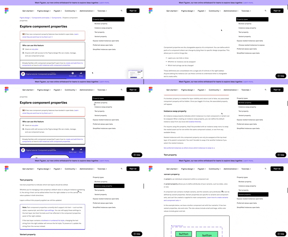
360. Page Outline Menu
This menu provides an interactive outline of page content, allowing users to quickly navigate to specific sections and understand the page structure at a glance.
Uink Digital Agency
Specilist on building and launching digital products. Let's talk!
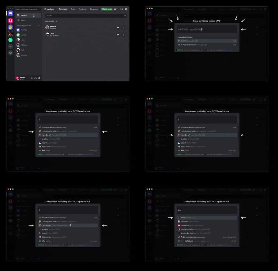
362. Modal Blackout w/ Form & Animations
A modal with a blackout overlay and animated transitions provides a focused input form, ensuring users can quickly add friends without distraction.
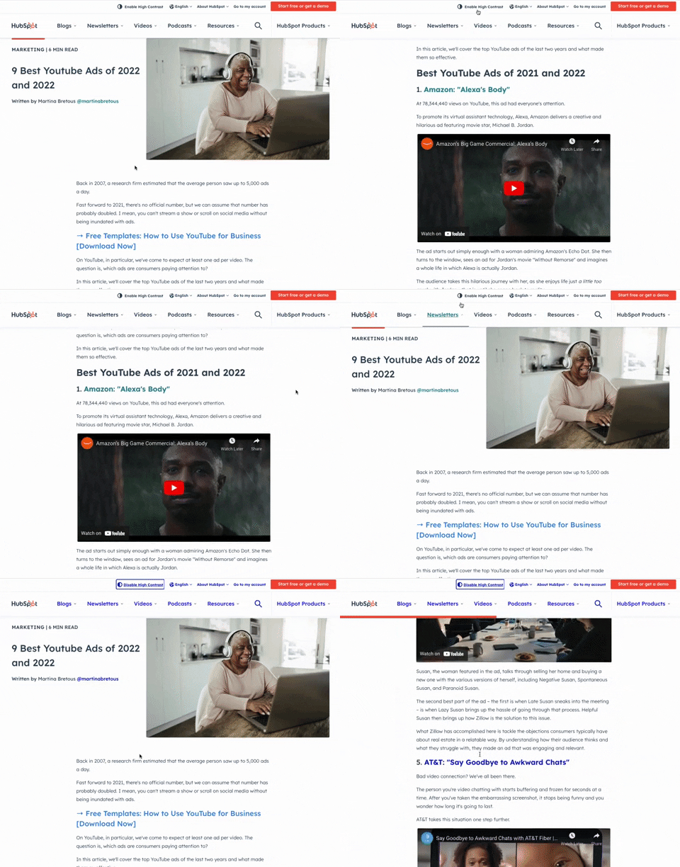
349. HubSpot - Toggle High Contrast
Users can toggle high contrast mode to improve readability and accessibility, enhancing the visual experience for those with low vision.

359. Toggle List/Grid View
Users can switch between list and grid views to optimize content display for their preference, enhancing readability and navigation.
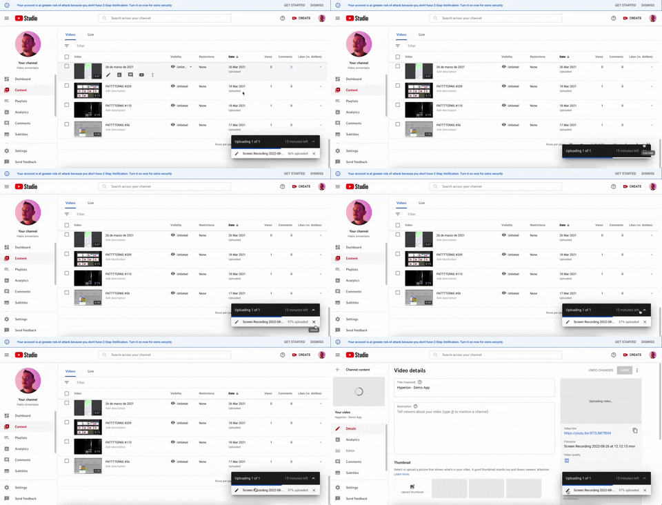
347. YouTube - Floating Progress Bar
This floating progress bar provides persistent, non-intrusive feedback on background tasks, allowing users to monitor progress while continuing other work.
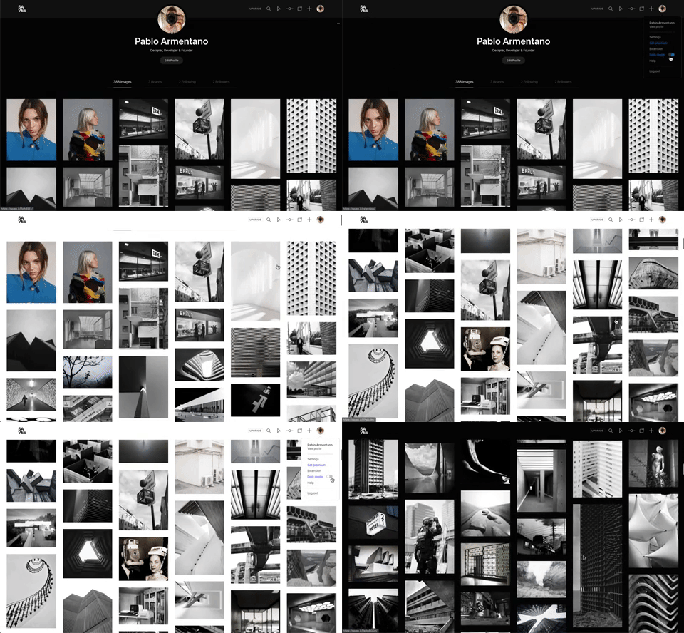
342. Savee - Light/Dark Mode Switcher
Users can instantly toggle between light and dark display modes, enhancing visual comfort and accessibility based on their preference or environment.
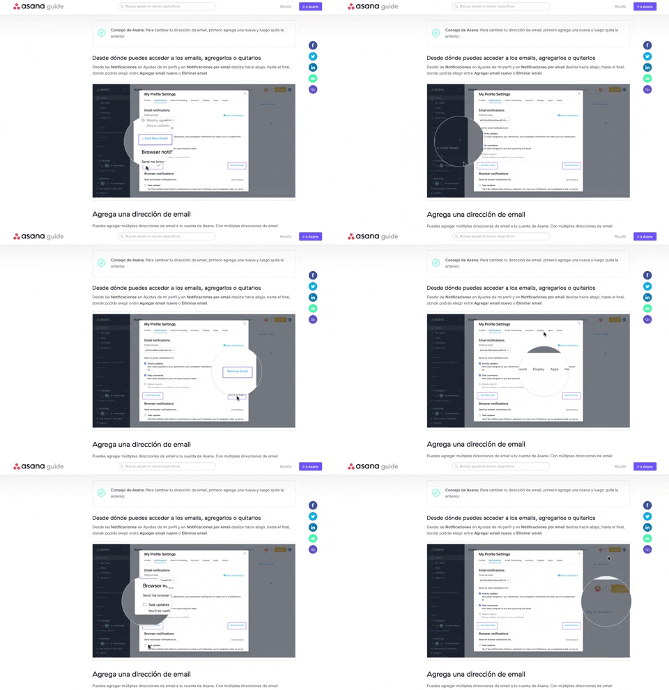
340. Asana - Zoom/Magnifier Over Image
This pattern enhances clarity by dynamically magnifying specific image regions, guiding users to key details and improving comprehension of visual instructions.
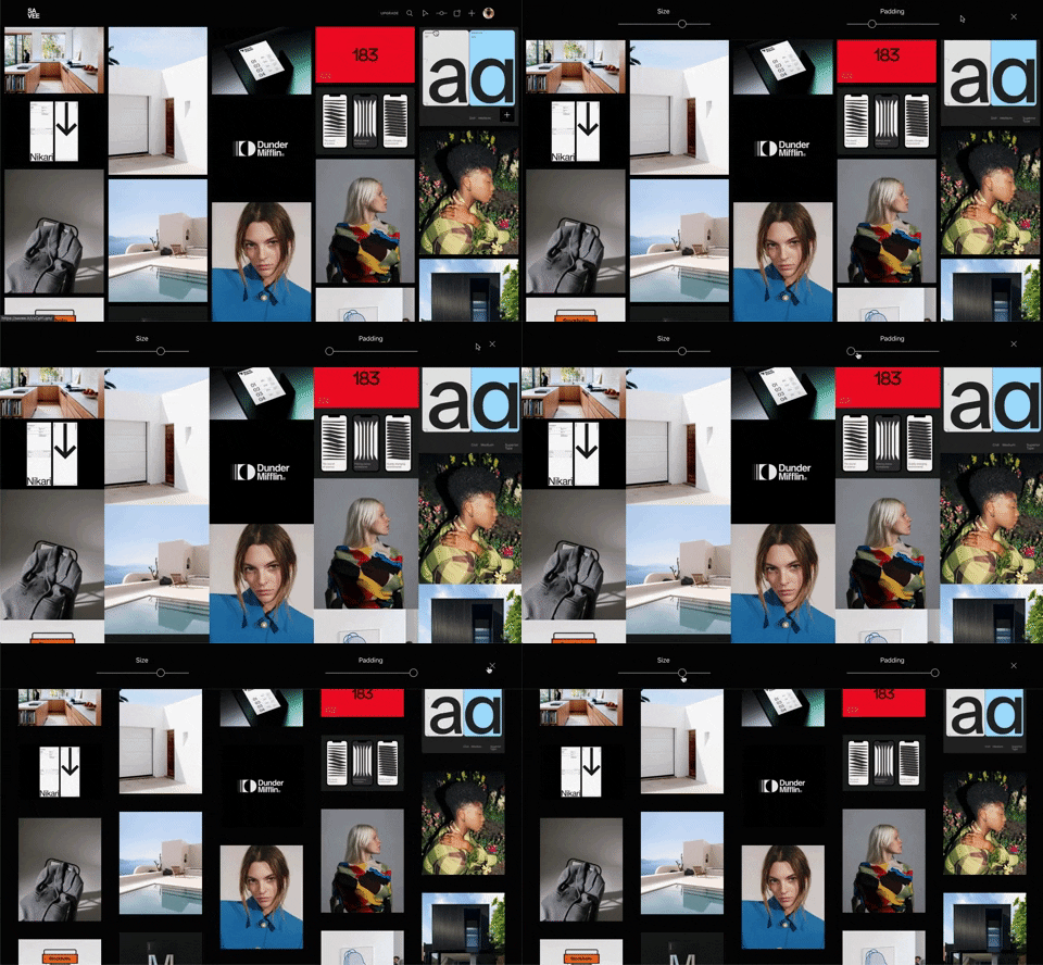
341. Image Grid Customization Sliders
Users can dynamically adjust the number of columns and spacing in an image grid using intuitive sliders, enhancing visual organization and content exploration.

346. Sidebar Menu With Collapsable Items (Show More)
This sidebar menu allows users to expand and collapse sections, efficiently managing screen space while providing access to numerous navigation options.

345. Vertical Accordion for FAQs
This vertical accordion allows users to efficiently reveal or hide detailed content sections, optimizing screen space and improving navigation for FAQs or contact information.
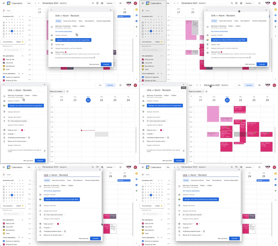
343. Modal/Dialog Drag & Drop to Fixed Position
Users can drag a modal dialog to a fixed side panel, allowing them to view and interact with underlying content without losing context.
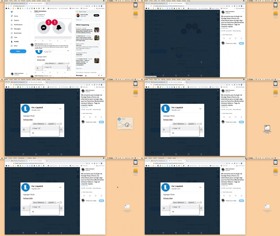
332. Drag & Drop to Create File from Web Image
Users can effortlessly create a new file on their desktop by dragging and dropping an image directly from a web browser.
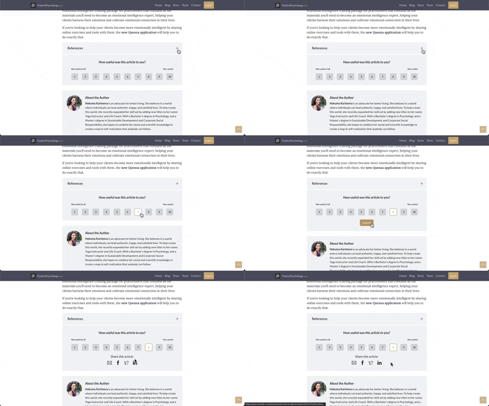
330. PositivePsychology - Article User Feedback
Users can quickly rate an article's usefulness on a 1-10 scale, providing immediate feedback to improve content quality and relevance.
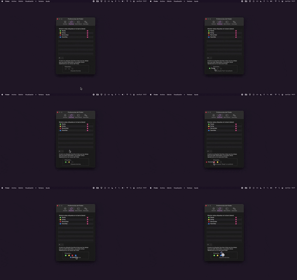
325. Drag & Drop Tag Colors to Slots
Users can intuitively assign color-coded tags to designated slots via drag-and-drop, enhancing organization and quick visual identification of items.

315. Signal - PIN Reminder
This pattern uses a persistent banner to remind users to verify their PIN, enhancing security and recall without interrupting core app functionality.
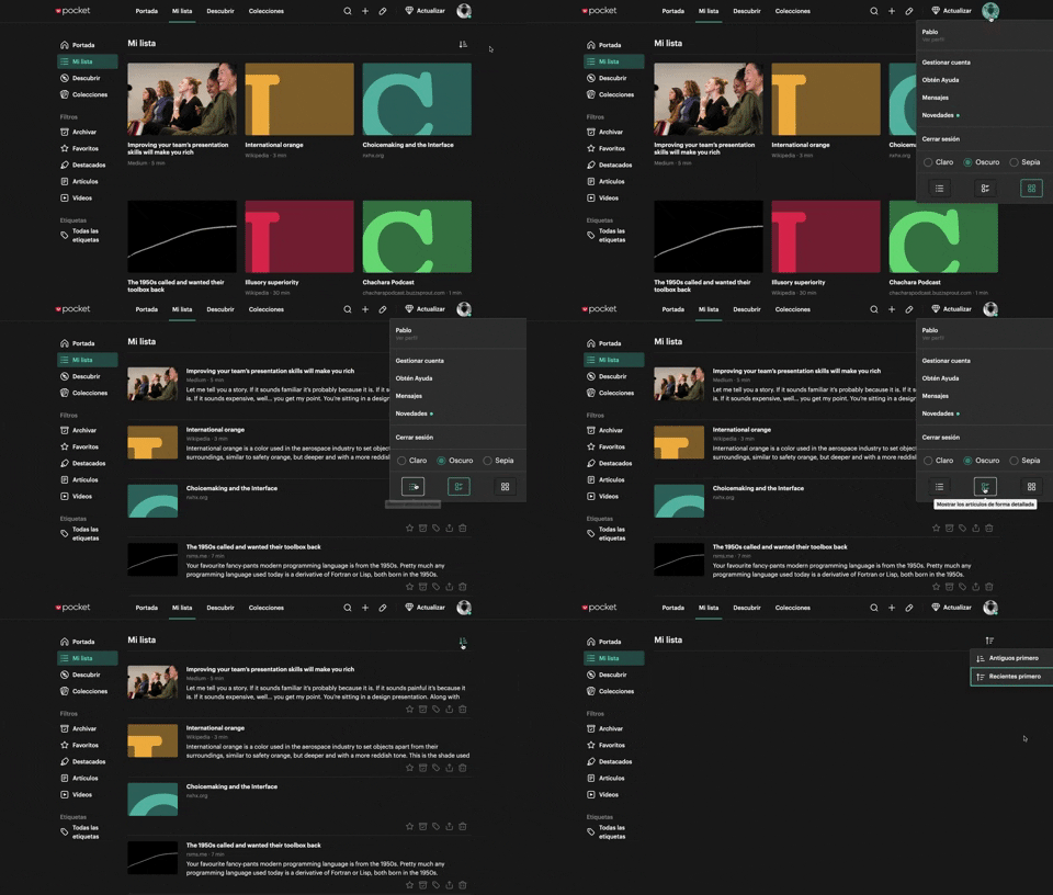
312. Pocket - View Switcher
Users can effortlessly switch between grid and list views of content, enhancing readability and personalizing their browsing experience.
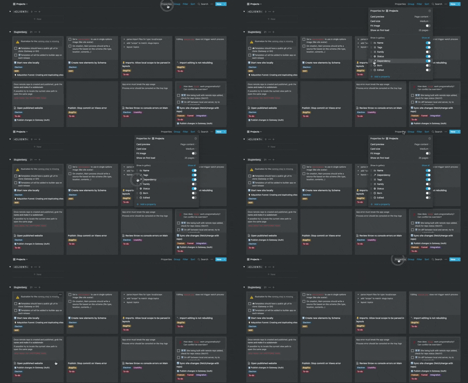
306. Drag & Drop for Reordering List Items (Mouse)
Users can intuitively reorder list items by dragging and dropping them, providing a direct and efficient way to customize their view.
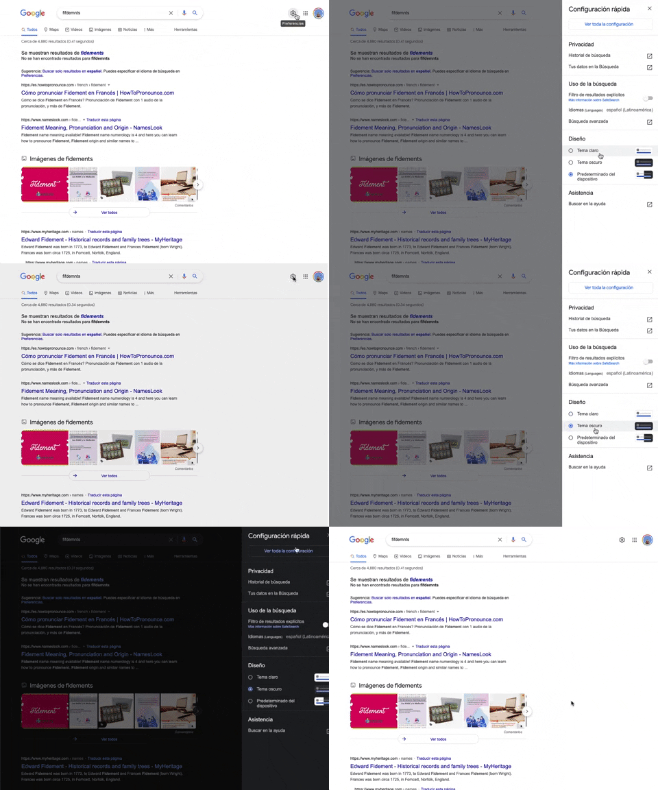
302. Theme Switcher in Side-drawer
Users can quickly toggle between light and dark themes via a side-drawer, enhancing visual comfort and accessibility without leaving the current page.
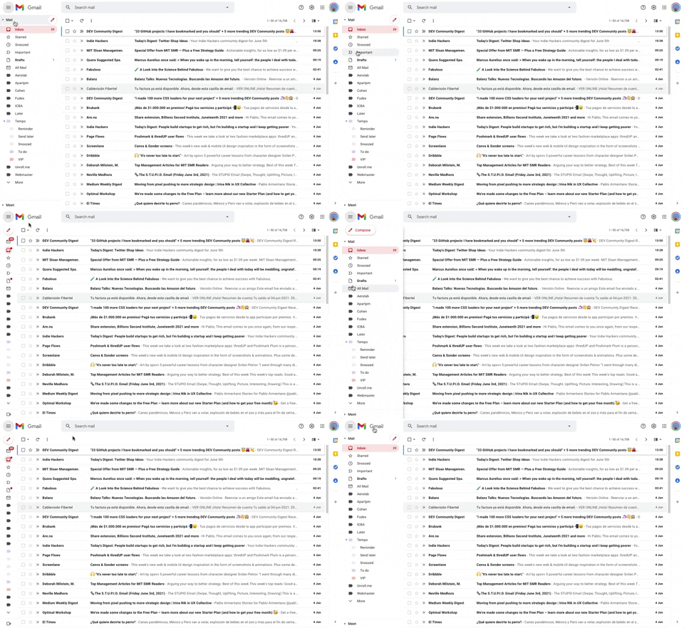
293. Collapsable Sidebar Menu
This collapsible sidebar menu allows users to expand or hide navigation options, optimizing screen real estate while maintaining easy access to key sections.
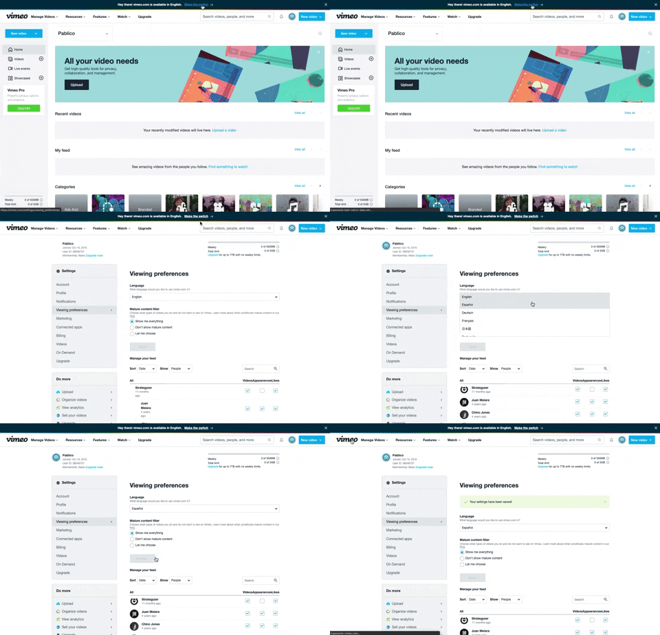
288. Vimeo - Topbar Language Switching
Users can quickly switch the site's display language via a prominent top bar link, enhancing accessibility and personalizing their experience.
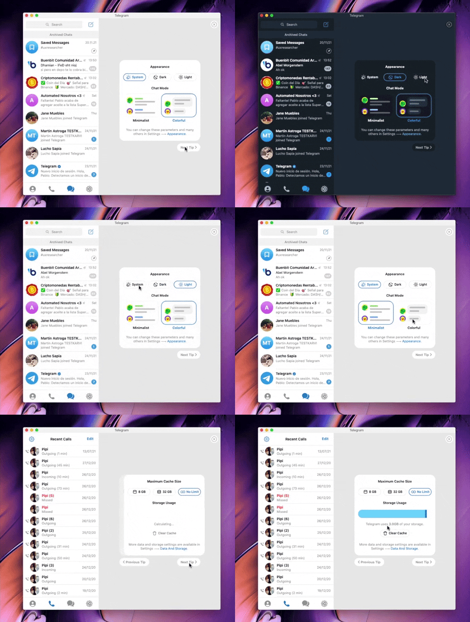
282. Telegram - Chat Setup Wizard
This wizard guides users through initial setup choices like appearance and chat mode, ensuring a personalized experience from the start.

280. Slack - Workspace Creation Wizard
This wizard guides users through creating a new workspace, ensuring a smooth onboarding experience by collecting essential information step-by-step.

279. Collapsable Layout Sidebars
Users can collapse and expand layout sidebars to optimize screen space, enhancing focus on primary content while maintaining quick access to navigation.

278. Search Menu Dropdown from Input Text
This pattern allows users to quickly find and select desired options from a dynamic, filtered list that appears as they type into an input field.
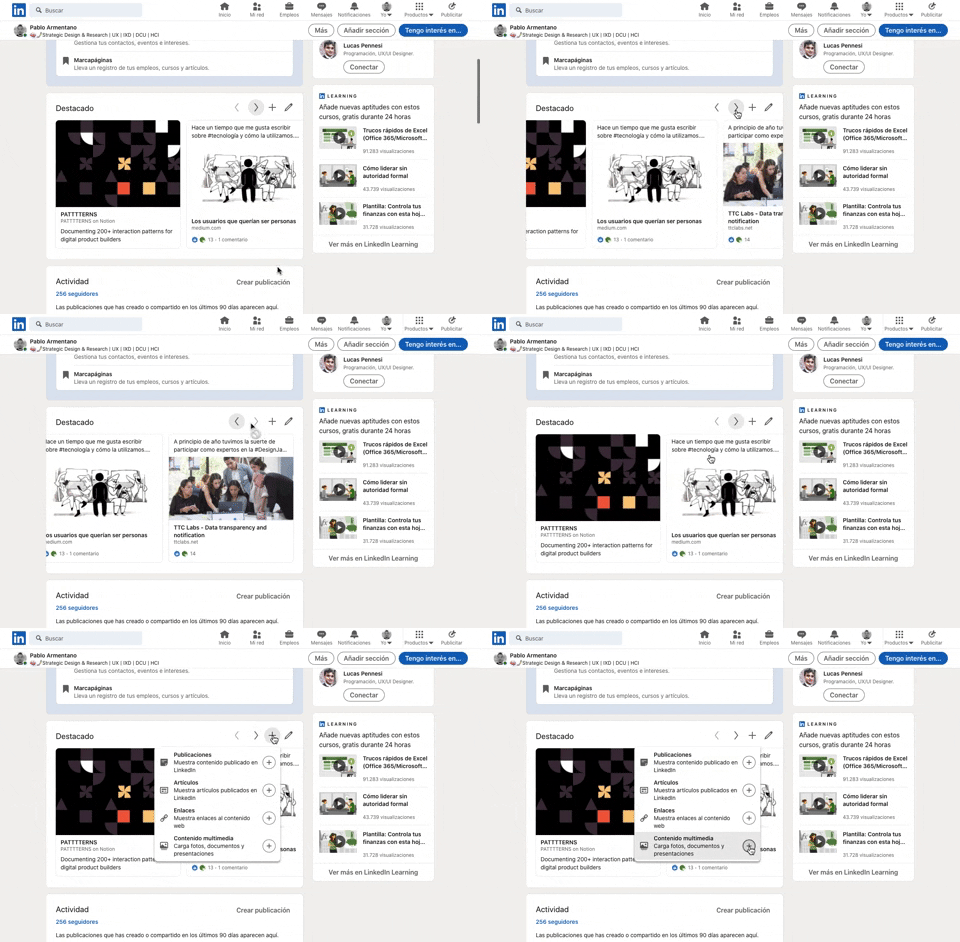
277. Horizontal Card Slider with Actions
This pattern allows users to efficiently browse a curated collection of content cards, with clear navigation and editing options for personalized interaction.
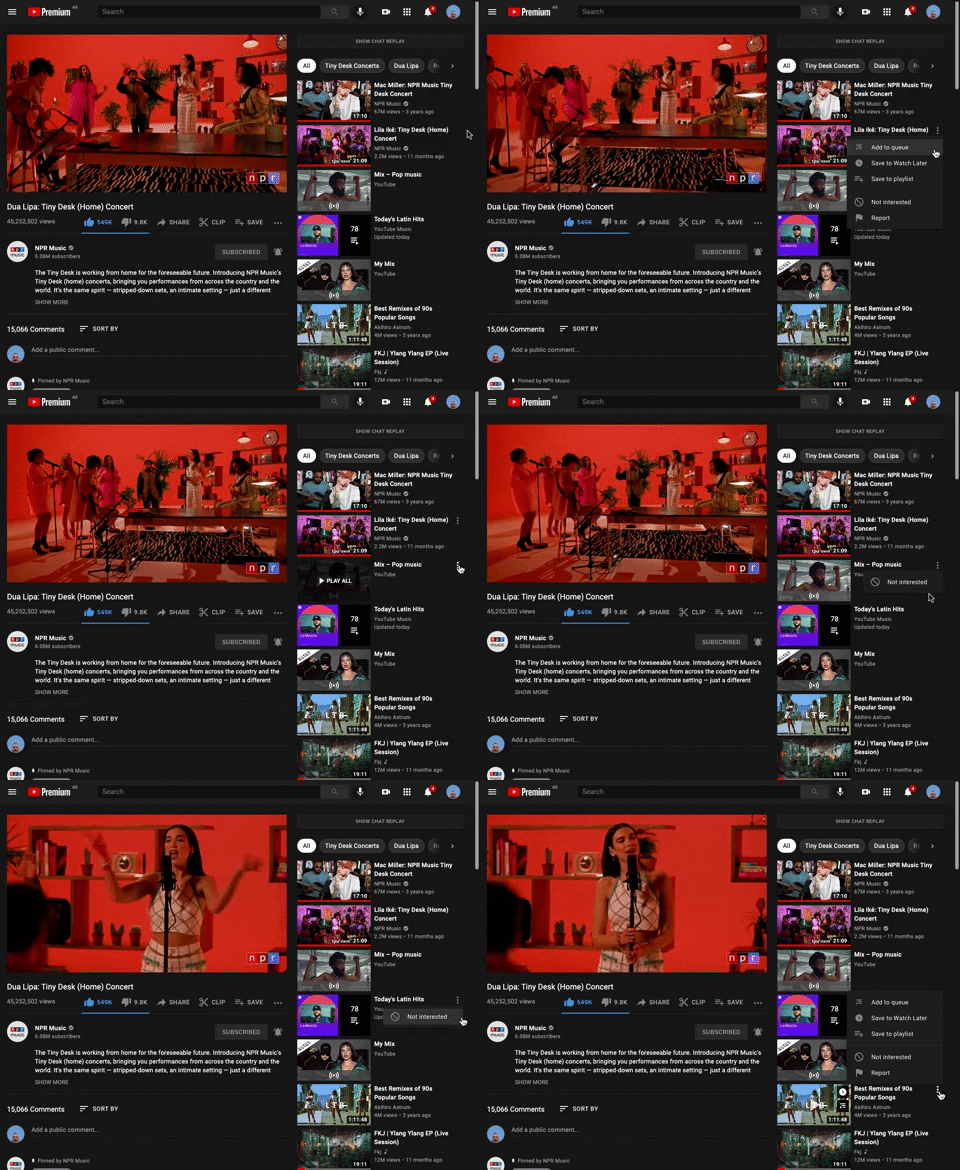
265. Youtube - Hidden Options Menu (Dots)
A common UI pattern where additional options or actions related to a specific item are initially hidden to conserve space. These options are revealed upon user interaction, typically by clicking or tapping a 'dots' (ellipsis) icon, presenting a contextual menu or dropdown.
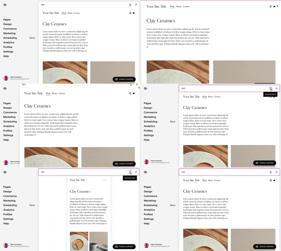
258. Squarespace - Adaptable Viewport Size
Users can dynamically adjust the content preview area, allowing them to visualize their website across various screen sizes for optimal responsiveness and design fidelity.
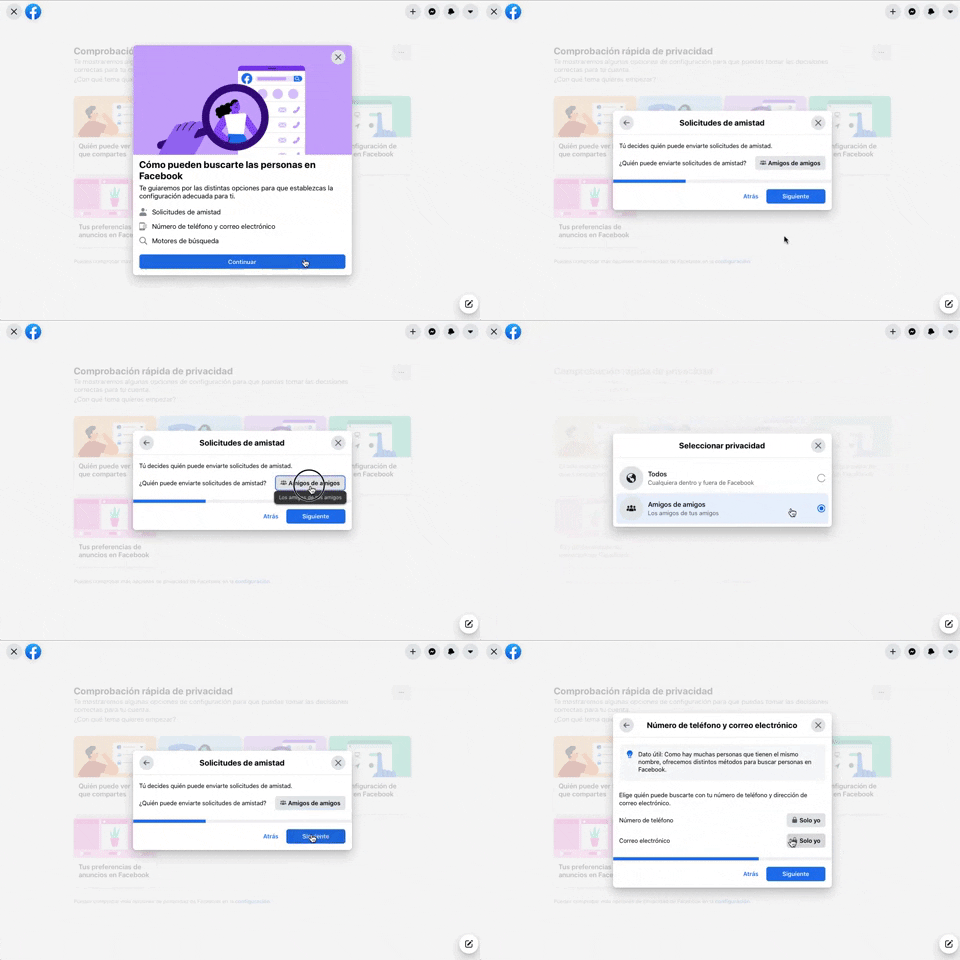
256. Modal Blackout w/ Forms & Steps
This modal blackout pattern guides users through multi-step forms, ensuring focused input and clear progression for critical decisions.
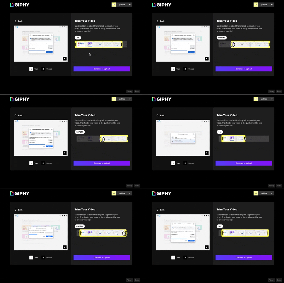
243. Trim Video Slicer
Users can precisely trim video segments using a draggable timeline with visual thumbnails, enabling efficient content selection and faster processing.

254. Toggle/Hide Sidebar Menu (Mouse)
Users can toggle the sidebar menu to hide or reveal navigation, optimizing screen space for content focus or quick pathfinding.
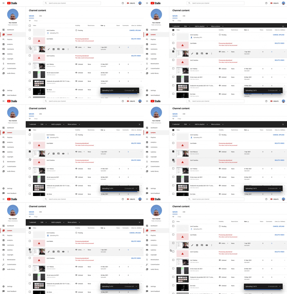
253. Youtube - Table Row Selector
Users can efficiently select multiple table rows by clicking checkboxes, enabling bulk actions and streamlining content management workflows.
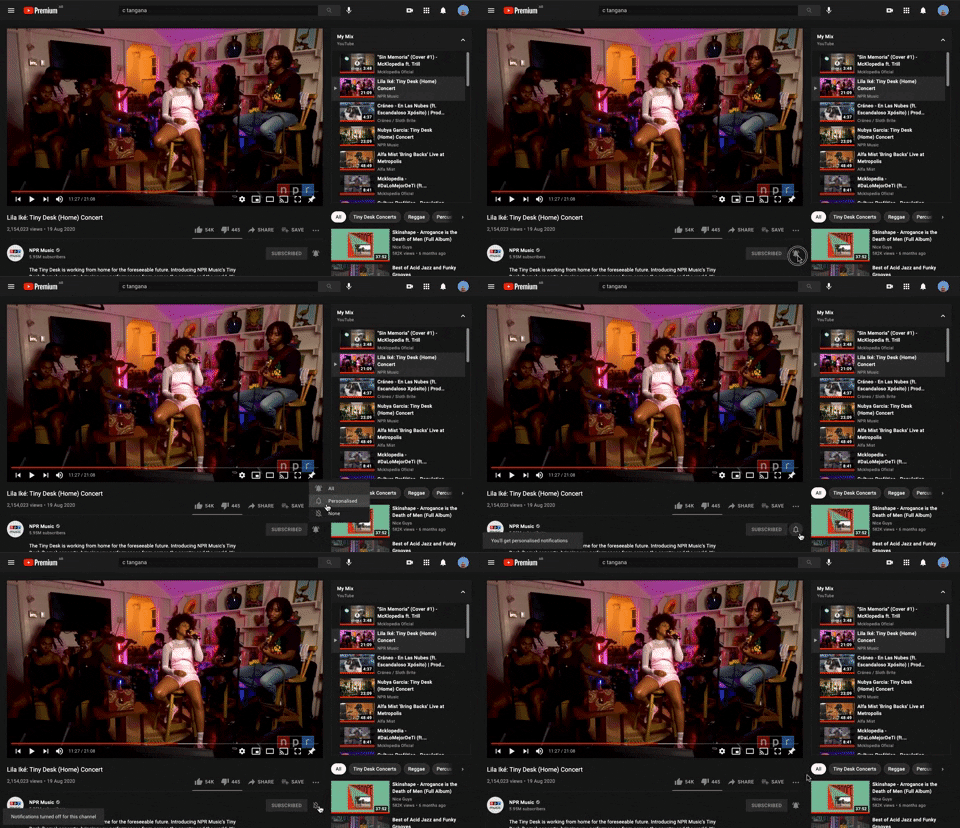
228. Notification Bell Status
Users can quickly check and manage their notifications by clicking the bell icon, revealing a dropdown with recent alerts and an option to clear them.
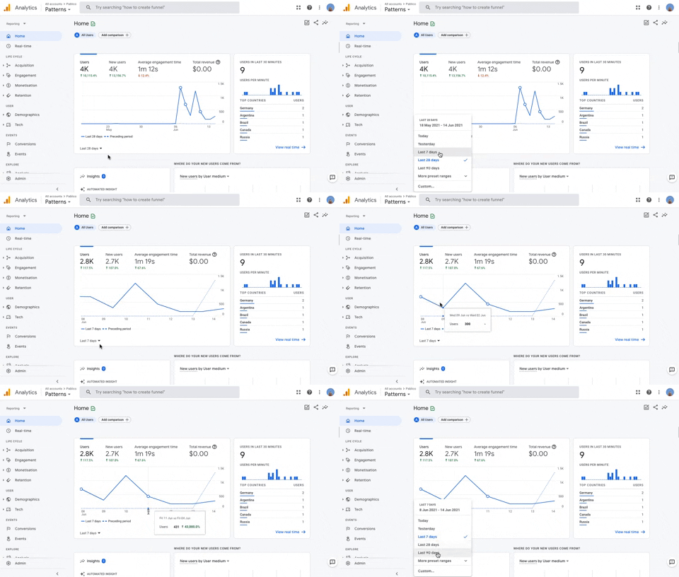
236. Horizontal Graph with Time Ranges
Users can easily compare data trends over customizable time ranges within a horizontal graph, enabling quick insights into performance changes.
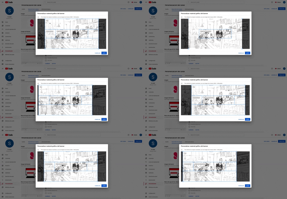
226. Youtube Studio - Image Multi-zone Crop
Users can precisely crop an image for various device viewports within a single interface, ensuring optimal visual presentation across all screens.
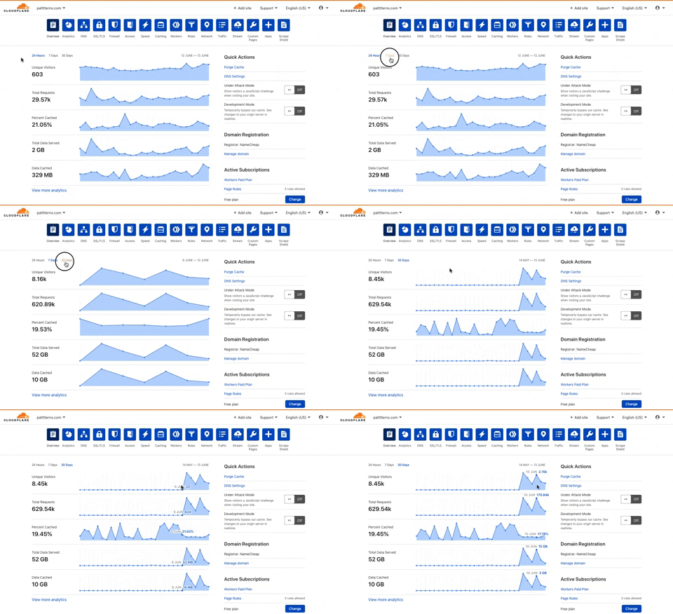
225. Cloudflare - Multiple Graphs by Time Ranges
This pattern allows users to quickly switch between predefined time ranges to view multiple related data graphs, enabling efficient analysis of performance trends.
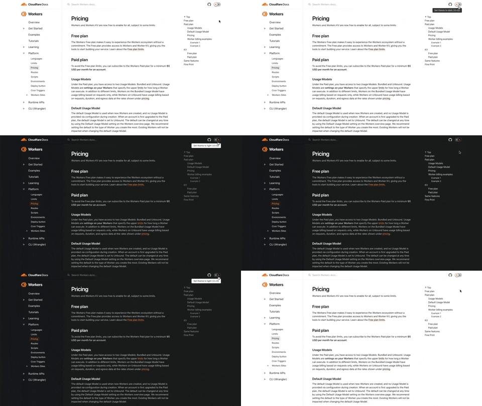
222. Cloudflare - Toggle Light/Dark Theme
Users can instantly switch between light and dark themes with a single toggle, enhancing readability and reducing eye strain for personalized viewing comfort.
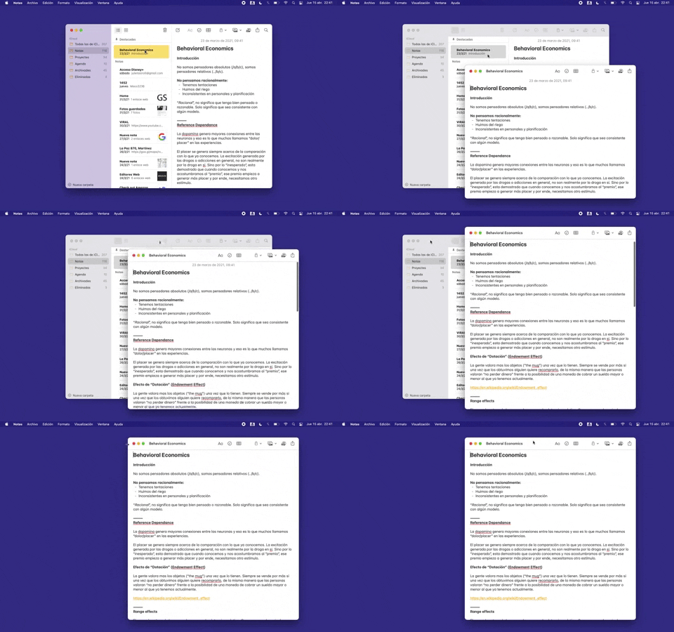
228. Open in New Window (Doble Click)
Users can double-click an item to open its content in a new, independent window, enabling parallel viewing and enhanced multitasking.
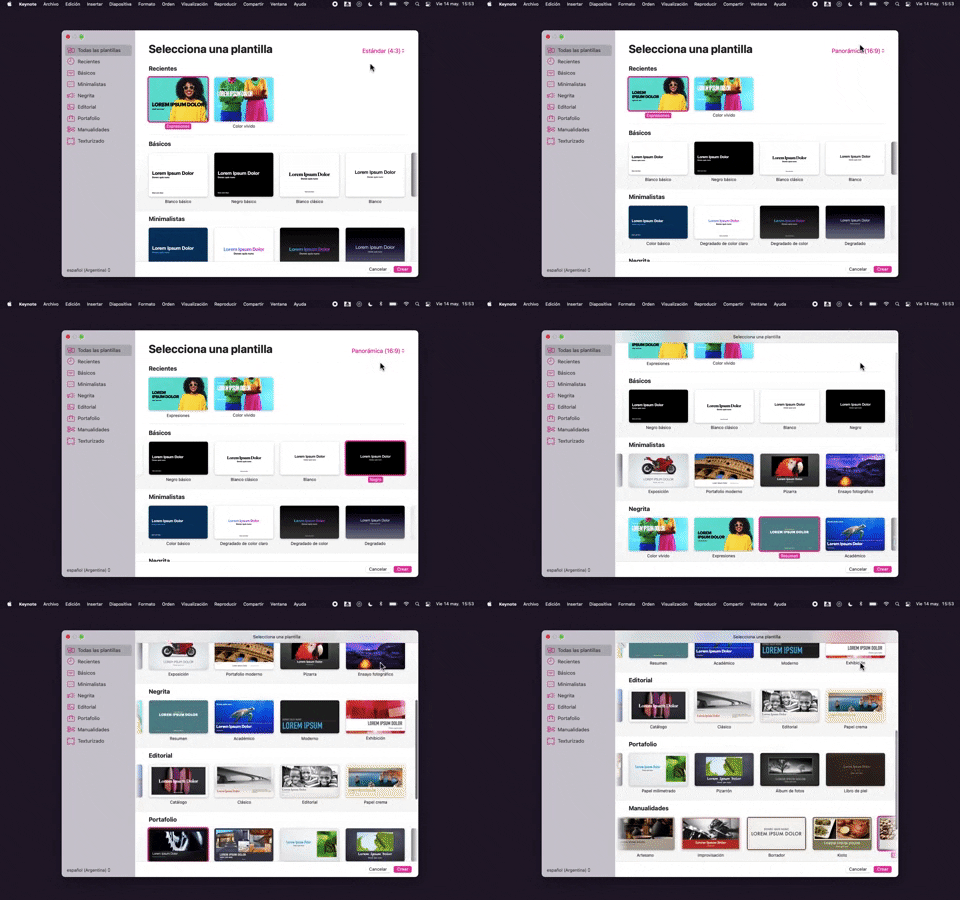
218. Apple Keynote - Template Format Selection
Users efficiently select a presentation template and aspect ratio from categorized options, streamlining the creation of new projects.
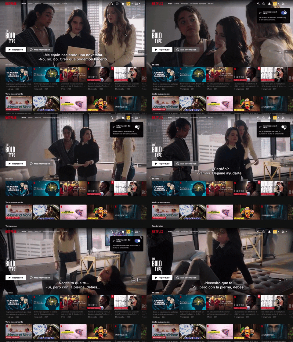
214. Netflix - Information Toggle
A UI pattern, exemplified by Netflix, that allows users to toggle the visibility of additional information, often within a navigation or content browsing context, such as revealing details about a video thumbnail via a dropdown or button interaction. Notable behavior: Click; Toggle; Expanded.
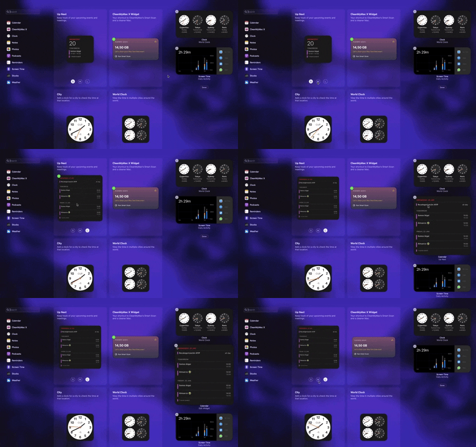
205. Full Screen Widget Customization
Users can easily personalize their full-screen widget layout by dragging and dropping elements, enhancing their dashboard's utility and visual organization.

189. Feature Preview on Menu
This pattern highlights new or experimental features within a dropdown menu, allowing users to discover and opt-in to upcoming functionalities.

91. Settings for Account Privacy
Users can manage their account's discoverability and contact settings, controlling who can find them via email or phone number for enhanced privacy.

138. Read Modes
Users can adjust text size and font for optimal readability, enhancing accessibility and personalizing their content consumption experience.

54. Apple Safari - Browser Reader Mode
Users can activate Reader Mode to strip away distracting elements like ads and navigation, focusing solely on the article's content for improved readability.

7. sitepoint - Accessibility Adjustments
The accessibility icon provides users with quick access to adjust display settings, enhancing readability and overall site usability.
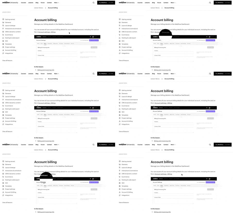
157. Webflow - Magnifying Glass on Images
Users can magnify embedded images by hovering over them, revealing crucial details and improving comprehension without navigating away.

150. Split OS Screens
Users can efficiently manage multiple tasks by splitting their operating system screen into distinct, resizable windows, enhancing productivity and multitasking capabilities.
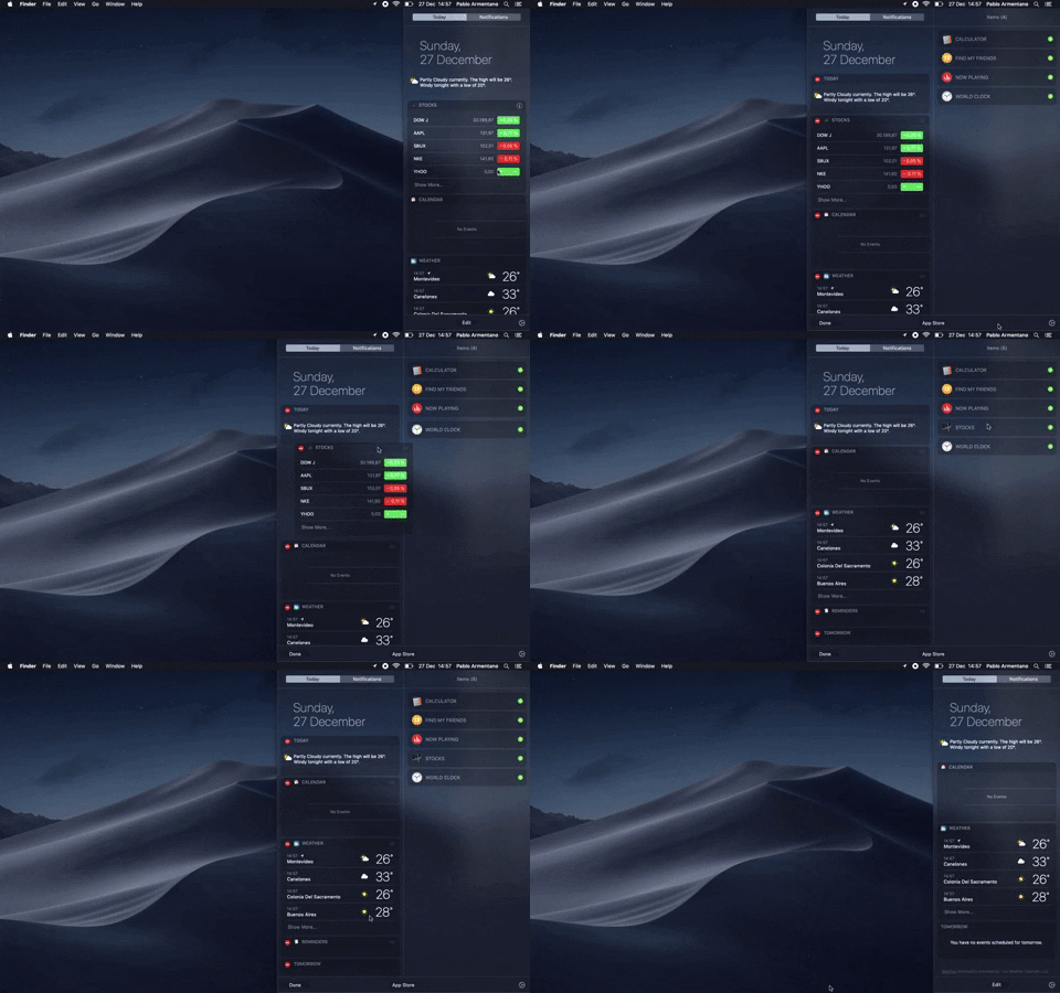
138. Widget Customization Sidebar (2-pane)
Users can quickly access and customize widgets in a two-pane sidebar, enhancing productivity by providing relevant information at a glance.

29. About.me - Wizard Generation Profile
This wizard guides users through a series of choices, enabling them to quickly define the purpose and desired interactions for their personal profile page.

182. Static Tooltip for Text Formatting
This pattern provides immediate, context-sensitive text formatting options via a static tooltip, enabling users to efficiently style selected content without navigating away.

115. Browser Background Customization
Users can personalize their browser's start page by selecting a custom background image, enhancing visual appeal and personal connection.

129. PDF Show & Download
This pattern allows users to preview a PDF document directly within the interface and offers a clear option to download it for offline access or detailed review.
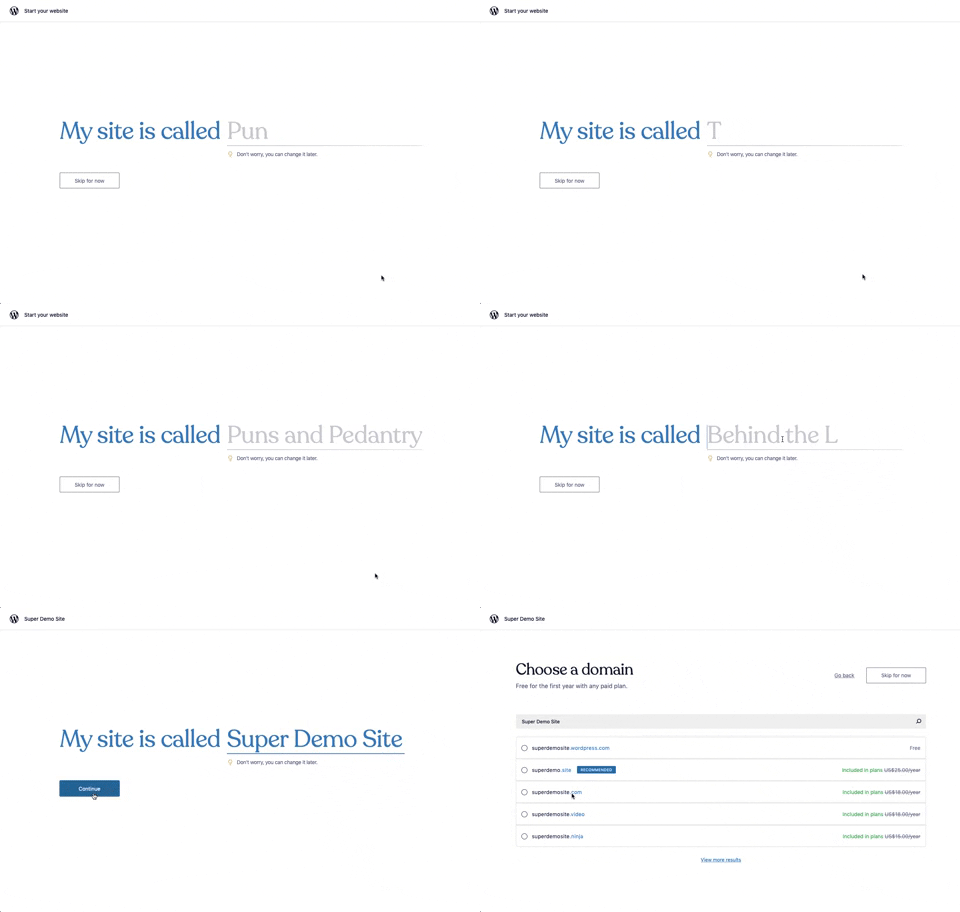
176. Wordpress.com - Natural Inputs with Suggestions
This pattern guides users to quickly name their site by offering real-time suggestions as they type, streamlining the initial setup process.

57. IDF - Encouraging Newsletter Sign-up
This pattern uses a modal dialog to offer a free ebook in exchange for an email address, encouraging newsletter sign-ups and lead generation.

76. List Widget Customization
Users can effortlessly organize and filter list items by category and status, enhancing task management and focus within a customizable interface.
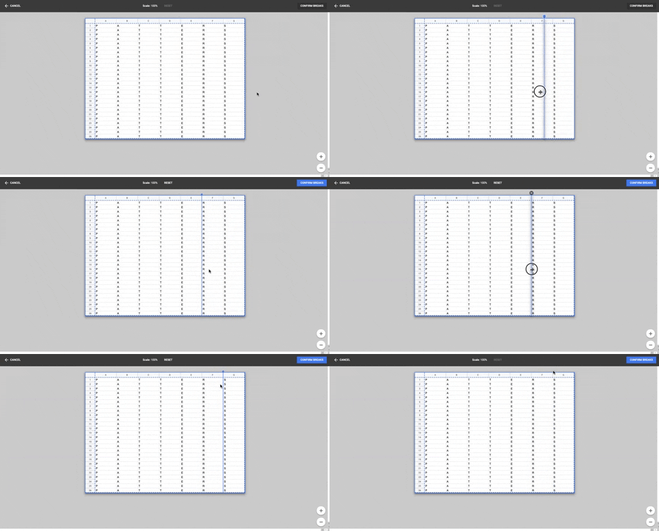
86. Table Column Slicer
Users can precisely define column breaks within a data table, enabling flexible data organization and improved readability for complex datasets.

54. Modal for Language & Region Picker
This modal allows users to efficiently search for and select a preferred language from a comprehensive list, enhancing personalization and accessibility.

119. PrestaShop - Site Cookie Management
This pattern presents a clear cookie consent pop-up, allowing users to accept or manage cookie preferences for a transparent and compliant browsing experience.

63. Window Maximize Options (on Right Click)
Users can right-click the maximize button to access a dropdown menu, enabling quick window arrangement options like full screen or tiling to the left or right.

42. Modal for Tags Editing
This pattern allows users to efficiently manage and organize their content by editing, adding, or removing tags through a dedicated modal interface.

21. Advanced Color Picking
This pattern allows users to precisely select colors from a spectrum, adjust saturation and brightness, and save custom swatches for efficient reuse.
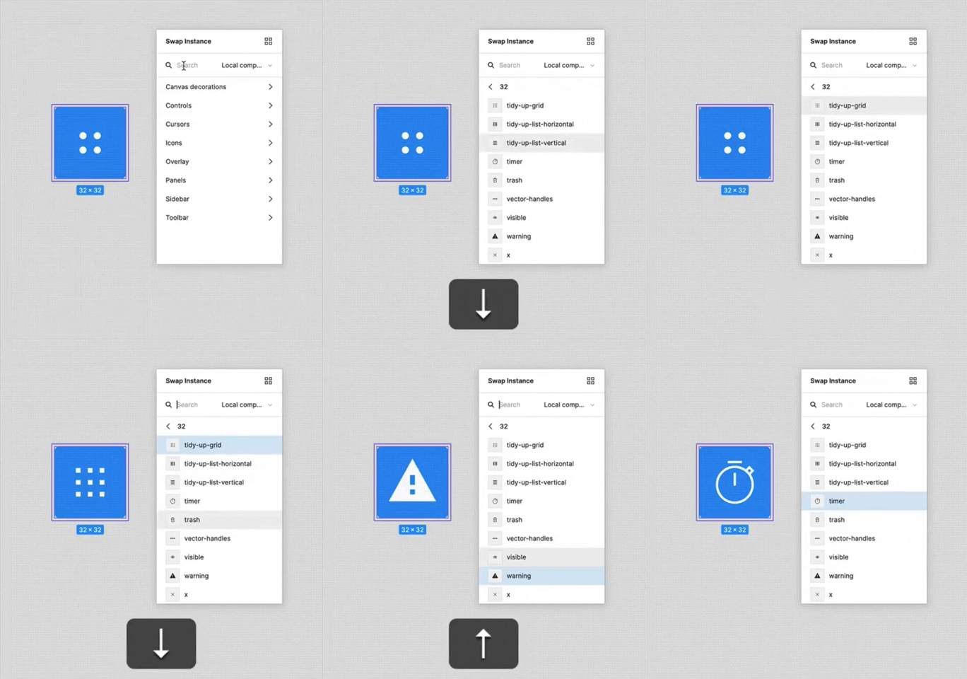
156. Figma - Keyboard Navigated Menu
This pattern enables users to efficiently navigate and select menu items using keyboard arrows, enhancing accessibility and speed for power users.

188. Trello - Color shapes for Colour-blind
This pattern allows users to toggle a colorblind-friendly mode, enhancing accessibility by adding distinct shapes to color labels for improved differentiation.

160. Pocket - Content Highlighting
Users can highlight and save specific text within an article, enabling focused review and easy access to key information later.