Patterns for Side Panels
- Desktop (22)
- Tablet (3)
- Mobile (0)

406. Fixed Bottom-Right Chat Bubble
Offers always-available, AI-powered guidance and support through a fixed bottom-right chat

404. Sidebar Backdrop Menu
This pattern provides a full-height, animated sidebar menu that slides in from the left, offering clear navigation options while dimming the main content for focused interaction.

402. Transition: Zoom-to-Dock for Minimize
This transition visually guides the user as a window minimizes, smoothly shrinking and moving to its new location in the dock, enhancing spatial awareness and system feedback.
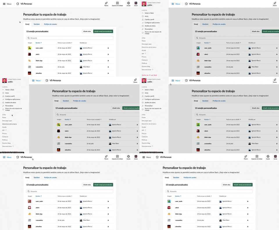
375. Toggle/Show Sidebar Menu
Users can toggle a persistent sidebar menu to reveal or hide navigation options, optimizing screen space while maintaining easy access to key features.
354. Figma - Floating Form with Steps
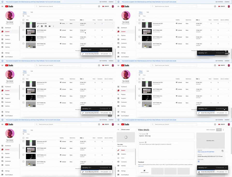
347. YouTube - Floating Progress Bar
This floating progress bar provides persistent, non-intrusive feedback on background tasks, allowing users to monitor progress while continuing other work.
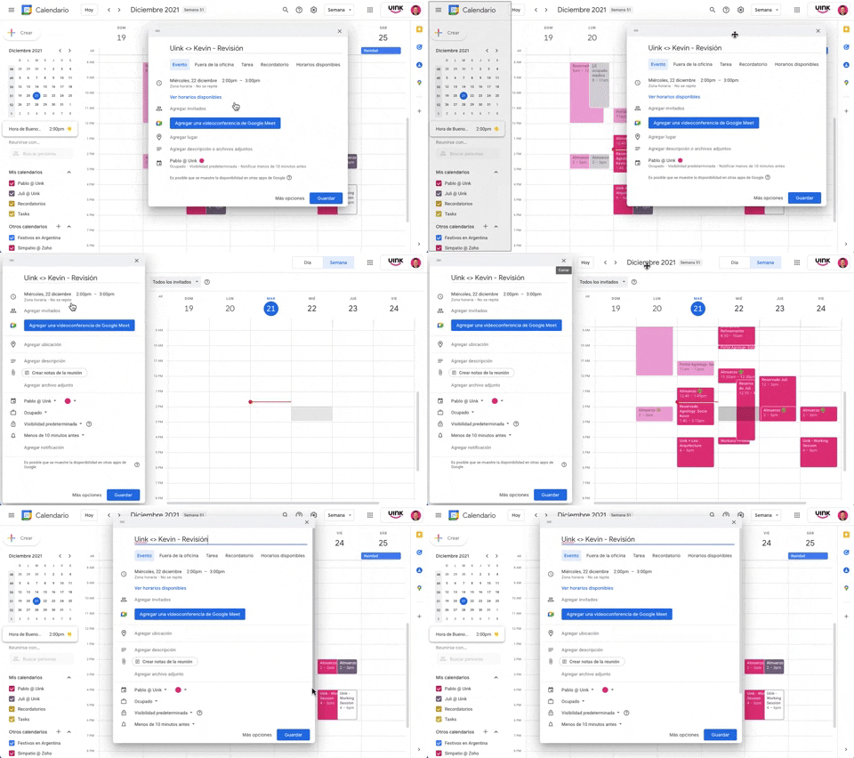
343. Modal/Dialog Drag & Drop to Fixed Position
Users can drag a modal dialog to a fixed side panel, allowing them to view and interact with underlying content without losing context.

Uink Digital Agency
Specilist on building and launching digital products. Let's talk!

307. Tooltip on Hover
Hovering over a truncated title reveals its full text in a tooltip, providing complete context without cluttering the interface.
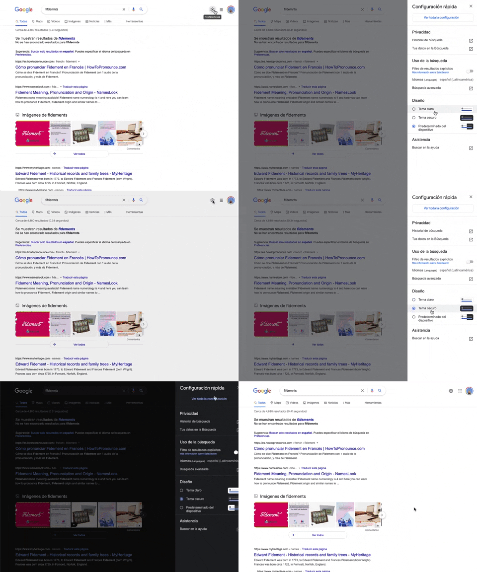
302. Theme Switcher in Side-drawer
Users can quickly toggle between light and dark themes via a side-drawer, enhancing visual comfort and accessibility without leaving the current page.
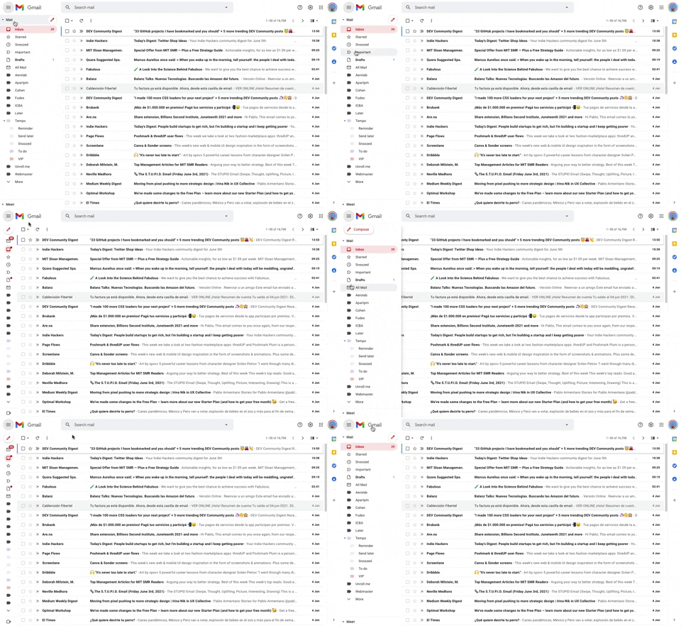
293. Collapsable Sidebar Menu
This collapsible sidebar menu allows users to expand or hide navigation options, optimizing screen real estate while maintaining easy access to key sections.
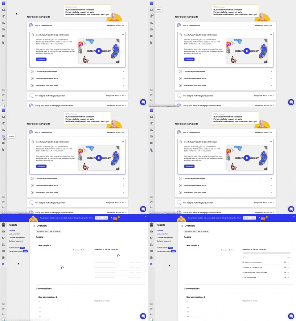
292. Vertical Icon Menu
This vertical icon menu provides quick access to key sections, revealing descriptive tooltips on hover to aid navigation and improve user pathfinding.

279. Collapsable Layout Sidebars
Users can collapse and expand layout sidebars to optimize screen space, enhancing focus on primary content while maintaining quick access to navigation.
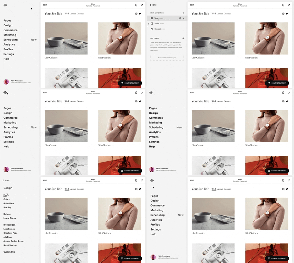
259. Multi-depth Sidebar Navigation
This multi-depth sidebar navigation allows users to quickly traverse complex information hierarchies, improving discoverability and reducing cognitive load.
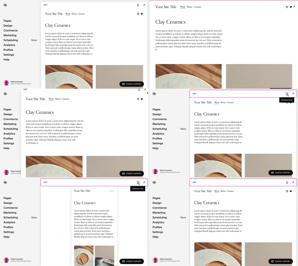
258. Squarespace - Adaptable Viewport Size
Users can dynamically adjust the content preview area, allowing them to visualize their website across various screen sizes for optimal responsiveness and design fidelity.

254. Toggle/Hide Sidebar Menu (Mouse)
Users can toggle the sidebar menu to hide or reveal navigation, optimizing screen space for content focus or quick pathfinding.
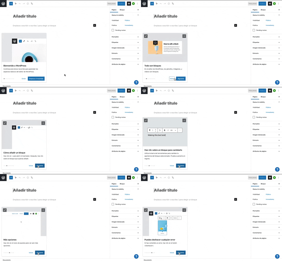
231. Floating Dialog Popover w/ Steps
This pattern guides users through a multi-step onboarding or feature tour with a dismissible, paginated floating dialog, enhancing discoverability and adoption.
217. Vertical Icon Menu (duplicated)

43. File Upload Status
This pattern provides real-time feedback on file upload progress and status, allowing users to monitor, manage, and resolve potential issues efficiently.

199. Sidebar Emptystate
This sidebar empty state introduces new features with a clear illustration and call to action, guiding users to discover and adopt new functionalities.

150. Split OS Screens
Users can efficiently manage multiple tasks by splitting their operating system screen into distinct, resizable windows, enhancing productivity and multitasking capabilities.
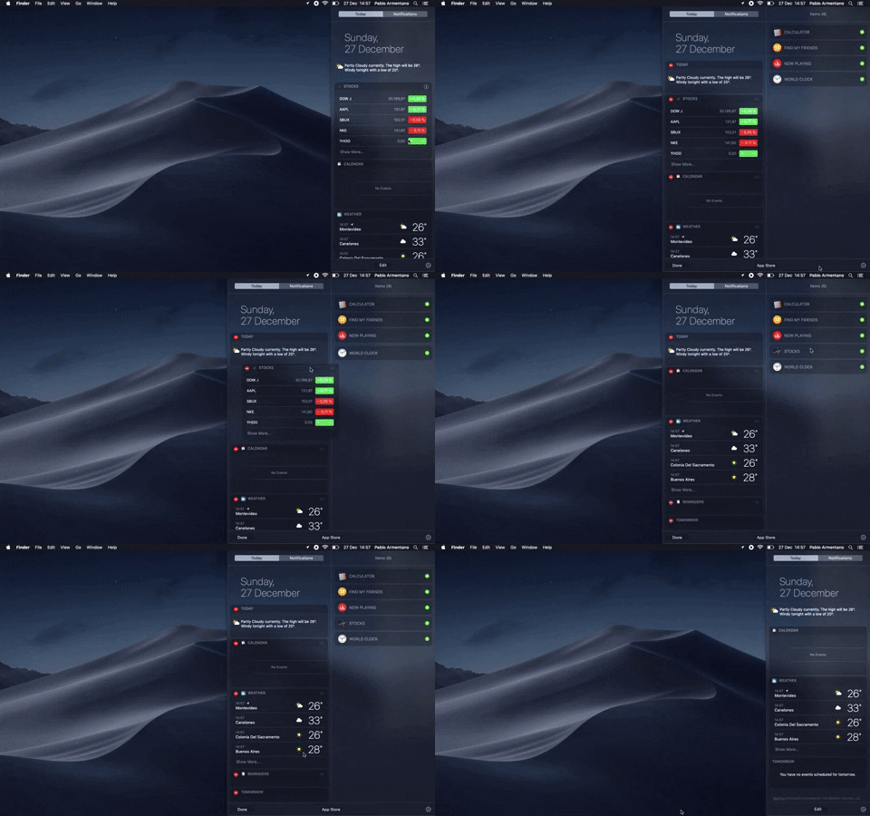
138. Widget Customization Sidebar (2-pane)
Users can quickly access and customize widgets in a two-pane sidebar, enhancing productivity by providing relevant information at a glance.

76. List Widget Customization
Users can effortlessly organize and filter list items by category and status, enhancing task management and focus within a customizable interface.