Patterns for Navbars & Toolbars
- Desktop (25)
- Tablet (1)
- Mobile (0)

405. Ferrari Luce Website (by LoveFrom)
This pattern describes a desktop web landing page, featuring a fixed navigation bar, footer, and interactive elements such as carousels, buttons, and hypertext links. It integrates animations, video, and anchor scrolling to create an engaging user experience. Notable behavior: Animation; Carrousel; Fixed on Scroll.

402. Transition: Zoom-to-Dock for Minimize
This transition visually guides the user as a window minimizes, smoothly shrinking and moving to its new location in the dock, enhancing spatial awareness and system feedback.

392. SaaS for Construction Workers
This pattern uses a dynamic carousel of images and text to showcase product features, engaging users with interactive content and clear calls to action.

390. Icon Software Landing Page
This landing page effectively guides users to download icon management software by showcasing its intuitive interface and customization features.
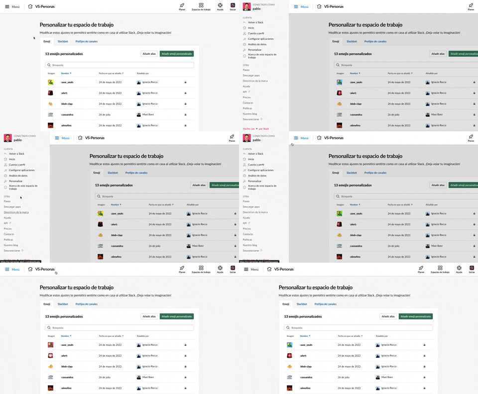
375. Toggle/Show Sidebar Menu
Users can toggle a persistent sidebar menu to reveal or hide navigation options, optimizing screen space while maintaining easy access to key features.
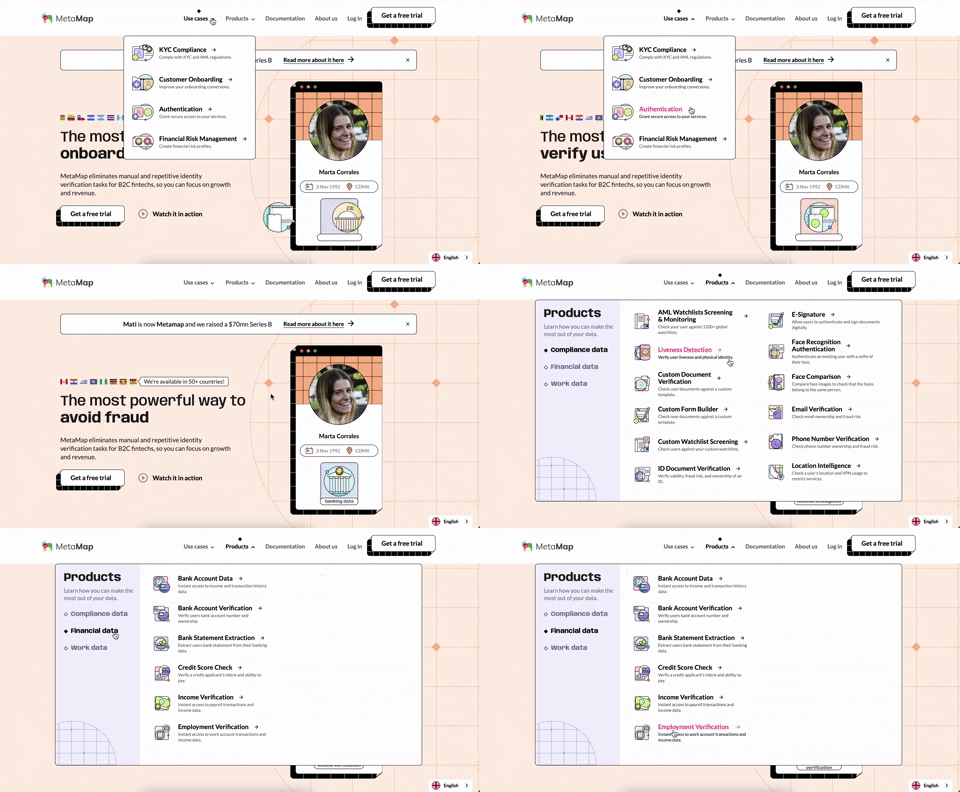
356. MetaMap - Multi-Layout Topbar Menu
This topbar menu uses a dropdown to reveal categorized links, enabling users to quickly navigate to relevant sections and understand the product's diverse offerings.
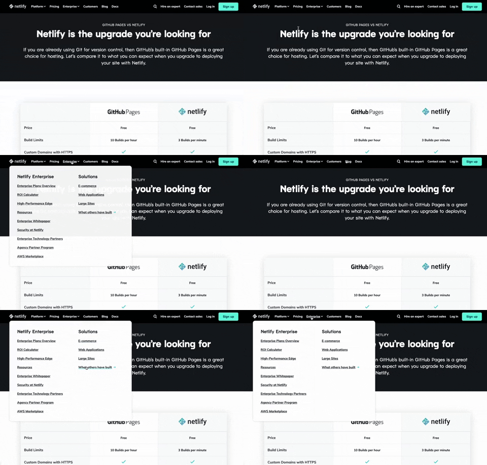
350. Netifly - Multi-layout Topbar Menu
This topbar menu dynamically adjusts its layout and content, offering users clear navigation and relevant options as they explore different sections of the site.
Uink Digital Agency
Specilist on building and launching digital products. Let's talk!
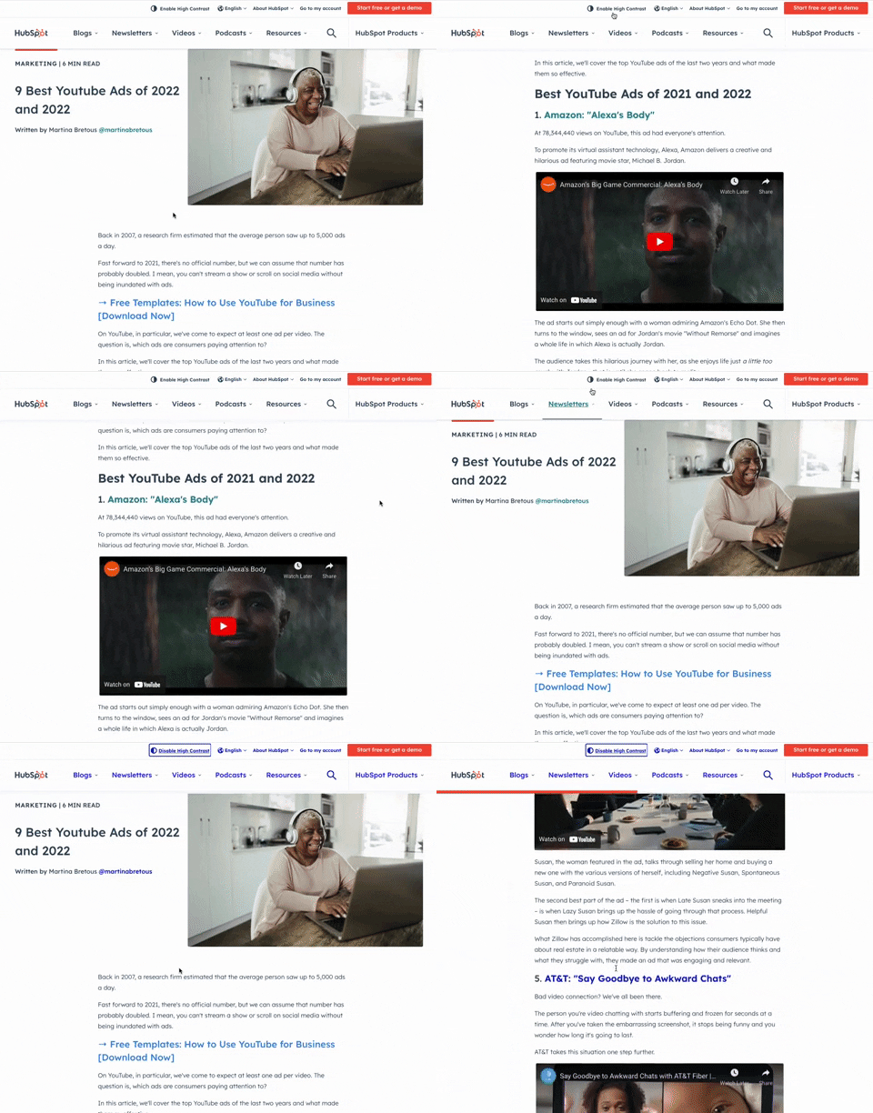
349. HubSpot - Toggle High Contrast
Users can toggle high contrast mode to improve readability and accessibility, enhancing the visual experience for those with low vision.

346. Sidebar Menu With Collapsable Items (Show More)
This sidebar menu allows users to expand and collapse sections, efficiently managing screen space while providing access to numerous navigation options.

322. Search on Menu Items
This pattern integrates a search input directly within a menu, typically a dropdown, enabling users to quickly filter and locate specific menu items. It enhances pathfinding and awareness, commonly found in desktop applications with navigation bars. Notable behavior: Typing; Filtering; Filtered Menu Items.
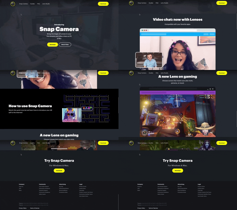
314. Snapchat - Snap Camera
A web landing page for the Snap Camera product, featuring a fixed navigation bar, interactive buttons, and animated video content to showcase its features and encourage user engagement. Notable behavior: Scrolling; Button Click; Fixed Header.
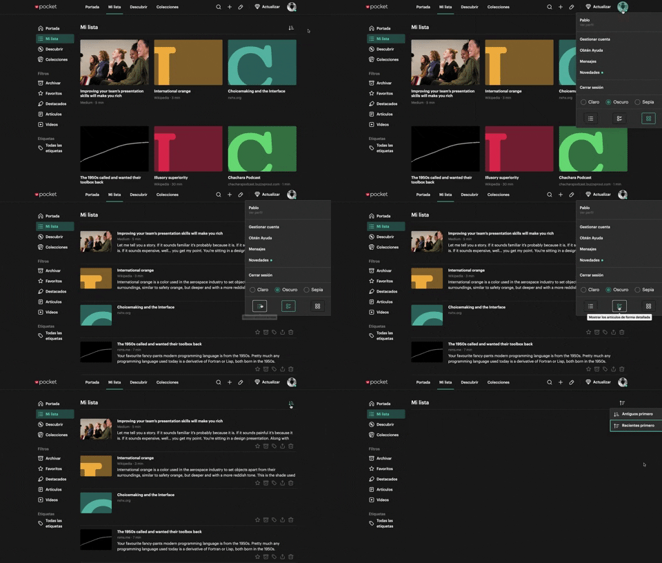
312. Pocket - View Switcher
Users can effortlessly switch between grid and list views of content, enhancing readability and personalizing their browsing experience.
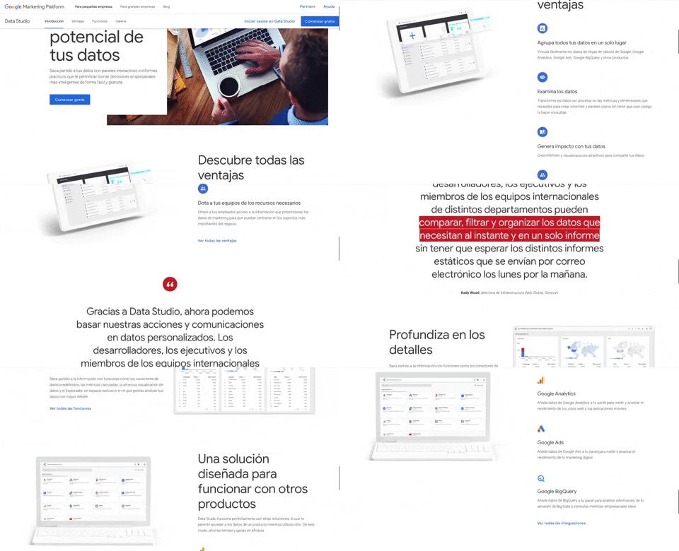
312. Google Data Studio
A fixed navigation bar ensures key actions like "Comenzar gratis" remain accessible as users scroll, improving discoverability and conversion.
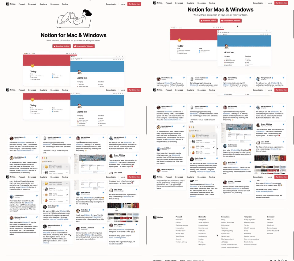
311. Landing Page for App Download
This landing page guides users to download the application for their specific operating system, simplifying the installation process.
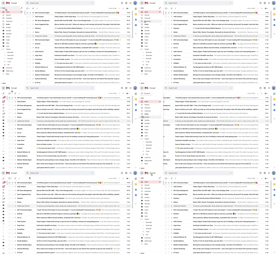
293. Collapsable Sidebar Menu
This collapsible sidebar menu allows users to expand or hide navigation options, optimizing screen real estate while maintaining easy access to key sections.
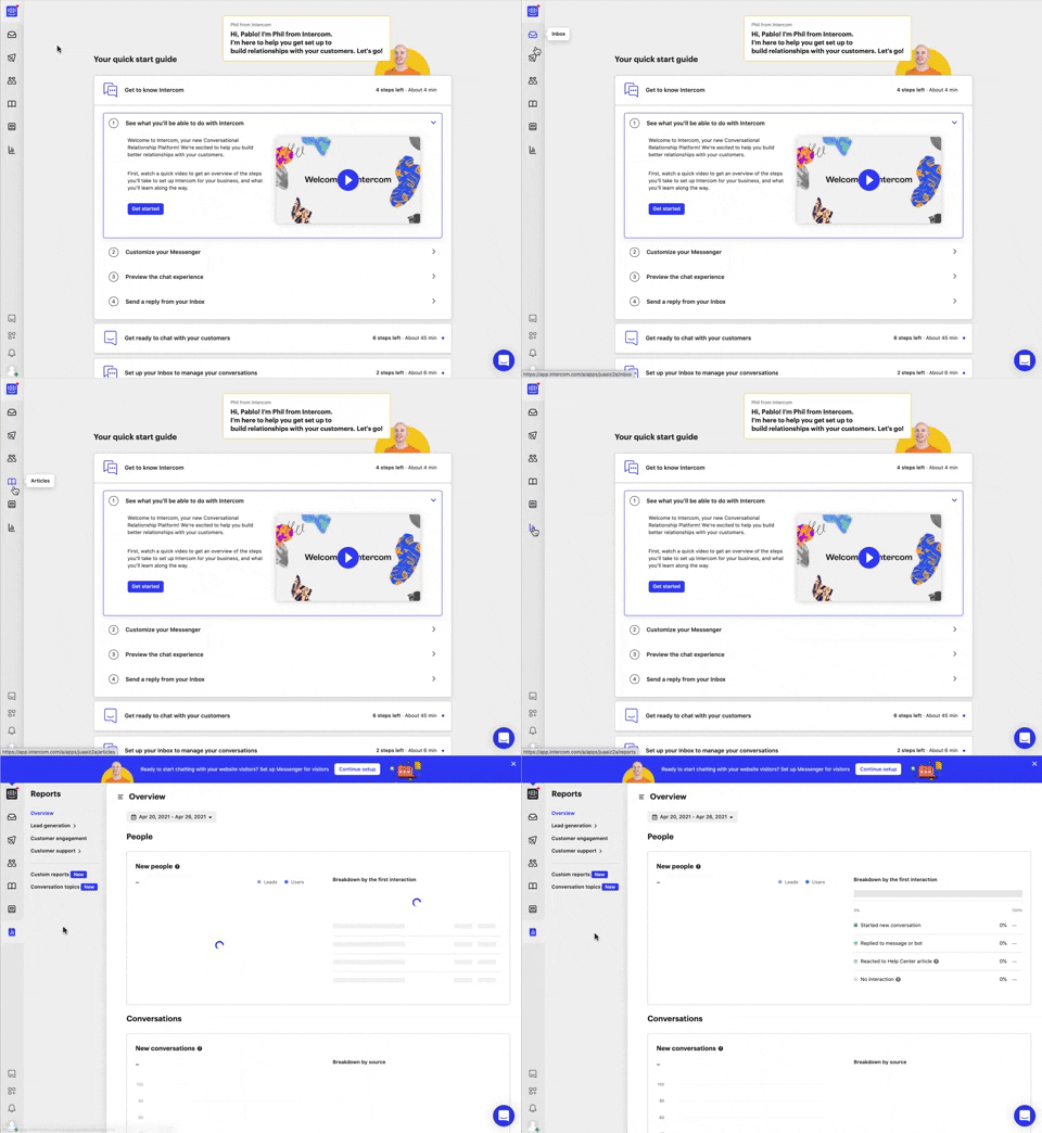
292. Vertical Icon Menu
This vertical icon menu provides quick access to key sections, revealing descriptive tooltips on hover to aid navigation and improve user pathfinding.

279. Collapsable Layout Sidebars
Users can collapse and expand layout sidebars to optimize screen space, enhancing focus on primary content while maintaining quick access to navigation.
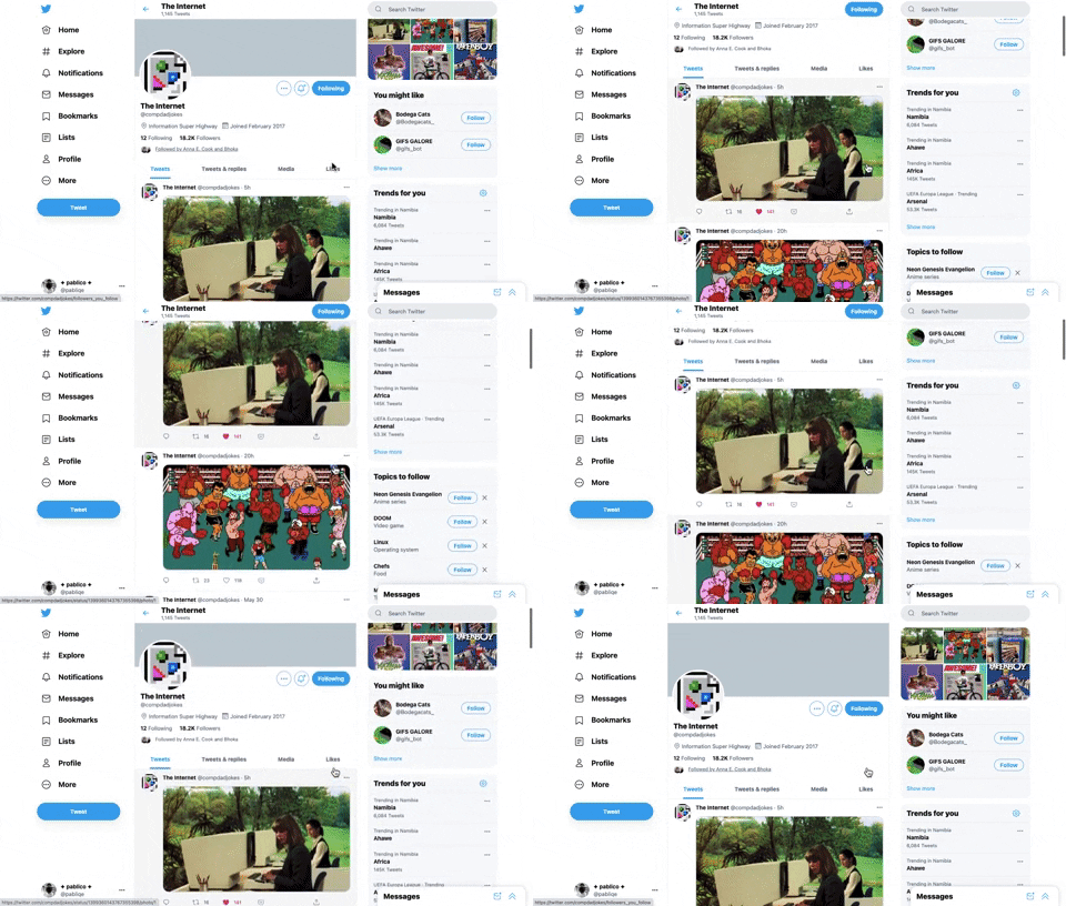
221. Stacked Action Button
This pattern keeps primary actions readily accessible by stacking them vertically, ensuring users can quickly initiate key tasks without scrolling.
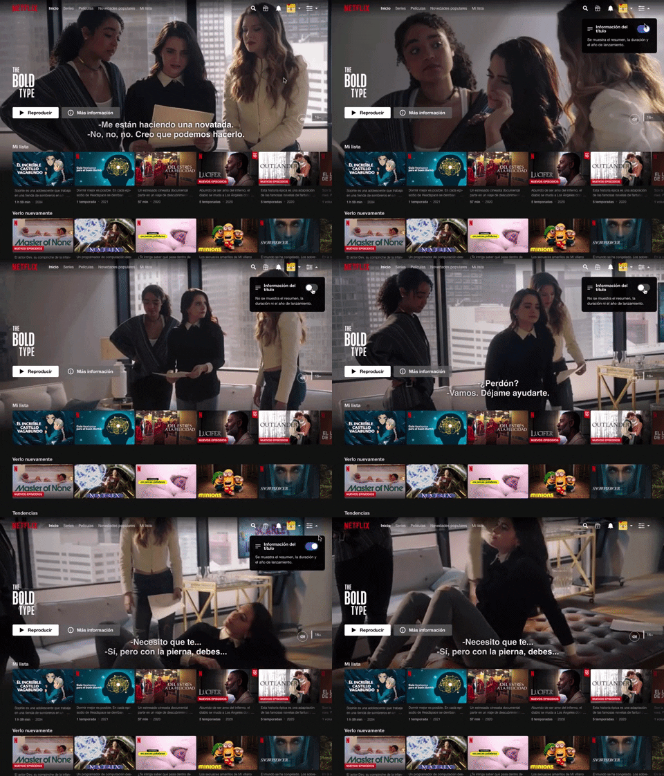
214. Netflix - Information Toggle
A UI pattern, exemplified by Netflix, that allows users to toggle the visibility of additional information, often within a navigation or content browsing context, such as revealing details about a video thumbnail via a dropdown or button interaction. Notable behavior: Click; Toggle; Expanded.

150. Split OS Screens
Users can efficiently manage multiple tasks by splitting their operating system screen into distinct, resizable windows, enhancing productivity and multitasking capabilities.
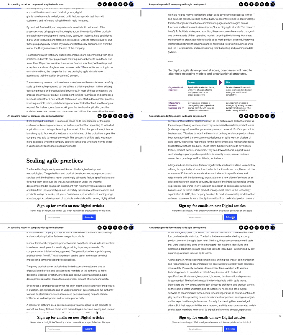
158. Bar Reading Status
A UI element, typically a bar, that visually indicates the user's reading progress or status within a document or page. Often integrated into a fixed navigation bar, it enhances awareness and helps users track their position. Notable behavior: Progress State; Fixed on Scroll.

149. Security Top-banner
This top-banner informs users about security risks and prompts them to take action, enhancing account safety and providing clear options to "Get Started" or "Dismiss".

171. Slack - Multi-browser Sign In
This pattern streamlines desktop app sign-in by redirecting users to a web browser for authentication, then seamlessly returning them to the application.

173. Share Invitation to Live Movie
Users can invite up to six friends to a synchronized viewing experience, fostering shared enjoyment and social interaction around media content.

83. Rewards Notification on Topbar
This pattern uses a notification badge on the top bar to alert users to new rewards, which can be viewed in a dropdown menu for easy access and appreciation.