Patterns for Animations & Transitions
- Desktop (47)
- Tablet (2)
- Mobile (7)
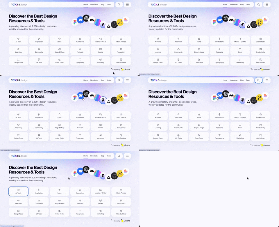
410. Hero Interactive Background (TOOOLS.design)
This pattern uses an animated, interactive background to engage users and visually highlight featured content, enhancing initial appreciation and pathfinding.

406. Fixed Bottom-Right Chat Bubble
Offers always-available, AI-powered guidance and support through a fixed bottom-right chat

405. Ferrari Luce Website (by LoveFrom)
This pattern describes a desktop web landing page, featuring a fixed navigation bar, footer, and interactive elements such as carousels, buttons, and hypertext links. It integrates animations, video, and anchor scrolling to create an engaging user experience. Notable behavior: Animation; Carrousel; Fixed on Scroll.

404. Sidebar Backdrop Menu
This pattern provides a full-height, animated sidebar menu that slides in from the left, offering clear navigation options while dimming the main content for focused interaction.

403. File Upload and Background Loader
Users can easily upload files or paste URLs, receiving clear visual feedback and background loading indicators for a seamless experience.

402. Transition: Zoom-to-Dock for Minimize
This transition visually guides the user as a window minimizes, smoothly shrinking and moving to its new location in the dock, enhancing spatial awareness and system feedback.

400. 3D Button Shadow
This pattern uses a subtle 3D shadow animation on hover to provide clear visual feedback, enhancing user awareness and guiding interaction.
Uink Digital Agency
Specilist on building and launching digital products. Let's talk!

397. Modal w/ Card Options
This modal presents users with clear, card-based options to initiate a task, guiding them efficiently through initial decision-making.

392. SaaS for Construction Workers
This pattern uses a dynamic carousel of images and text to showcase product features, engaging users with interactive content and clear calls to action.
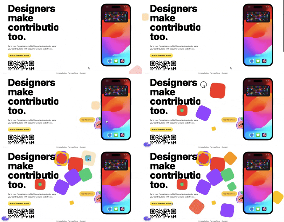
382. Interactive Background Animation
This pattern uses subtle, interactive background animations to engage users and provide dynamic visual feedback as they scroll or interact with the page.

378. Modal Blackout w/ Animation
This pattern uses an animated blackout modal to focus user attention on critical information or actions, ensuring clear decision-making.
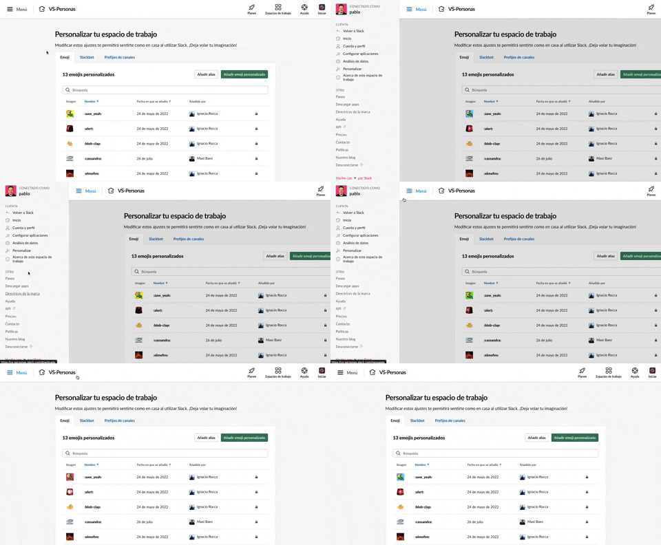
375. Toggle/Show Sidebar Menu
Users can toggle a persistent sidebar menu to reveal or hide navigation options, optimizing screen space while maintaining easy access to key features.
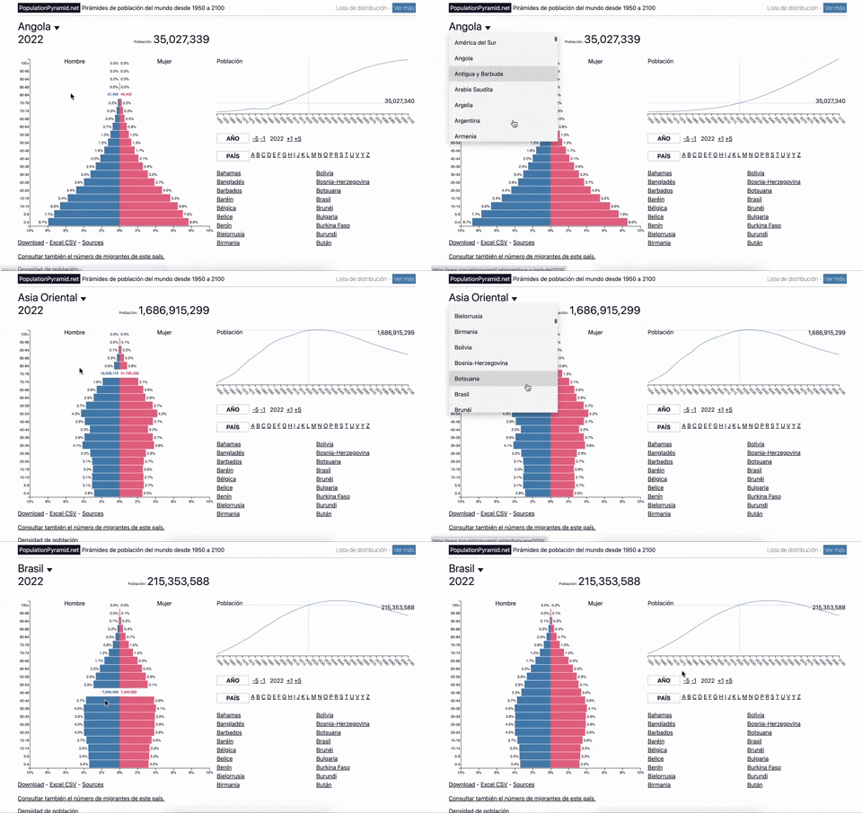
353. Population Pyramid - Visualizations with live filters
Users can dynamically filter population data by country and year, enabling quick comparisons and insights into demographic trends.
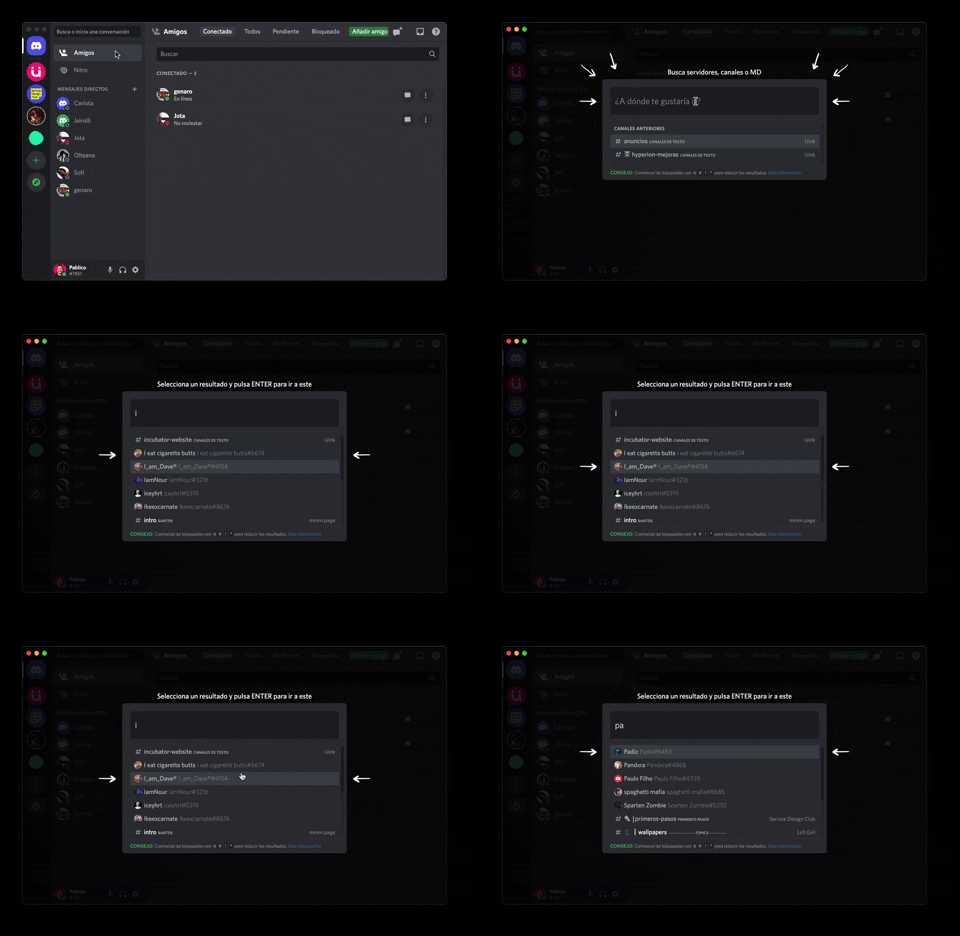
362. Modal Blackout w/ Form & Animations
A modal with a blackout overlay and animated transitions provides a focused input form, ensuring users can quickly add friends without distraction.
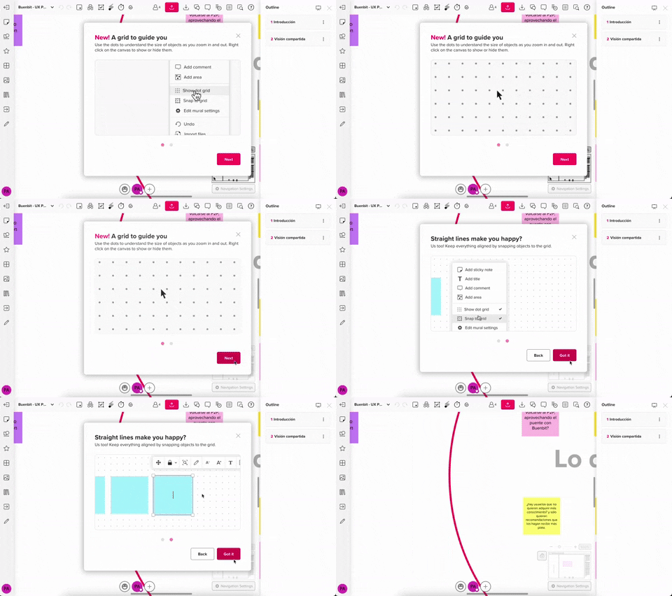
357. Modal w/ Steps & Animation (No blackout)
This modal guides users through multi-step processes with clear instructions and animated transitions, enhancing awareness without obscuring the underlying content.
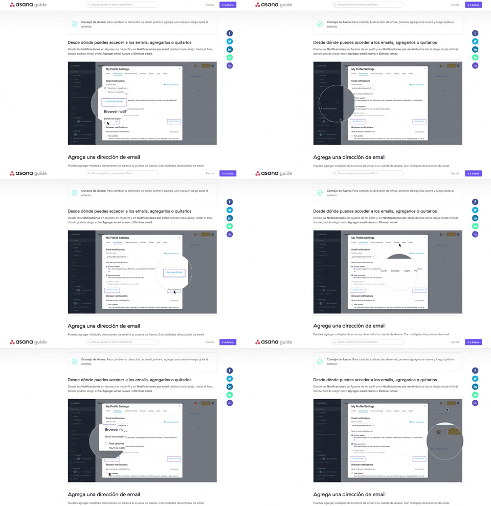
340. Asana - Zoom/Magnifier Over Image
This pattern enhances clarity by dynamically magnifying specific image regions, guiding users to key details and improving comprehension of visual instructions.
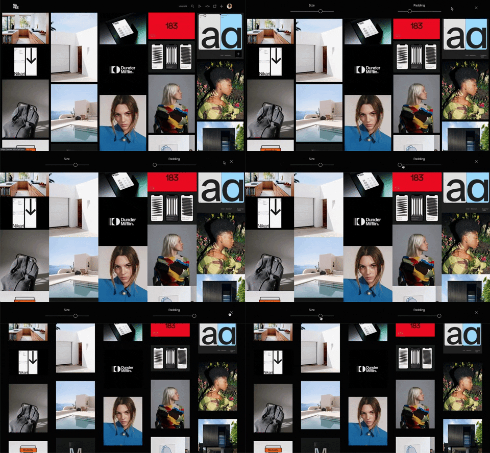
341. Image Grid Customization Sliders
Users can dynamically adjust the number of columns and spacing in an image grid using intuitive sliders, enhancing visual organization and content exploration.
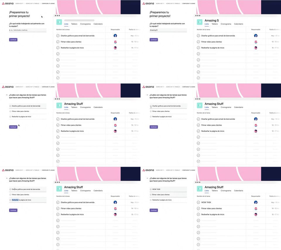
339. Asana - Platform Onboarding Simulator
This pattern guides users through initial setup by simulating product features, allowing them to visualize outcomes and make informed decisions before committing.
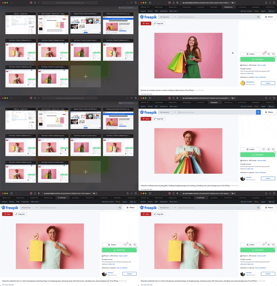
336. Transition: Zoom-In/Out for Browser Windows
This transition allows users to fluidly zoom between a grid of browser tab thumbnails and a full-screen view, enhancing navigation and context switching.
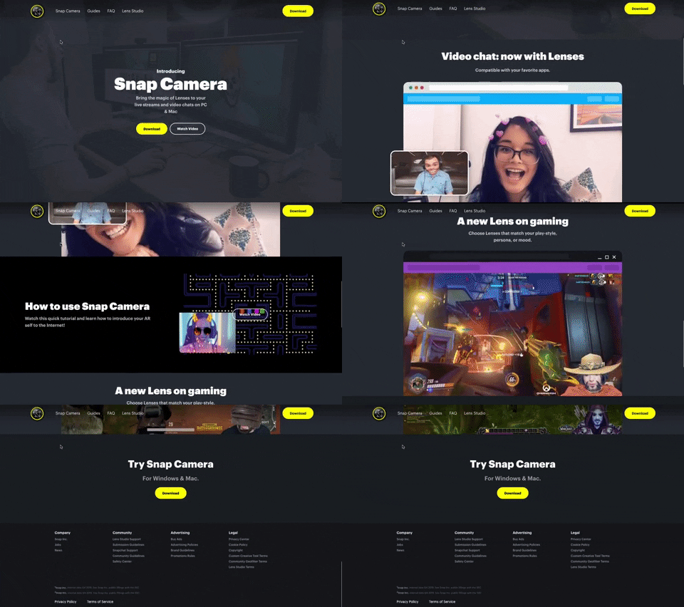
314. Snapchat - Snap Camera
A web landing page for the Snap Camera product, featuring a fixed navigation bar, interactive buttons, and animated video content to showcase its features and encourage user engagement. Notable behavior: Scrolling; Button Click; Fixed Header.
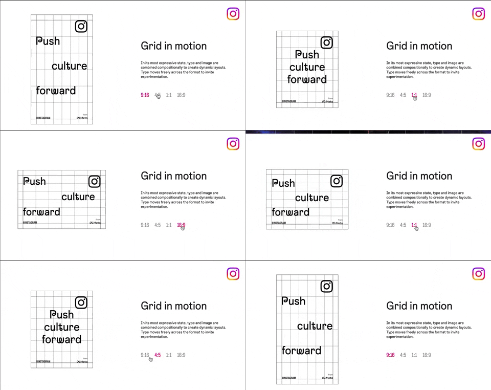
318. Instagram - Animated Illustration with Menu
Users can dynamically adjust content aspect ratios via a clickable menu, providing flexible viewing experiences and enhancing content adaptability.
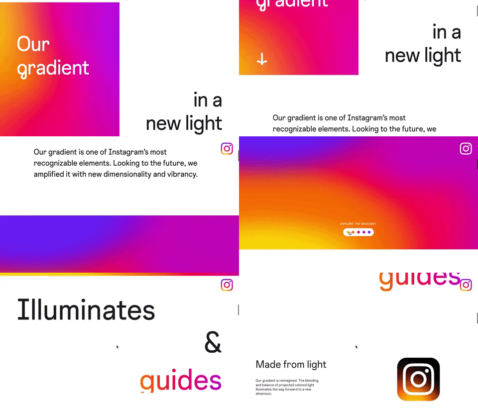
309. Instagram - Brand Gradient
This pattern uses a dynamic, animated brand gradient to visually engage users and highlight key messages as they scroll, enhancing brand recognition and content flow.
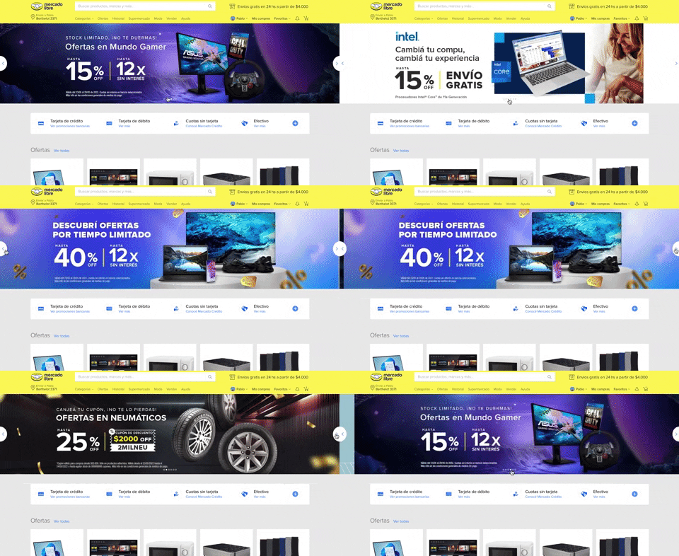
308. MercadoLibre - Hero Slider
Users can effortlessly browse featured promotions and products through a dynamic hero slider, enhancing awareness and guiding their pathfinding.
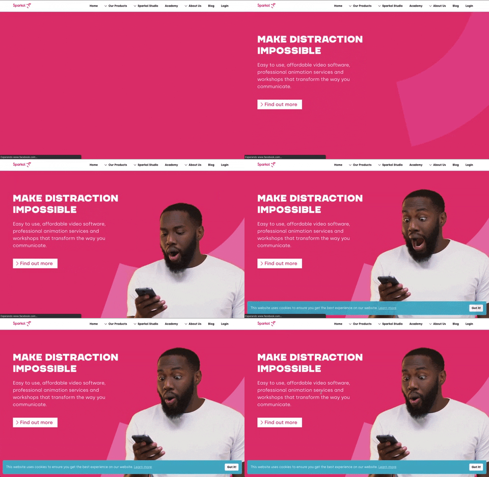
303. Background Animation (on Load)
A dynamic background animation on page load engages users immediately, providing visual interest and a sense of activity while content renders.
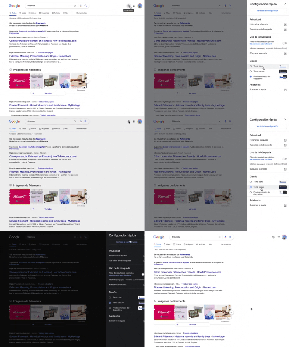
302. Theme Switcher in Side-drawer
Users can quickly toggle between light and dark themes via a side-drawer, enhancing visual comfort and accessibility without leaving the current page.
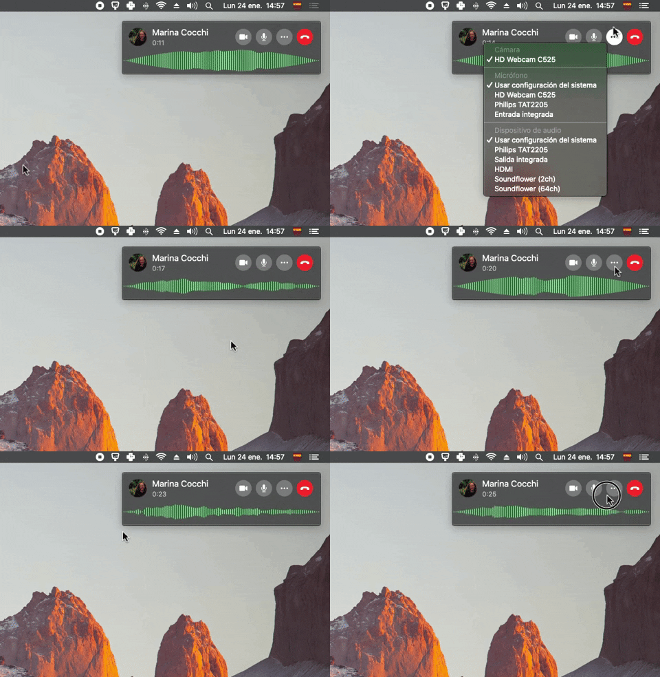
300. Sound Bars Graph
This pattern displays real-time audio levels as a dynamic graph, providing immediate visual feedback on sound input during a call.
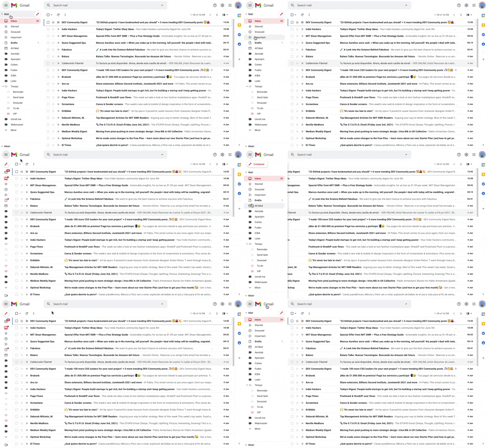
293. Collapsable Sidebar Menu
This collapsible sidebar menu allows users to expand or hide navigation options, optimizing screen real estate while maintaining easy access to key sections.

286. Background Animation on Scroll
This pattern uses a fixed background image that animates and shifts as the user scrolls, creating a dynamic and engaging visual experience.

279. Collapsable Layout Sidebars
Users can collapse and expand layout sidebars to optimize screen space, enhancing focus on primary content while maintaining quick access to navigation.

268. Drag & Drop to Upload File
Users can effortlessly upload files by dragging them from their desktop directly into a designated drop zone within the application.

274. Interactive Background Animation
This pattern uses an interactive background animation to engage users and provide visual feedback as they navigate or interact with elements on the page.
264. Interactive Background Animation
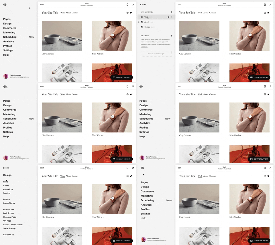
259. Multi-depth Sidebar Navigation
This multi-depth sidebar navigation allows users to quickly traverse complex information hierarchies, improving discoverability and reducing cognitive load.
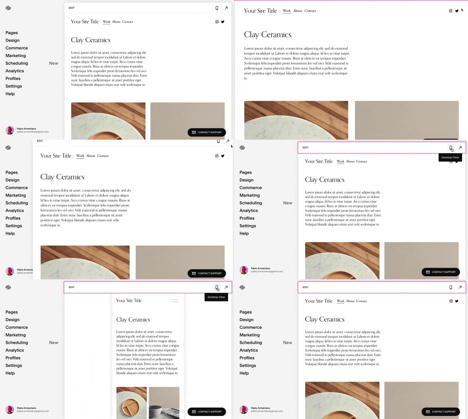
258. Squarespace - Adaptable Viewport Size
Users can dynamically adjust the content preview area, allowing them to visualize their website across various screen sizes for optimal responsiveness and design fidelity.
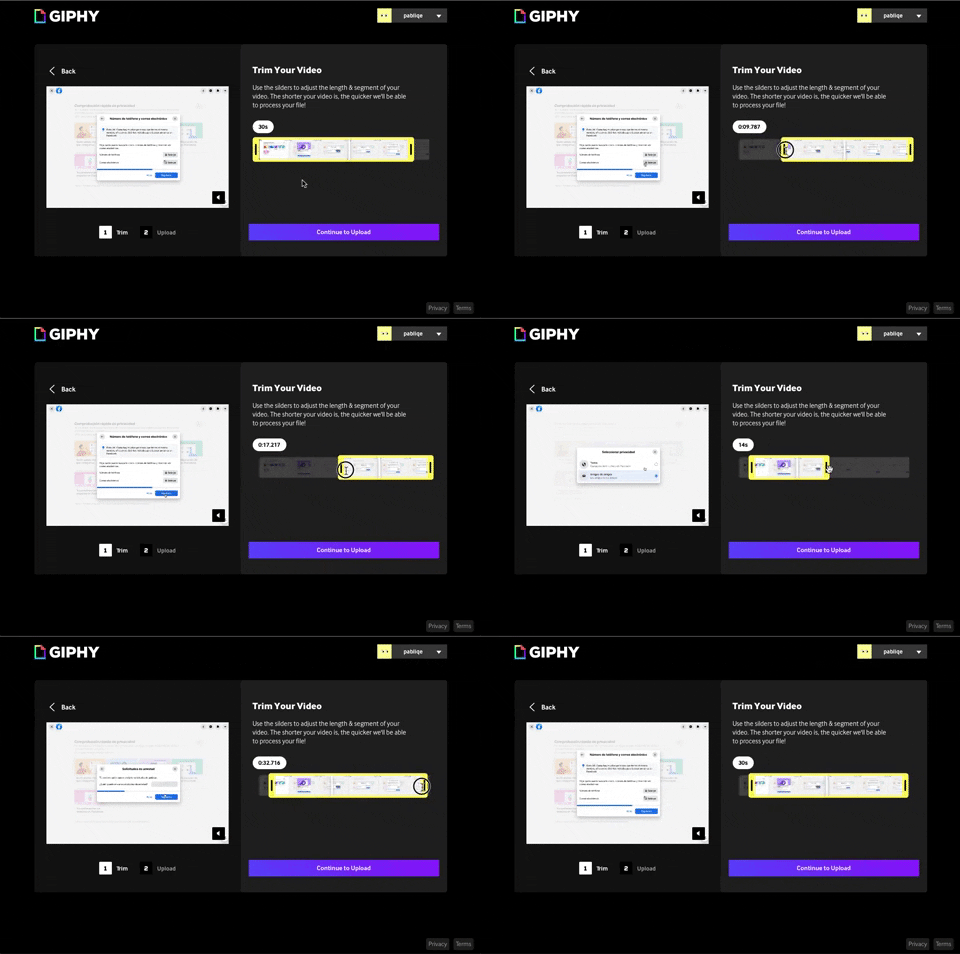
243. Trim Video Slicer
Users can precisely trim video segments using a draggable timeline with visual thumbnails, enabling efficient content selection and faster processing.

254. Toggle/Hide Sidebar Menu (Mouse)
Users can toggle the sidebar menu to hide or reveal navigation, optimizing screen space for content focus or quick pathfinding.
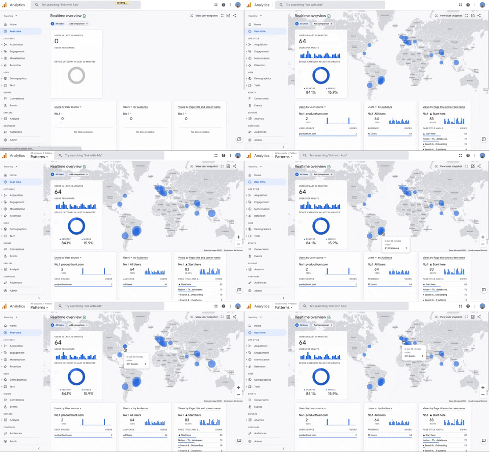
251. Progressive Layout Loader
This pattern provides immediate visual feedback during page loads, progressively revealing content to reassure users that the system is actively processing their request.
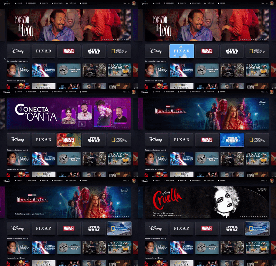
235. Background Animation (on Mouse Hover)
This pattern uses a subtle background animation on hover to provide visual feedback, guiding users to interactive elements and enhancing discoverability.
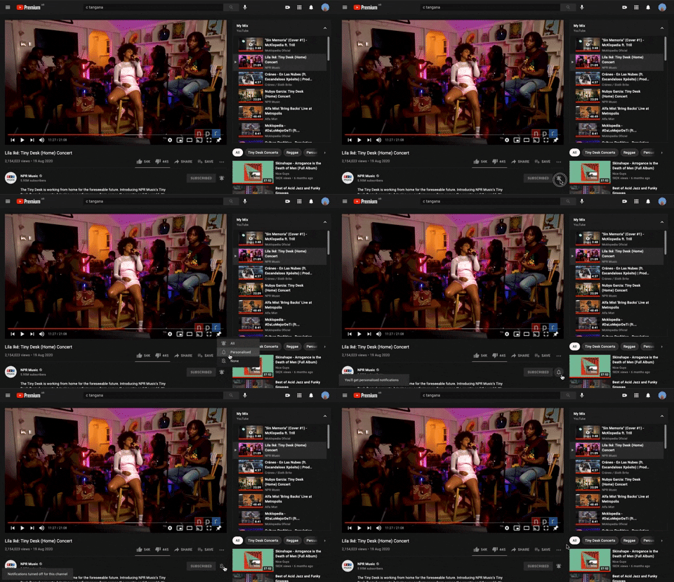
228. Notification Bell Status
Users can quickly check and manage their notifications by clicking the bell icon, revealing a dropdown with recent alerts and an option to clear them.
217. Vertical Icon Menu (duplicated)
212. Automatic Background Animation (on Load)
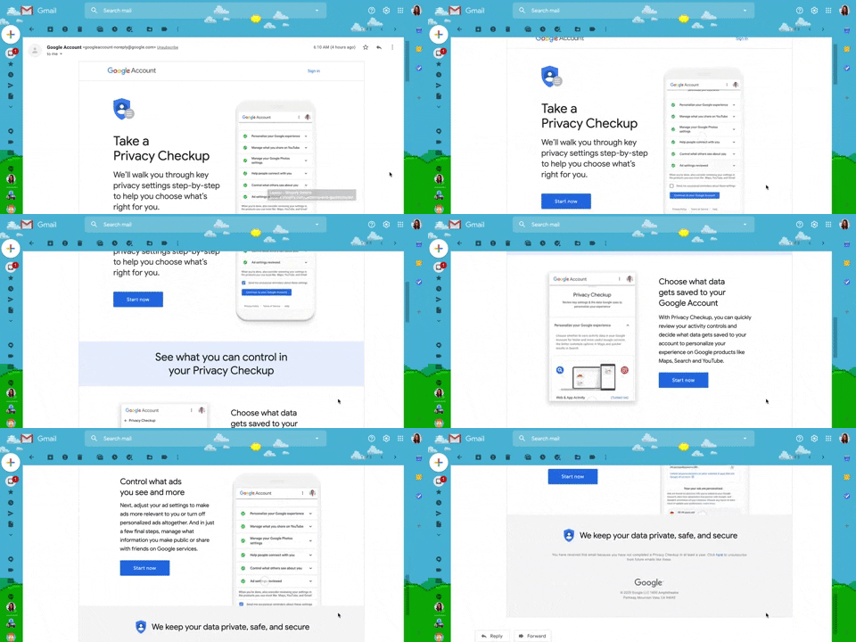
130. Animated Email Page
This pattern uses subtle animations within an email to guide users through a privacy checkup, enhancing engagement and clarity for important account actions.
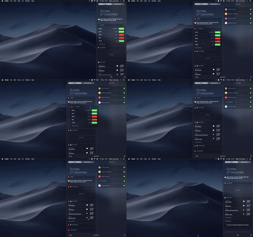
138. Widget Customization Sidebar (2-pane)
Users can quickly access and customize widgets in a two-pane sidebar, enhancing productivity by providing relevant information at a glance.
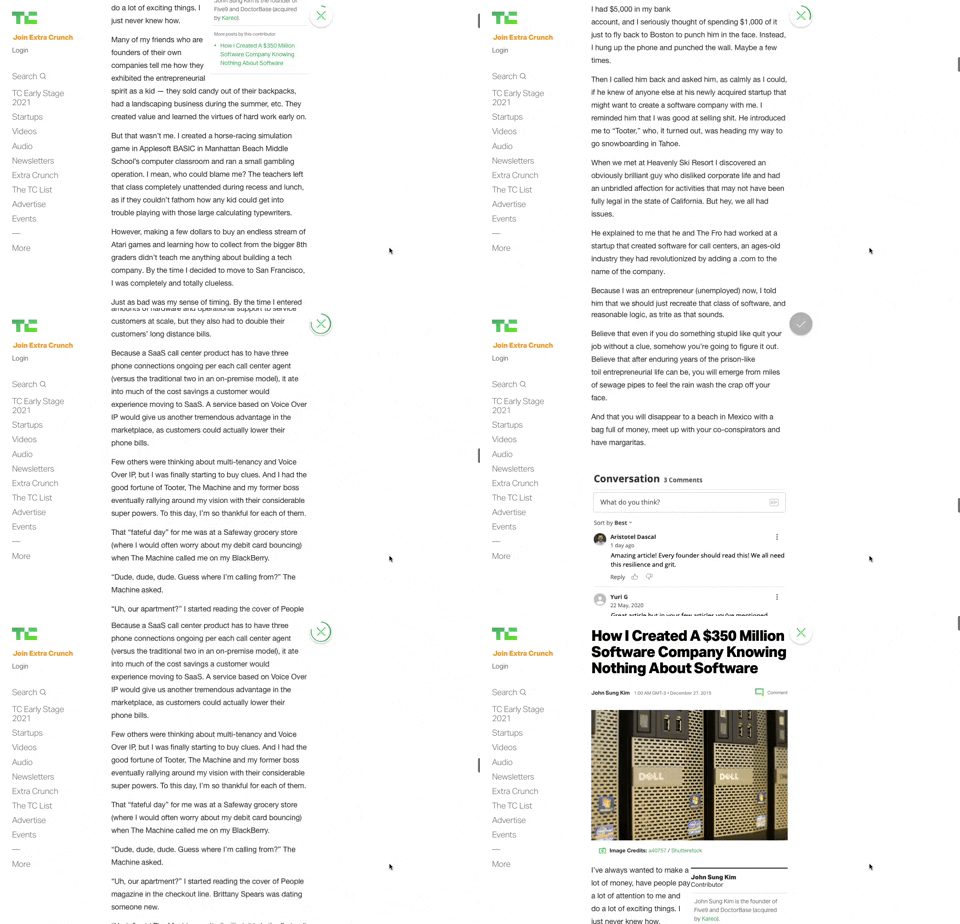
91. Bubble Status Reading
This pattern provides a fixed, animated bubble that indicates reading progress, helping users understand their position within long articles and enhancing content appreciation.
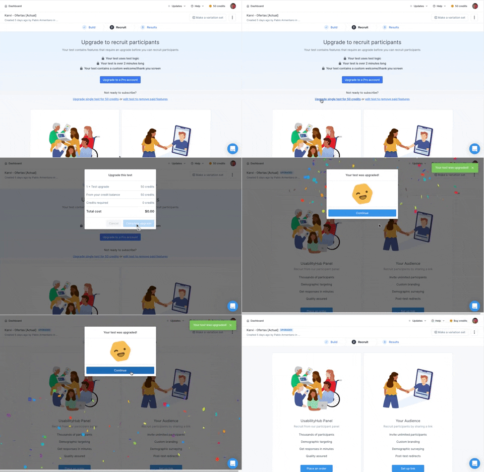
166. Generated Effect: Confetti Explosion
A celebratory confetti explosion visually confirms successful user actions, enhancing positive reinforcement and delight.
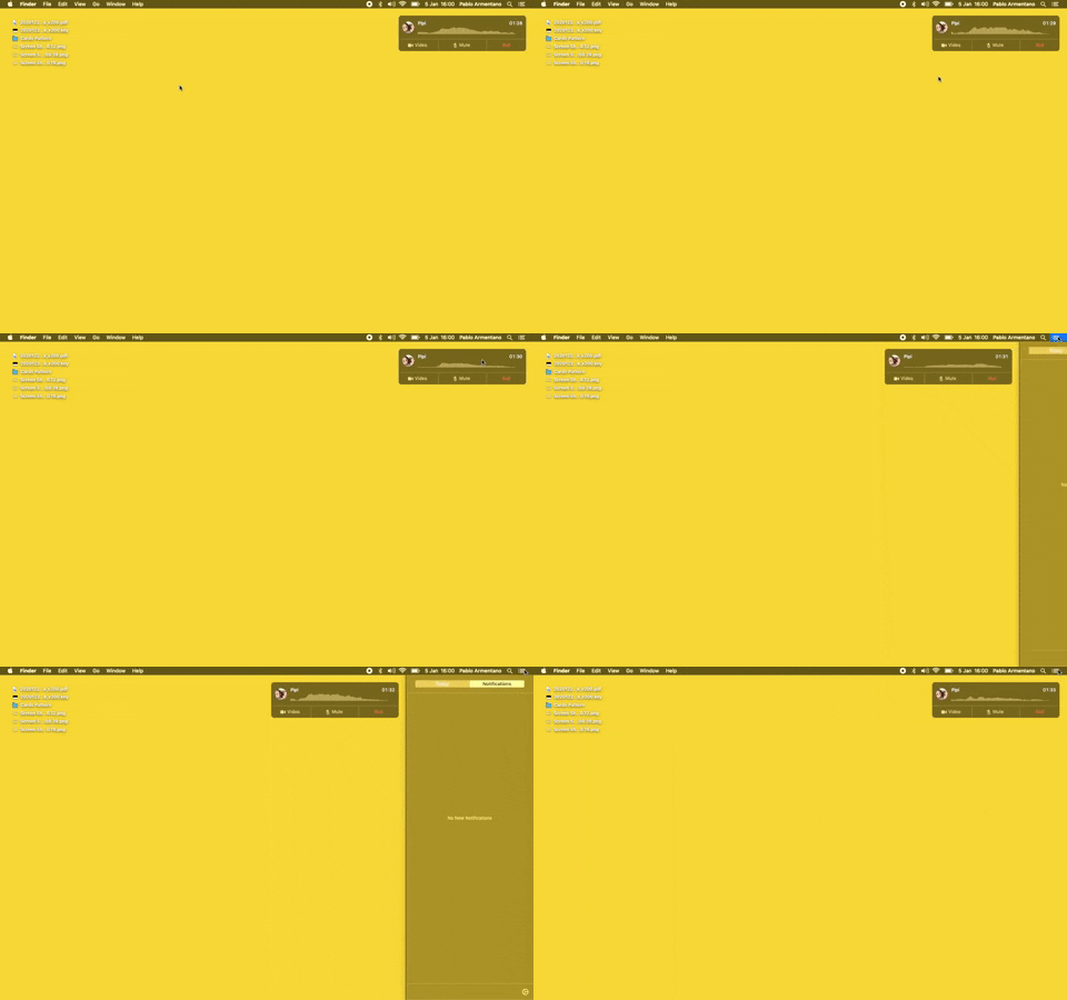
23. Floating Voice Widget with Actions
This floating voice widget provides persistent awareness of an active call, allowing users to quickly mute, unmute, or end the conversation without interrupting their workflow.
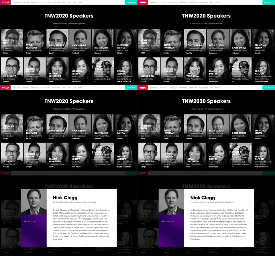
139. Transition: Zoom-Out on Hover
This transition subtly scales down an image on hover, providing visual feedback and highlighting interactive elements without obscuring content.